

Lollipop Chart

About
The lollipop chart is functionally the same as a bar chart. The length/height of the line equals the measure value. The value is indicated by the dot/circle at the end.
Visually, the lollipop chart reduces some of the data-ink that a normal bar chart typically has by narrowing the bar to a thin line. Additionally, the dot can be more visually dramatic to the eye (example, a red dot can draw attention to the top of the lollipop, identifying the value more quickly than a regular bar chart).
However, there are some limitations and considerations when deciding between a bar or lollipop chart. The circle at the end can make identifying the exact value (the center of the circle) more difficult. The top, or end, of the circle actually extends beyond the value (which stops at the end of the line).
How to Bake It
- Drag dimension to columns
- Drag measure to rows
- Ctrl or Command drag green pill (measure) from rows shelf over to the right to duplicate it.
- Click on down caret on green pill, select Dual Axis.
- Right click on axis header, select Synchronize Axis.
- On Marks Card, change one mark to a bar and reduce the size to make it look like a thin line and change the color.
- On Marks Card, change the second mark to a circle, adjust the size, and change the color.
- Hide one of the axis headers.
Pie Chart

About
The pie chart is often credited to William Playfair (1759-1823), an engineer and political economist. The pie chart represents a whole of something which is then divided into parts, represented by the slices, or wedges. Each slice is a portion (percent) of the whole pie (circle) and is represented by the proportional angle. Each percentage point is represented by 3.6° (360/100) so each slice’s angle is equal to the percent value x 3.6.
Pie charts are often criticized because angles are challenging to interpret. When values are close to one another, they become harder to distinguish – it’s difficult to tell which slice is larger or smaller than another. Additionally, because pie charts rely on color to distinguish each slice from one another, there is a limit to how many dimensional values are appropriate to place on the pie chart. Typically, data visualization experts lean towards five or less slices, with the preferred number being 3.
Pie charts can still be clear if the few slices have very different values (for example, 65%, 25%, and 10%) and the viewer can tell which is the largest vs. smallest. Additionally, they are compact and therefore are effective in small spaces. Lastly, people tend to like them regardless of the general opinion by experts. This means that they draw attention and your audience is likely to notice them.
How to Bake It
In Tableau, a pie chart is part of the “Show Me” window, which means by selecting the correct fields, Tableau will create the chart for you. However, here is how you build it from scratch without using “Show Me”.
- Set the Marks Card to “Pie Chart”
- Drag the measure to the angle card and set the table calculation to be Percent of Total
- Drag the dimension to color
- You are done!
Note: I added a trellis chart to my pie chart example. You can read more about making that chart here and here.
Donut Chart
About
The donut chart is just a pie chart without the middle. The “hole” reduces some of the data ink and also provides a space for text/numbers to call out a value. While there is the benefit of the extra white space to use for text, such as to call out a data point, the biggest issue (in addition to the issues with the pie chart) is that by removing the middle, the actual location where angles meet is missing. This makes interpreting the values even harder than they already were. Again, donut charts should be used when actual values are necessary (meaning you only need to know the largest slice, for example) or you have adequate space to label the necessary values.
How to Bake It
- Follow the steps above (or use Show Me to make a pie chart)
- Type MIN(1) into the rows shelf
- Ctrl or Command drag the calculation from rows shelf over to the right to duplicate it
- Click on down caret on green pill, select Dual Axis
- Right click on axis header, select Synchronize Axis
- On Marks Card, adjust the size of the second mark by making it smaller. Remove the color and details from the card and change the color to white.
- Format the view by removing zero lines and borders
Waffle Chart
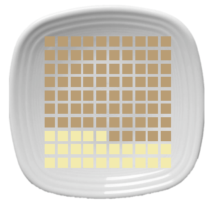
About
The waffle chart reminds me of a multiplication table. Why? Because typically it’s a 10 by 10 grid, comprised of 100 squares. The purpose of the waffle chart is to show progress towards a target, where the target is 100% met, or a percent value out of 100%. The total squares must be the total possible value and the number of differently colored squares equals the value for the dimension.
The waffle chart shares many use cases as the former dessert, the donut chart. It’s basically another visually appealing way to show a KPI metric with the option to add text in some of the unused space. Waffle charts can be used next to one another to compare the quantitative values for dimensions.
Waffle charts shouldn’t be used when values can be greater than 100% or when you are comparing dimensions that have different possible totals without normalizing the values to percents. As with all of these dessert charts, use them with caution.
How to Bake It
Andy Kriebel has a great video already on how to create this chart and the data set to use, which you can watch here and you can download the data file here.
- Bring in the data set linked above. The data set assigns a percentage to each square in the 10 by 10 grid. Use this as your primary data source.
- Put Rows on the rows shelf and Columns on columns shelt. Set to discrete.
- Reverse the Rows axis
- Create a percent calculation to use in your view, such as profit ratio and drag that to the Details shelf.
- Create a calculation that results as true/false for if the measure from your “real” data set is greater than or equal to the percentage from the Waffle chart data set. For example: Profit Ratio >= SUM(Percentage)
- Adjust the size of your squares, fix your axes from 0-1 and hide the header. Format as necessary.
Plum Pudding Chart
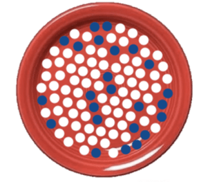
About
The Plum Pudding Chart, named by Kizley Benedict and myself, and is a variation on the standard waffle chart. The Plum Pudding Chart plots 100 points on coordinates that result in the shape of a circle. The chart can be used in the same way as the waffle chart to show progress towards a goal or the percent out of 100.
One nice difference is that the Plum Pudding Chart can use random assignments of the colors to show measures such as percent of a population, such as in the viz that Kevin Flerlage and I collaborated on. This approach should only be used when the exact values do not need to be identified directly from the visual. You don’t want people counting the circles to understand the value. However, this approach can be visually impactful. Large text can also support the number you are visually representing.

How to Bake It
A full guest blog post can be found here.


- Follow the directions for data prep on the blog post
- Place X on columns and Y on rows
- Convert the flag field to a dimension and put on color
- Change the mark type to any shape you wish, such as a circle
- If you have a static number you can then create a random calculation: RANDOM()
- Create a Float parameter and then another Color calculation: INDEX()>[# of Points}
- Put the Color calculation on the color shelf and adjust the parameter to show whatever value you want.
- Ensure that the Color is set to compute using both X and Y with a Custom Sort using the Random calculation.
The Chart-iest Desserts Ever
To view all the charts in this blog along with the cute dessert spread, check out the visualization on my Tableau Public Page via this link and download the workbook.
Yummy!
As always, I hope you enjoyed this and that it was fun and helpful!
Cheers,
Lindsay
