

Plum Pudding, What?
I guess it depends on where you live. If you are in the US, you are likely baffled. If you are in the UK, you probably know what I’m talking about. If you are elsewhere, then sorry, I cannot promise to know where you stand in the understanding of what the hell plum pudding is.
What I can tell you, is that it is a cake-like pastry with speckled dots of fruit in it. How can this possibly relate to data visualization and chart types? Clearly, I’m going to tell you.
JJ Thomas, a scientist who discovered the electron, named his model of the atom after plum pudding. (I know! After a Christmas cake. Scientists are so silly!) The plums are the electron and the cake (pudding) is the positive ball. It became the plum pudding model. The chart we are going to talk about, looks a lot like the “plum pudding model.” So there you go.


Hopefully, now that I’ve got your attention, let me explain how all of this relates to Tableau and chart design.
The World as 100 People
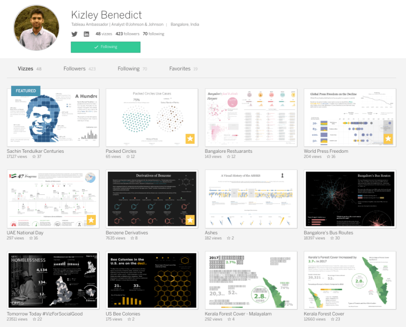
I joined the Tableau discussions on Twitter towards the tail-end of 2017 and rounded out the year with my first #MakeoverMonday visualization for the final week 52. When I started searching for the #MakeoverMonday hashtag, I scrolled through some vizzes from a few prior weeks. Many caught my eye, but there was one that I never forgot. That particular viz was developed by Kizley Benedict. He is a brilliant Tableau author with a unique style and amazing ability to tell clear data stories through innovating charts without them being unnecessary or overly complicated.
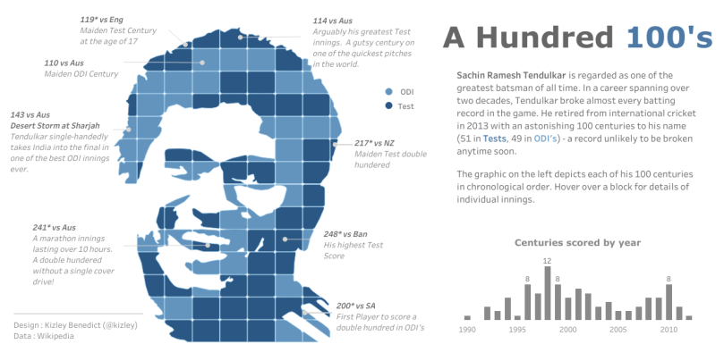
You may recognize Kizley Benedict’s amazing vizzes when you scroll through his Tableau Public profile. His VOTD on the famous cricket player, Sachin Ramesh Tendulkar, is quite memorable.
So when I saw his “World as 100 People” visualization in late 2017, I immediately thought, “Wow, this is clever and I think it actually could be practical, especially with population data!”
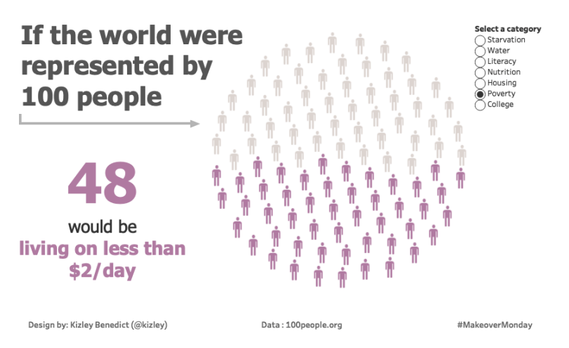
See, at the time I worked for a healthcare management company and I did a lot of population analysis and comparisons. Kizley’s circular population graph was similar to the standard waffle chart, but much more compelling when I was thinking about populations. People in healthcare often like to hear a simple phrase of “1 in 10 people have…,” “35 out of 100 are diagnosed with…,” “2 in 8 spend this much on…,” whatever the case may be.
A waffle chart makes a square grid into 100 squares and simply colors in the number that would represent the percent of something. Sort of like a pixelated bar chart. So if 27% of the population hated tacos, then 27 of the 100 squares would be shaded a different color than the rest. And I feel bad for those 27 people. Everyone should love tacos.
Now, a waffle chart works just fine, but the circular graph with actual people had a much larger emotional impact when I saw it. Sometimes it’s these small elements that can change not only the story of your viz, but the likelihood someone is going to interact with it. It’s a sort of humanizing effect.
Case in point…
You may recall that in a recent collaboration viz I completed with Kevin Flerlage on the cheetah population, we used the same approach for our population loss comparison chart. We spoke about the process a bit in our blog summarizing our collaborative effort, which you can read about here. The short story is that when Kevin showed me a waffle chart initially, I immediately thought about Kizley’s earlier #MakeoverMonday viz and told Kevin we needed to replicate it.
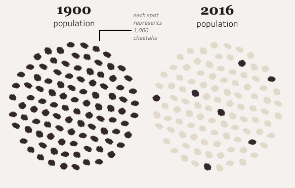
Kevin and I were thankful for Kizley’s original idea as it really had a much better effect and visually told the story better than a square waffle chart, or even a bar chart, frankly. Given the inspiration I’ve received from the “World as 100 People” viz, I asked if Kizley would be kind enough to share his process for creating it and some practical uses. I’m very thankful that Kizley agreed to write the following post sharing his knowledge!
The following is a guest post by Kizley Benedict. Kizley is an analysis at Johnson & Johnson and is well known in the Tableau Community as a Tableau Ambassador. His visualizations are rich with beauty, complexity, and simplicity, all at the same time. You can find him on Twitter at @kizley.
Plum Pudding Charts (or circular waffle charts)
Back in 2017, for Makeover Monday week 48 I was looking at alternatives for a waffle chart.
Since the topic was “The World as 100 People” plotting a hundred points in a circle (representing a globe) seemed like an effective way to draw attention to the issue.
One option I considered was using a packed bubble chart. However, the overall shape of the packing would not have been circular which would have defeated the purpose.
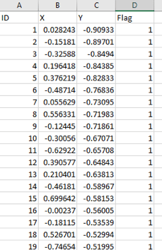
I searched online for any method or algorithm using which I could plot the hundred points in a circle and soon enough came across this link : http://hydra.nat.uni-magdeburg.de/packing/cci/cci100.html
This was exactly what I needed. The coordinates of each point were also available, so all I had to do was copy paste them into Excel. In my viz, I have used a parameter to allow the user to make selections as the data had multiple measures. So, I had to create a flag field for each measure.
You can view the interactive version here.
Data Prep
For showing a single percentage value we just need to create a single flag field.
This is similar to a waffle chart where flag is equal to one wherever the row number is less than or equal to the percentage value. So, if the percentage value is 75 the first 75 rows would have flag = 1.
Building the view
- Place X on Columns and Y on Rows
- Convert the flag field to a dimension and drop it on Color
- Change the mark type to circle (or any shape of your choice)
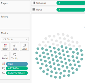
And we’re done.
There are a couple of other use cases for the packed circles chart which are discussed below:
Highlighting random points in the circle
In their recent collaboration for #IronQuest Lindsay Betzendahl and Kevin Flerlage used packed circles to visualize the decline in cheetah population.
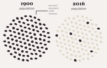
This is certainly more eye catching compared to a waffle chart. The use of the cheetah print as shape is a nice touch as well. Check out this amazing visualization here.
To build the second view the flag field can be defined in the data source itself or can we can make random selections in Tableau using a couple of calculations.
To make a random selection of the colored points follow these steps:
First, create a calculated field using the random() function as shown:
Next, create another calculated field to select the number of points to be colored. Here “# of Points” is a parameter which reads the user inputted number. We can also hardcode a number in the calculation instead.
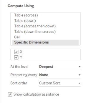
 Lastly, place the Random Selection calculation on Color. Make sure it is computed using both X and Y. In sort order select Custom Sort and choose the “Random” field created in step 1.
You should get a circle as shown below with random points highlighted (20 in this case)
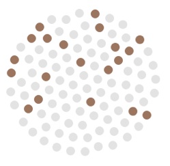
Note: Random() generates new values on every refresh. So, if you want specific points to be colored it would have to come from the data source itself.
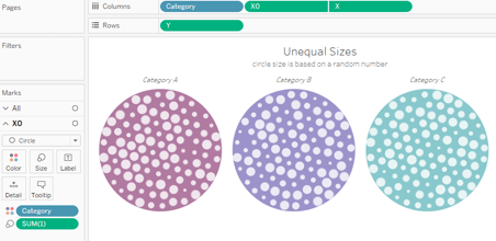
Unequal Circle Sizes
Circle sizes can be varied by placing a measure on size. This can be used to compare values across categories. E.g. Comparing Box office collections for 100 movies across three genres.
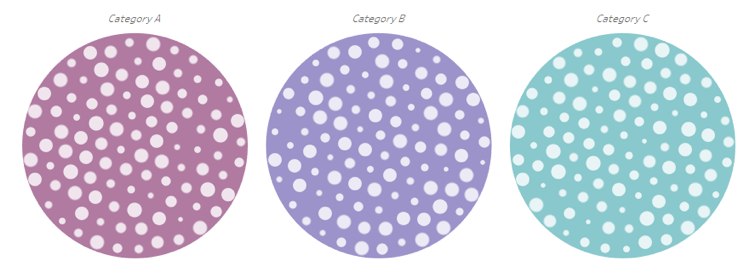
The example above uses randomly generated data to vary the circle sizes while color was used to differentiate the categories.
Design Alternative: Instead of coloring the inner circles you could color the outer circle using a calculated field.
In the workbook I have used the following calculation for the outer circle:
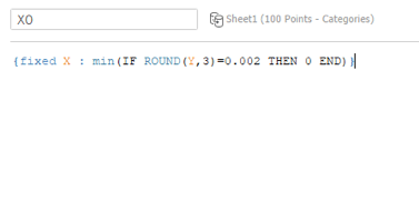
X0 can now be used as a dual axis.
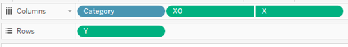
Drop SUM(1) on the size mark for X0 and adjust the size as desired.
Drop Category on the color mark for X0 and choose colors accordingly.
You should get the following view:
The data and workbook with the use cases can be found here.
Want to use a number other than 100?
Just change the 100 in the URL to whichever number you want.
http://hydra.nat.uni-magdeburg.de/packing/cci/cci100.html
The rest of the steps would remain the same.
~Kizley~

5 comments