

A Brief History of Measles
If you are under the age of 60, you likely have never seen a case of the measles and probably had forgotten all about the disease until the past few years. Why is that? Because prior to the measles vaccine program that started in 1963, an estimated 3-4 million people contracted the virus each year in the United States and 6,000 people, on average died from the disease. It wasn’t uncommon back then to know someone who had, or even died from, measles.
In 1954, John Enders and Dr. Thomas Peebles isolated the virus from an ill student during a measles outbreak in Boston. Less than a decade later, in 1963, they were successful in creating a vaccine, the same one used today.
However, in recent years there has been plenty of news coverage about measles outbreaks. In the US, measles was considered eradicated back in 2000; however, due to an increase in vaccine-refusal and international travel, there have been various outbreaks across the country. This is significant because it puts us all at risk, especially those with a compromised immune system and physically cannot have the vaccine. Awareness of the disease and the changing rates across the world is important.
The Data Set
March’s #ProjectHealthViz data set was provided from the World Health Organization (WHO). According to the WHO website, “Most Member States submit monthly reports on suspected and confirmed measles and rubella cases identified through their national disease surveillance systems to WHO. In general, the number of reported cases reflects a small proportion of the true number of cases occurring in the community. Many cases do not seek health care or, if diagnosed, are not reported.” The data set was rich with different metrics and values for various countries over the years.
My Inspiration, Approach, and Chart Choices
During the month of March, a promotional advertisement popped up in my Twitter feed from Help Stop the Virus, an initiative by Gilead to raise awareness about HIV prevention treatment options. That particular infographic had a few elements that I thought would perfect to emulate in my #ProjectHealthViz visualization on the measles outbreaks.
I’ve mentioned before that I draw inspiration from a lot of random places at random times. The other piece about inspiration, is sometimes I find a few elements that I really want to try to recreate in Tableau even if the original visual is not using data at all.
So before you start saying, “you just copied their infographic”, let me explain. I actually only used three generic elements: color, layout, typeface.
Yes, my visualization looks very similar to this infographic, but that is mostly because I used the same colors. Colors have a strong ability to make connections. We often see resemblances between two things (a painting, an image, a book cover, an advertisement) based on the exact elements I just stated: color, layout, and typeface.
So despite “stealing like an artist” and using those concepts, my visualization is nothing like theirs from the topic, to the details, to the fact that everything is created by data.


When I saw this, there were a few elements I wanted to try:
- Separated sections using dots and rotated headers (I literally just used a text box and a bunch of periods to make the separations…ha!)
- A timeline that both moved across and up or down to allow for more space for other parts in the viz
Plus, one idea of mine that I was determined to create:
- A virus made entirely of data points
Creating a Stepped Timeline
I had a data set with two columns: Year and Event. These were the points why which I wanted to construct a simple timeline of major events related to the measles virus. However, as I mentioned above, I wanted that timeline to be able to move up or down the page in order to provide room for other worksheets. In my case, I had text and a virus (worksheet) that I needed to have ample room for.
There are at least three ways to do this depending on your level of need to move things around and the level of effort. All three still use the same set up.
Create a calculation called “Year Placement” which you will manually determine how high or low you want each year based on those other pieces of your viz that you are trying to “move around.” I played with the calc a bit in order to get it just right. This calculation is just creating a vertical axis that I can then plot my data points so that they move up and down in the space as well as across time.
IF [Year]=2000 THEN 6
ELSEIF [Year]=1963 THEN 1
ELSEIF [Year]=1978 THEN 4
ELSEIF [Year]=1981 then 4
ELSE 0
END
Here are where the three variations diverge.
First method: The circles and blank boxes (good for customization, fewer calcs/data prep, not so good if you aren’t detail oriented, not so good if you get frustrated with pixel pushing).
This is the method I chose. I put Year on Columns and my Year Placement on Rows; changed the marks to circle and added in my event details in the tooltip.

Next, I added in floating blank boxes and filled them with the same color as my circles, set them to 3 pixels (wide or high depending on the direction) and ensured they connected exactly with each circle. I then sent the timeline to the back so that it would be interactive. Voila!

So you may be wondering, “why didn’t Lindsay just use a step line chart?”. Good question.
Step lines are the next option, but based how I wanted my chart to move, Tableau wasn’t going to break the lines in the right spot. Tableau goes over and up, and I wanted up and over as well as over and up in some places.
Second method: Using a step line chart. Using the “Year Placement” calculation, you can still achieve a similar effect. So, for quick uses, this may be fine. For me, I need extra room for my text boxes and virus, so I opted not to do this one, but it’s certainly very effective.

Third method: Using additional calcs and perhaps “fake dates” to make your custom breaks. Although, I’m sure someone else has a better idea! This would take a little more thought and is less dynamic. The blank boxes was easy for me to move around if I had to adjust my calc. Changing one calc and moving some lines seemed to be the best fit for my purposes. A more complex method, however, could be easier in the long run if you needed to update things.
Making a Virus Out of Data Points
I really enjoyed putting this one together. I used some techniques I’ve used in other vizzes to create it.
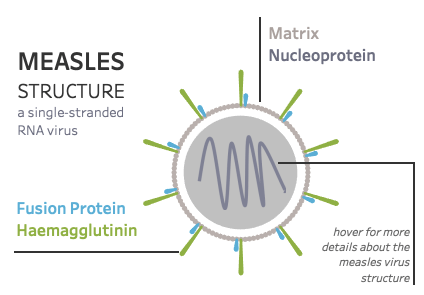
The virus is actually three-layered worksheets (why do I feel like this is becoming a trend for me…?): The outer ring of the matrix and proteins (blue/green), the inner circle (the virus center), and the squiggly line (the RNA). Each of these elements are still interactive, but there is some limitations with the layering approach near the edges of each worksheet. Again, I’m sure someone else has a method to get these all on one worksheet! If you do – let me know!
Reference for the virus structure image I used.

Virus Center: I had made a circle with data points before. In fact, when I created my Nautical Flag visualization (all via custom data points), there was one flag (letter ‘I’) which required a circle. I created 100 x/y coordinates to make the circle. Given that data set, I needed my circle in a specific place in a 4×4 unit grid. So, I already had a data set with 100 points available to me and the placement of the data points didn’t really matter because the headers were going to be hidden anyhow. So, I simply used those points to make my circle.
I created an Excel worksheet with 6 columns: Shape ID, X, Y, Order, Part, Path, and Description.
For the Virus Center, I made it Shape ID 1 and created an Order from 1-100. I didn’t need the Path for this part so it was just set at 0 and the Part was “Matrix” with a description fo the tooltip.
Using the polygon mark type I put X on Rows and Y on Columns and SUM(Order) on Path. I filtered to just Shape ID=1 for this worksheet since I would have another worksheet that would only use Shape ID 2 and 3.
Matrix/Proteins: For the outer ring, I needed a circle and then two types of outward projections. I had made both circles and petals with data before so I had some idea of how I was going to tackle this first part. (You can read about how I did petals here from my “A Mom who Vizzes” viz.)
Now, I had the data for the circle from the Matrix step. But the circle was only half the battle. I still needed those Fusion Protein and Haemagglutinin projections. Those would require two data points each, one along the circle coordinate and another one a certain distance out from the center of the circle. To do this, I reference another old blog post of mine about radial charts.
First, I decided I would make 10 protein projections around my 100 point circle. That meant that I simply needed to find the x/y coordinations from my first data set for every 10th data point and copy those. While this technically gave me three identical data points, that was okay because I was going to modify those points in Tableau using calculations.
In my data set, I created two new shape IDs (2 and 3), copied the X/Y coordinates for every 10th data point from my original 100-point data set, set the Path to 0, and gave them their name and description. Then I copied that whole set and changed the Path to 1. So for the proteins I had two identical sets of data each with a different Path number. This would be used to create my projections. The whole section looked like this:

Next, was the math in Tableau. Again, reference by blog about radial charts. I often just copy the calcs from there.
First, I created my radial, or the order along the circle I wanted these projections. I created a calc called Radial Position and just put my Order field in it. Next, I created my Angle calculation, or the where along the circle the projection would be. Because I wanted my Matrix and Proteins along the same circle, here is where I adjusted their location.
For the Matrix, I needed each of the 100 dots to be spread around a 360° circle. So that part was to divide 360/100 and multiple that angle by the Radial Position. For the two proteins, I needed to move one of the proteins ‘up’ a radial position. In order to do this, I first divided 360/10 (because there were 10 points). Then for the Haemagglutnin, I just kept the angle at the Radial Position times the degrees (360/10), but for the Fusion Protein, I just added one Radial Position to move the angle up one.
Angle
IF [Part]=’Matrix’ then [Radial position]*(360/100)
ELSEIF [Part]=’Fusion Protein’ THEN ([Radial position]*(360/10))+(360/100)
else [Radial position]*(360/10) END
Lastly, I had to create new X/Y coordinates that would use the Path to create the projection. This took a little playing around to get the distance just right, but basically I just multiplied a number to the usual X/Y calculation just for the coordinates with a Path of 1 to extend each of these lines outward.
X2
IF [Shape ID]=1 THEN 1*COS(RADIANS([Angle]))
ELSEIF [Part]=’Fusion Protein’ THEN
(IF [Path]=0 THEN 1*COS(RADIANS([Angle]))
ELSE 1.15*COS(RADIANS([Angle])) END)
ELSEIF [Part]=’Haemagglutinin’ then
(IF [Path]=0 THEN 1*COS(RADIANS([Angle]))
ELSE 1.5*COS(RADIANS([Angle])) END)
END
Y2
IF [Shape ID]=1 THEN 1*SIN(RADIANS([Angle]))
ELSEIF [Part]=’Fusion Protein’ THEN
(IF [Path]=0 THEN 1*SIN(RADIANS([Angle]))
ELSE 1.15*SIN(RADIANS([Angle])) END)
ELSEIF [Part]=’Haemagglutinin’ then
(IF [Path]=0 THEN 1*SIN(RADIANS([Angle]))
ELSE 1.5*SIN(RADIANS([Angle])) END)
END
The final part, was just to plot it using those new coordinates and the Path field to make the connecting lines.

RNA: This was the easiest one to create. I created the image in PowerPoint (just drew a squiggle and saved it as a picture) and then used a calculated field called “Blank” with only two quotations in it (”), dragged that onto rows, hide all the headers, changed the mark to a shape, and loaded my image I created into my shape file. Then I was able to type in whatever I wanted into the tooltip. No “real” data necessary.
This was the end result, which I was really pleased with! Also, I have to thank Young Song for reviewing it for me to ensure I had everything accurate from a molecular standpoint!
I realize that was a lot of information, so please reach out if you have any questions. I’m happy to (try to) help if you get stuck!
The final viz can be seen here.
Cheers,
Lindsay
