

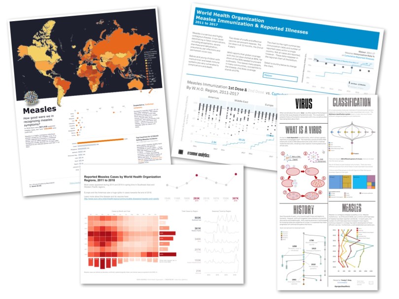
A Brief History of Measles
If you are under the age of 60, you likely have never seen a case of the measles and probably had forgotten all about the disease until the past few years. Why is that? Because prior to the measles vaccine program that started in 1963, an estimated 3-4 million people contracted the virus each year in the United States and 6,000 people, on average died from the disease. It wasn’t uncommon back then to know someone who had, or even died from, measles.
In 1954, John Enders and Dr. Thomas Peebles isolated the virus from an ill student during a measles outbreak in Boston. Less than a decade later, in 1963, they were successful in creating a vaccine, the same one used today.
However, in recent years there has been plenty of news coverage about measles outbreaks. In the US, measles was considered eradicated back in 2000; however, due to an increase in vaccine-refusal and international travel, there have been various outbreaks across the country. This is significant because it puts us all at risk, especially those with a compromised immune system and physically cannot have the vaccine. Awareness of the disease and the changing rates across the world is important.
The Data Set
March’s #ProjectHealthViz data set was provided from the World Health Organization (WHO). According to the WHO website, “Most Member States submit monthly reports on suspected and confirmed measles and rubella cases identified through their national disease surveillance systems to WHO. In general, the number of reported cases reflects a small proportion of the true number of cases occurring in the community. Many cases do not seek health care or, if diagnosed, are not reported.” The data set was rich with different metrics and values for various countries over the years.
Insight from the Community
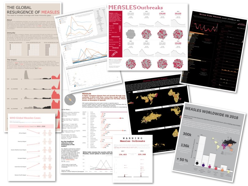
There were so many fabulous health visualizations this month that I wanted to take a different approach. I chose my four favorites and asked each of the authors a few questions about their viz. (It happens to be a coincidence that each of these has a simple red/white color palette.) Responses correspond to vizzes clockwise from the top left: Michele Frayman, Riddhi Thakkar and Saujanya Ram, Pradeep Kumar, and Ann Cutrell.
Thank you to everyone who participated and the folks below who kindly provided some insight into their visualizations!

Eradicating Measles: A Global Imperative by Michelle Frayman
Michelle used an impactful title to immediately explain what her viz was about. I know it’s about measles around the world and there is something really important about it. She follows the title with a quick overview of what measles is and then some key numbers about significant changes in BANs (Big Ass Numbers): the region with the greatest percent change from 2017-2018, the region with the largest volume increase, and the region with a reduction. The column of information to the far right is perfect. It clearly gives more context to the data and then a call to action and is organized in a way that it certainly adds to the viz.
I’m a big fan of barbell charts because they clearly show me the overall change (length of the bar) and the direction (Michelle used colors on the bells/ends). I can quickly see that the European Region had the largest volume change (as she indicated in the BAN above) and the South-East Asia Region was the only one with the reduction (only one where 2018 in red is below 2017 in gray).
Finally, I love the annotations in the jitter plot. This shows that Michelle did a little extra research and wanted to ensure that her viewer had the information to know why these two countries were such outliers.
How did you go about deciding on your chart types? Did you draw inspiration from anywhere when you were developing?
Michelle: This was my first jitter plot and it was inspired by @ZeeVizGirl. I loved how the dots looked like measles and highlighted the outliers. I might have taken the BANs concept a little too much to heart after reading #MakeoverMonday from @TriMyData and @VizWizBI, but I really like how they showed the HUGE increase and the one region that is improving. I chose the barbell chart for the same reason, I felt it very clearly showed that we are moving in the wrong direction, and I thought the map helped add context.
My inspiration for this viz in general was my local communities. My childhood neighbor was born deaf as her mother contracted German measles, and in my current neighborhood one of my friends son had an infection when he was young leaving him vulnerable.
Measles: Highly Infectious, Highly Preventable by Riddhi Thakkar and Saujanya Ram
It was such a pleasure to see another collaboration viz from the community represented in #projecthealthviz! Besides the fact that it was a collaboration, I really enjoyed the infographic feel of Riddhi’s and Saujanya’s visualization. There are only two actual Tableau graphs (the line chart and the map). The rest of the space is filled with a custom timeline built outside of Tableau and brought in as an image, and icons with important text about the disease. I found this visualization very informative and easy to understand. Each portion felt important and nothing was unnecessary. Given some of my points above about custom timelines, I think this timeline certainly could be made in Tableau! But regardless, I enjoyed the look of it and the data this entire visualization conveyed.
You know I love collaborations! How did you both decide to collaborate on this #ProjectHealthViz? Why did you choose this data set over any other? Can you tell me one tip you learned that would help others who want to collaborate on a viz?
Saujanya: I joined Twitter in January 2019 to motivate myself to become a more active member of the Tableau community. I saw great collaborations by Tableau #datafam members, and I was sure that I wanted to collaborate in the near future. I had been following Riddhi’s work on #makeovermonday and observed she had a great sense of design. I messaged her couple of days after Measles data was available if she would like to work together on #projecthealthviz.
The measles visualization was only my second #projecthealthviz, and I loved the topic. Health visualizations require time to understand the disease, cause, symptoms and treatment in addition to data already available. This makes #projecthealthviz a perfect platform to collaborate and present something unique to the community.
Measles outbreaks have been in the news for about a year and in order to give this topic the time it deserves, I understood that I couldn’t do it alone. Although I was working full-time, I love #projecthealthviz challenges. They allow me to think differently, and to work on something totally different than what I do at work. When I started my collaboration with Riddhi, I immediately knew that we were a great team. She was easy to work with, and I shared my ideas without hesitation and our visualization started taking shape quickly. Riddhi took the visualization to the next level by adding icons and building a story around them. This made the visualization interesting, captivating, and readable. The timeline chart was created using PowerPoint and we worked together to give it the best look and feel. Our collaboration tools were email and twitter messenger only.
My one tip about collaboration would be to take initiative to ask #datafam members if they want to collaborate with you. You can learn a lot through the process. Now, I message Riddhi to ask her what she thinks about my other vizzes and she guides and motivates me to keep improving.
Riddhi: I recently started my Tableau Journey and each week I was amazed by all the great work by the #datafam.
I have been following Saujanya’s work and her visualizations since she joined the community. Although we never talked or met before, I immediately said ‘yes’ to the opportunity to collaborate with about 9 days before submission deadline. To me, #projecthealthviz on measles was one big viz considering the type of visualizations that Saujanya was submitting. We initially gathered all our thoughts on paper, shared them on twitter and browsed many infographic examples. We finalized the charts, colors, and fonts, and divided our tasks. We shared our .twbx file via email and made edits to each other’s work.
I believe that collaboration prevents silos. The measles data set was a perfect opportunity for me to team-up with someone outside work, and we now had four eyes working on the data instead of two. Saujanya was always available to talk to, and I was very impressed with her ideas. We both got a different perspective on how to represent data and in the end I believe the visualization turned out great.
Regarding collaboration, if you want to learn and gain a different perspective on your visualizations, collaborate! Find a partner with whom you can discuss and share ideas. You get an opportunity to present your visualizations as a “Team”.
Elevated Measles Risk by Pradeep Kumar
I was really struck by Pradeep’s attention to detail both in his storytelling, but also in his use of Tableau. This data set wasn’t overly complicated, which sometimes makes it easy to visualize, but other times can make you wonder, how can I make this interesting?
Pradeep’s clever use of the reversed axis dual axis bar/shape chart was very effective in showing both the countries with a high number of measles cases. It also was psychologically effective. While it reminded me a bit of spiders (eek!), the look of the chart certainly gave me the image of a spotted rash and sad reality about the increase in outbreaks.
He also paid attention to the tooltips, something I hold dear to my heart. If you don’t format your tooltips, you may or may not end up on my naughty list. In addition, the bottom graph shows the regional annual case count and gives a quick summary for the most recent year. I love the percent increase and tiny arrow! Great little details make a viz POP! He even added a background color choice so you could switch between white and black! Also, this viz was made of only two charts, but it was very effective in my opinion. Just the right amount for the story.
While this was your first #ProjectHealthViz, it’s clear you have a good eye for design and details. Where do you draw your creative ideas from? What is your favorite part about this viz?
Pradeep: First of all, thanks for choosing my viz for your guest blog post.
Initially, I was really curious about #ProjectHealthViz after I saw many people came up with great visualizations that were dealing with health issues that were pleasing to eyes and created awareness. So, I thought to give it a try, and I chose to create a viz with the given data set about measles.
Design Idea: As the given data deals with disease, I used the ‘red’ theme across the dashboard which represents warning or alert. I had particularly chosen a font that sort of resembled a virus which matched well with the entire viz. Then, I used a jitter plot with a shape (virus) for “Measles cases across countries” that showed which country had the highest cases. I compared the last 2 years of measles cases at the top right corner. (used virus shape) and added few facts about vaccinations and about measles that would make the viz much more informative. I also wanted to show the measles cases trend across each region using spark lines following the red theme.
Favorite Part of the Viz: While I was creating the viz, I wasn’t sure whether to set the background color of the dashboard to ‘black’ or ‘white’. I found both colors looked good as the foreground objects were red. Then I just wondered why not allow the users/viewers to choose their own background color of the dashboard dynamically by parameters. The Flerlage brothers did the same by sheet swapping with toggle buttons. I tried even the simpler way by using only one sheet (filling the entire sheet with square shape) and the color of the square can be changed by parameter. This trick was found accidentally, so this was my favorite part.
Ann took a business-like approach to this dashboard, which I think worked very well. She shows the percent change from 2017 to 2018 followed by a bar chart of 2018 measles cases with a reference line for 2017 cases. Additionally, she used set actions to allow the user to toggle between viewing the regional values and then the individual country values. The use of set actions was very effective. In the European Region, for example, when expanded showed me that every country, except for Italy, had a rise in cases. I’d love to know more about what Italy may be doing to reduce outbreaks!
What was the hardest part about developing this visualization? How did you go about solving it?
Ann: The hardest part for me was using the data to tell the story, instead of me telling the story and assuming the viewer would connect the dots. I knew about recent U.S. measles outbreaks and researched worldwide problems from WHO publications. My first version used only 2018 data and I chose to pick the top 10 countries for both case count and incidence rates. There were definitely outliers in every region, and I mistakenly assumed the story was self-explanatory, thinking these outliers were clearly showing a change towards a measles comeback.
I failed to show the viewers the answer to the important question: Compared to what?
When I used the data from both 2017 and 2018, I was clearly able to show percentage change over the year. For example, the Americas Region had a drastic % increase, validating the measles status change going from elimination in 2016 to endemic in 2018 for the Americas Region.
I loved this #ProjectHealthViz because of the awareness created for a current health crisis. In fact, the forecasting is holding true in 2019. Just a few months after the March project, there have been daily news reports of new measles cases spreading across the U.S. Yesterday, my home region of Pittsburgh, PA reported the first case of measles in 2019 in an adult resident who recently traveled internationally. Thanks for the #ProjectHealthViz!
The Submissions
The vizzes this month were spectacular from so many different angles: storytelling, analysis, use of techniques such as set actions, various chart types, and overall design. Each and every one made me smile. Thank you all for participating and sharing the visualizations of our health!!
Cheers,
Lindsay
