

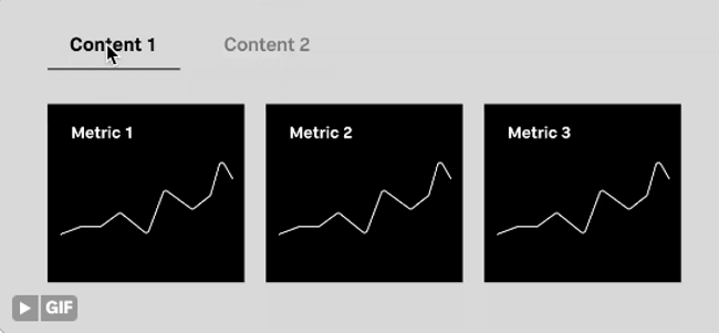
I’ve been working with a client for the past 4 years creating infographics for their printed annual report. This year, they requested that we move the static infographics into an online, interactive infographic showcasing their grantees research projects and the supporting data. For one of the infographics, I wanted to create tabs that users could select to view portions of the research summary (once it’s live I’ll update with the actual link but you can see years 2018-2021 that I did here).

As it typically goes, you aren’t the only person who wants to solve the same problem. Best thing about the Tableau #datafam is that because you likely aren’t the only one, all you need to do is ask the question and more often than not, you will get your answer. This happened the night before I was going on vacation when Samo Drole posted on Twitter (aka X, I suppose) an ask about tabs in Tableau. Specifically, he wanted to know if he could create a dashboard where a user could select a “tab” and that would change the charts in the view.
I quickly DM’ed Samo to share my process via a number of haphazard text explanations the night before my flight. However, here we are now because I’ve been meaning to write this blog post so I’m thankful for the gentle nudge! Also, I must add, you have to check out Samo’s stuff on Instagram. I always loved his work since day one years ago when we both participated in MakeoverMonday, but I’m digging his new creative work so check him out (@samo.drole).
So, here is the post to explain how to create parameter-driven tabs in Tableau that can change what is visualized using dynamic zone visibility, or DZV. I must add that one thing I love about this approach is that you can create these tabs WITHOUT DATA! I’ve used the approach a lot when I’ve needed to create buttons for parameters, but instead of bringing in a small data set to use as the source of the parameter values to make the buttons, I use this approach. So, check it out!
Step 1: Create the Tabs
I’m going to use the Superstore data for this as it is available to everyone within Tableau, but this entire approach actually doesn’t require ANY DATA!
Create a new worksheet called “Tabs”.
First, determine the number of tabs you need. Here, I will use three and for purposes of replication, they will be Metric A, B, and C Set. It’s easier if you know what you want the labels to be for organization, but it really doesn’t matter in the end.
Create a calculation for each tab (Metrics A Set, Metrics B Set, Metrics C Set). Name the calculation the name of the tab. Write 0.0 in the calculation field. Yes, you can certainly do a few inline MIN(0.0) calculations onto columns but I find that this just helps me stay organized when setting it all up.

Place the calculations that will be your tabs on columns in Tableau and be sure they are all set to a continuous measure (green pill) with the aggregation of Minimum. You can go ahead and change the mark type to Gantt (FYI, a bar works too, but I find this looks better and takes less adjustments).

Next, create a calculation called “Size” with the value of 1. We will use this to support the adjustment of the size of the Gantt bars. You can place this calculation on the size marks card on the ALL marks card so that it applied to all three marks.

Then adjust the sizing to your liking as well as the axes range. I adjusted the axes range to -0.2 to 1.2 to give space between each tab. Clean up the formatting by removing borders and grid lines. Mine looked like this:

Step 2: Create the Parameter
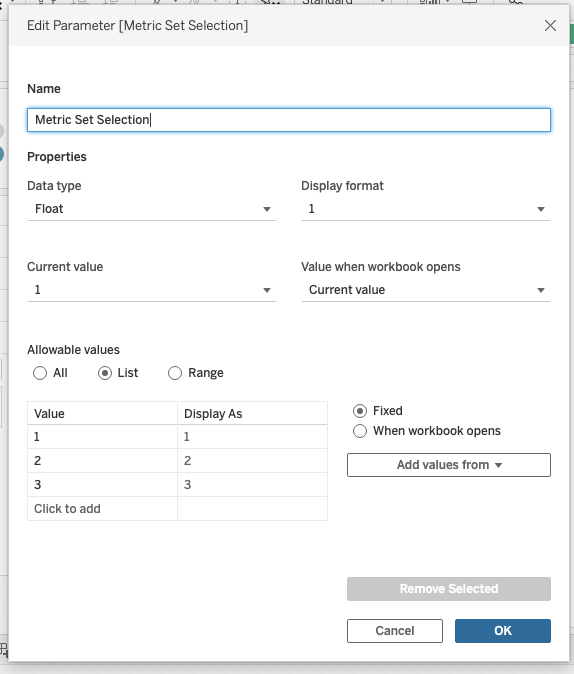
Create a parameter to drive what is shown on your dashboard. We will use this to impact both which tab is selected using color and the dynamic zone visibility. Here, I created a parameter called “Metric Set Selection” with integer values 1, 2, and 3 for my three intended zones. If you have more zones (like my client did) then just add values for the correct number.
Step 3: Create Parameter-Driven Calculations
Once the tabs are created, we can make the calculations that will determine the color of the selected tab and what shows up on the dashboard.
Back on your “Tabs” sheet, create one calculation for each value in your parameter list as follows:
[Parameter]=1
[Parameter]=2
and so on.
For my example, I had 3 calculations, one boolean for each parameter value called “Metric X Set Selected” (where X was my A, B, and C).

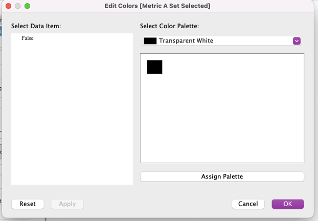
Once you have one calc for each tab, place the calc on the color shelf on the corresponding mark. Set the TRUE value to a color and the FALSE value to a transparent white. You can alternatively use white if your dashboard background is white, but if it is not, then using the transparent color is useful for banking out the non-selected tabs. You will need to add the color to your preferences file. Check out Kevin Flerlage’s post about how to go about it here. Add the calcs to each mark and set the true value to your selected color choice and false to the transparent white. You will need to adjust the parameter to each value to complete the color choices for each.
Additionally, later we will need reference values for the parameter actions so we need to add values to each tab mark. For the mark corresponding to the first value, add an inline calculation to the mark’s detail of MIN(1). For the second value, MIN(2), and. so on.
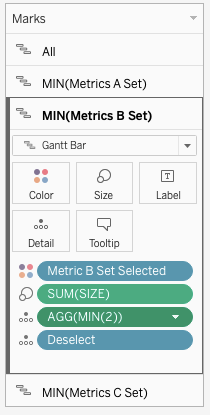
Lastly, while not required, it’s helpful to create a deselect/remove highlight feature so when someone selects a tab or tab label, the mark doesn’t get selected. Create a calc called “Deselect” that contains just 2 simple open single quotes and place that calculation on detail on each mark.
Step 4: Create the Tab Labels
Duplicate your “Tabs” sheet and rename the new sheet “Tab Labels”. Change the mark type to a shape, select a blank shape, remove the color calculation we made earlier, and clear the axis ranges. If you don’t already have a blank shape in your repository, you can check out this old post of mine that shared how to do it (FYI you can use PowerPoint or Figma to create one).
Next, label each mark as you desire. You can place your calculation on text, then edit the label to change the text. Here, I just wrote the metric set corresponding to each tab. The reason for this worksheet is so that people don’t have to select the Gantt bars since typically people are accustomed to selecting the words as the tab. So, we are working towards a common user experience.

Set the alignment to bottom center, hide the axes labels, and turn off the tooltips (unless you prefer them on then format them accordingly).
Now you have both worksheets that will drive your DZV. The next step is to build your dashboard.
Step 5: Add Containers to Your Dashboard with Worksheets
On your dashboard, you can down add both the “Tabs” and “Tab Labels” worksheets. I recommend adding a vertical container first so you can adjust the height of each worksheet (add title, Tab Labels, then Tabs, followed by a horizontal container for your worksheets).
I recommend adding each container and the worksheets to the dashboard before setting up the DVZ. If you don’t, I’ve found it difficult to add new containers once the DZV is set up. Add them all and then we will set up the parameter action that will only show one container at a time.

Next, select one container at a time and on the dashboard layout pane, select “Control visibility using value” and select the boolean calculation that corresponds to the grouping of worksheets. In my case those were the Metric X Set Selected calculations which I had used on my tab color. Repeat for each container.

Step 6: Set Up the Parameter and Deselect Action
Now you should only see one container on your dashboard and the last step is to set up the parameter action to drive the DZV and the tab selected color.
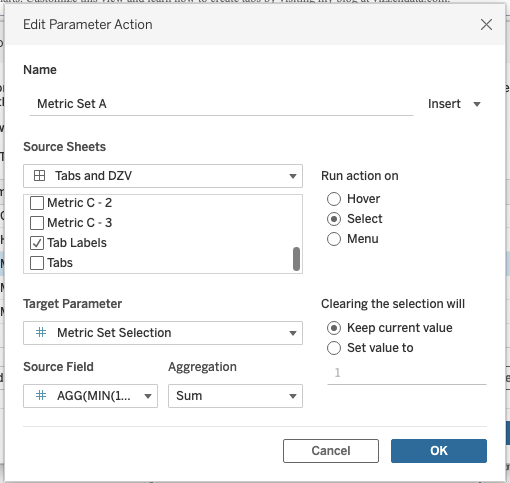
Go to Dashboard – Actions and add new Parameter Action. Create one for each parameter value corresponding to one of your containers all of which have the source sheet of your “Tab Labels” worksheet. For example, I set a parameter cation called “Metric Set A” that has the Source Sheets set to “Tab Labels”, the Target Parameter is our Metric Set Selection parameter, and the Source Field is MIN(1) which is the value we have on the details mark for the Metrics Set A mark. You will need to create one parameter action for each of your tabs (or the containers you want to show/hide based on the parameter value).
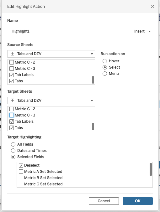
Once you have all your actions set up, you can also create the highlight action to deselect the tabs if you wish. Go to Dashboard – Actions and select Add Action – Highlight. Set the Source Sheets and Target Sheets to both the “Tabs” and “Tab Labels” sheet with the Target Highlighting to Selected Fields of “Deselect” (the calculation that is simply those two open quotes).
Now that you have your parameter actions set up using your tabs, you should be able to select a tab, which will in turn change the parameter value, which will activate the correct boolean calculation that changes the tab that is colored and the container that is shown on your dashboard!
You can now format your containers and worksheets as needed, but the tabs should work smoothly showing the worksheets within each container when chosen by the user. And there you have it – parameter-driven tabs that use dynamic zone visibility! Full workbook is downloadable here.
As always, please reach out if you have questions or comment here.
Cheers,
Lindsay

Hi Lindsay,
What if we have different container for each metrics?
For example,
metric A has 2 containers
metric B has 5 containers
metric C has 9 containers?
What should I do?
Does this method work to make a landing page too? https://vizzendata.com/2020/07/14/using-blank-transparent-shapes-for-navigation-buttons/
LikeLike
Hi Lindsay, I’ve found another use case for DVZ. It’s to make a collapsible filter while it does not take up space in the container. I know it can be done using a parameter swap, but the only downside is requiring some spaces.
I’m having trouble finishing it. Wondering if you’d be kind enough to take a look and help with this. You can definitely use my example for your blog post to help other people in the future. A lot of people think this collapsible filter idea is useful, but hard to find resources to accommodate that.
https://community.tableau.com/s/feed/0D58b0000BbKJgUCQW
LikeLike
Hi Lindsay, great post. Laid out well, explanation is clear and easy to follow.
Any tips or suggestions on how to make the tabs created using this method more “tab-like”?
Thanks
LikeLike
Why not use Text instead of Shapes for the Tab Labels sheet? Seems to work just fine.
LikeLike