

What are Navigation Buttons?
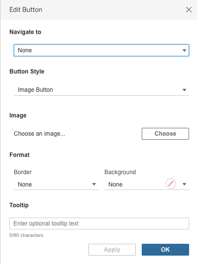
As of Tableau 2018.3, we have had the “navigation button” dashboard object to provide our users with a seamless transition from one dashboard to another without the use of the native tabs, or a dummy navigation worksheet and “go to sheet” action filter. Navigation buttons currently can be used as an image button or a text button.
Text Buttons
Text buttons are perfect for simulating a menu and provide a quick navigation solution since no custom image is needed. You have the ability to customize the colors and text of the button as well as the tooltip. There are currently some limitations in the colors you can select, but I hope that Tableau changes that so that all custom colors are accessible.
By using a filled container and setting all padding to 0, except for the bottom (set to 2), for the navigation buttons you can create the look below with an underline to draw your user’s attention to the buttons.

I find text buttons useful and typically pretty obvious for a user to use even though I don’t see them used too much in Public vizzes. One main drawback is that it’s imperative you make the text button clear that it’s a button and not just helper text. Typically, organizing the text buttons at the top of the dashboard all in a row will help to indicate that they are navigation buttons as they then resemble a menu.
Image Buttons
One of the great benefits of using an image as a button is that you can customize it to your client’s or your personal needs. I typically use Figma, Adobe XD, or PowerPoint to create my custom buttons, but this can take up precious time, especially if you have to create a lot of them.
Kevin and Ken Flerlage have a great workbook that has a direct link to a PowerPoint slide deck with a ton of created custom buttons which you can edit to your heart’s content! This can give you a leg up on your design, resulting in some time saving. Check it out here.
Below is an example of custom buttons I created using the Flerlage’s initial template. One of the challenges I have with creating custom buttons is that if you are looking to create buttons with text, you have to create a separate image button for each one. In this example, I had to create the four individual buttons to use.

So what if there was a quicker alternative that leveraged some of Tableau’s native features (such as simple images and text boxes) to reduce the number of custom buttons you had to create?
Well, sign me up! That’s what we are here to learn.
Blank/Transparent Shapes
If you aren’t sure what I mean by a “blank” button, I simply mean using a blank shape as your navigation button. Blank (or transparent) shapes have a number of versatile uses. Luke Stanke writes about a number of use cases for the blank shape. Kevin Flerlage will be sharing another blog post shortly on even more use cases!
I teach the use of transparent shapes it in my online data viz course using my SuperStore Dashboard. In the example below, the area chart has two circles for the high/low points on the chart. What you can’t tell is that actually every point has a shape on it; however, I’ve assigned all non-high or -low values to the blank/transparent shape.
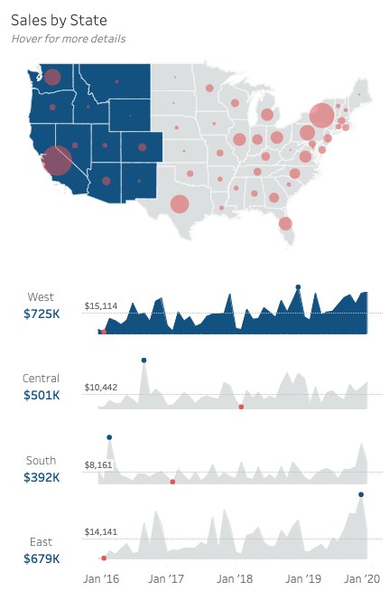
What you can see is that I’ve assigned a circle to the values I want to show on my chart and a blank shape to those I want to not show up. That blank space on the second row of my custom shapes palette, is my transparent shape.
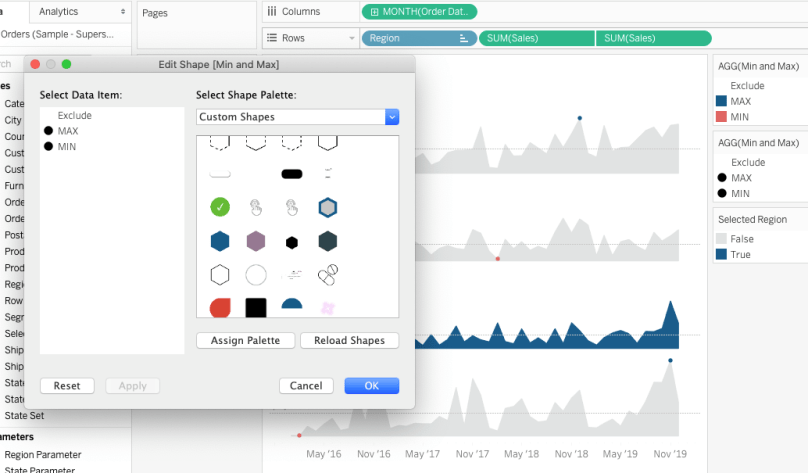
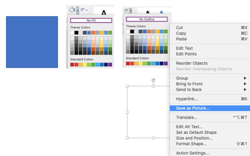
Creating a blank or transparent shape is quite simple using PowerPoint. Open PowerPoint and create a shape (any shape you want). Change the fill color to “no fill” and outline color to “no outline”. Then right click on the image and “save as picture”. Save this picture to your shapes folder in your Tableau Repository.
So now that we understand what blank/transparent shapes are and how they can be used a bit in a chart, let’s move on to how we can use them to simplify our use of custom navigation buttons.
Using Blank/Transparent Shapes as Navigation Buttons
The Tableau Community has been making custom buttons for a long time, so this isn’t new. However, Tableau only comes with ONE native button option and it’s not very effective since the arrow within it also only goes one direction.

This is just to say that custom buttons aren’t new. What I want to propose, is how to leverage a blank/transparent shape and ONE custom button to save on time and effort.
As with many things I conjure up in Tableau, they come from encountering a problem. My “problem” was that I had a client who needed to improve their current dashboard, which had been designed by another organization awhile back. The workbook had 50+ dashboard tabs that their users had to search through. Clearly, the user experience was terrible even if the data and the dashboards themselves were effective. Aside from the fact that we needed to do some data adjustments to help reduce the number of dashboards, we also wanted to make the navigation much more seamless to the user. Tabbing through dashboards is something I’ve come to dislike now that navigation buttons are so simple to implement.
For this case, the client needed to have 7 navigation buttons which would go to 7 topic area dashboards. On each of those dashboards were even more drill-downs. Without going into too much detail, it was going to take a lot of effort to create the number of custom buttons I needed, so I wondered if I could save time by using one image button, text objects in Tableau, and a blank/transparent navigation button.
We are going to use this Landing Page dashboard I created as an example. You can view and download the dashboard here.
Please note that I custom created all the images (spaceship, star icon, satellite icon, comet icon, downward arrows, etc., using both Figma and Procreate), so please be respectful and don’t reproduce or take those images to use without asking. Thanks! 😉
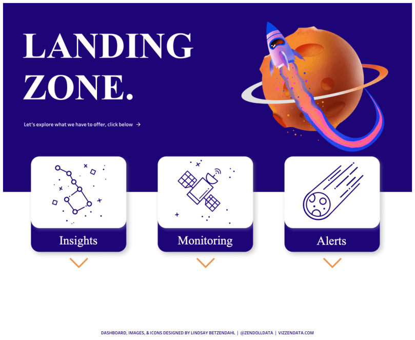
In this landing page, I have a few custom images. The top two served as my “expansion”, which gives the effect of animation even though there isn’t any. The last is the actual blank button which has no customized text on it. I snagged it from the Flerlage’s PowerPoint template as linked above.
")
")

I set up my landing page will all the images. In my example, I did go a bit overboard with the icons as well, so technically I have a few more images than needed in a regular build.
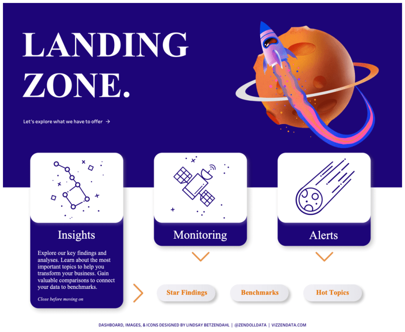
What I wanted to happen is that when someone selects the “Insights” button, the button appears to expand and then drill-down options are populated. The “tab-like” buttons are images, text objects in Tableau, and then a blank button floating over it to seal the deal and make it seem like the whole collection of images and text is one button. Additionally, the subsequent drill-down buttons are all created by using ONE blank button (example shown above), a native text box in Tableau, and then a blank/transparent navigation button floating on top. So, instead of creating 3 custom buttons, I used one and the blank/transparent navigation button. (Note that a text button could work as well, but currently there are limitations to the colors of text buttons but not text objects.)
Here’s a video of how it would look (though I realize you can’t see my pointer, which is a bit annoying), and you can find the viz on Tableau Public here. Check it out!
Limitations
As with any technique, there are limitations. One of these is that using a blank button requires floating that navigation button over your other image or text object. Floating objects may not be the best approach in your design and if you have a mobile version along with a desktop view, that can pose additional work.
Additionally, there may be a balance between when creating a custom button is actually faster or more simple than layering various dashboard objects. The best use case for this is when you need to create a number of custom text/shape buttons and can leverage Tableau’s text boxes to eliminate the need for the various custom buttons.
Also, as of the date of this post, the dashboard renders a bit slow on Tableau Public (it’s fast on desktop). This could be due to the images used, or a bug, but either way, at the moment the root cause isn’t sorted out, so it’s best to test on a server to ensure that the user experience is fast and not bogged down by the navigation buttons and images.
I hope this is useful! Feel free to reach out with questions.
Cheers,
Lindsay

Thankks great blog post
LikeLike
Hi! how to make this landing case using the dynamic visibility?
for example like in case: thank you
https://community.tableau.com/s/question/0D58b0000BOoGp9CQF/dynamic-zone-visibility-help
LikeLike