

July’s #ProjectHealthViz Data Set
July has been a jam-packed data viz month. Why? Well, if you hadn’t heard, Tableau announced on July 1st that there would be ONE feeder for the global Iron Viz competition. This meant that for the month of July many folks were heads down working on visualizations that likely have taken countless hours (like 10-20 or more) over the course of the 5 weeks until the deadline on August 4th.
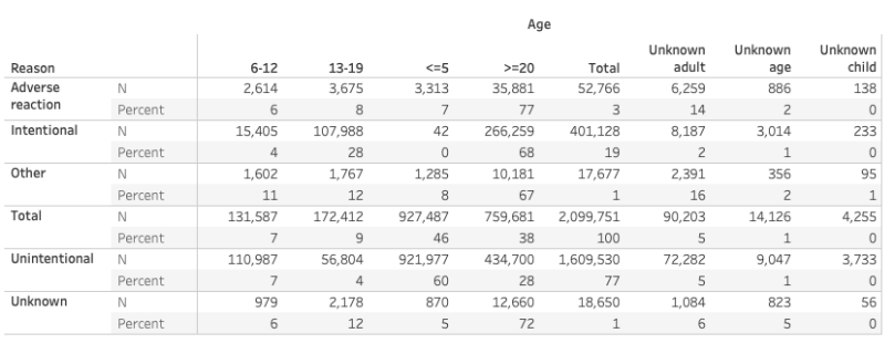
As a result, I chose a very simple data set for #ProjectHealthViz this month: a table with 2 dimensions and 2 measures.
Given a simple data set, I decided I wanted to focus on my design and keep the resulting charts simple and clear. No need to make more out of it than necessary.
But how did I create the design? How did I think through what to put where?
Finding Inspiration
It’s not as exciting as you may think… I get “inspired” from others at lot of the time. But really – this means I look for layout ideas to almost completely copy. Why? Because I find it fun to find a design that is made for one thing (an application, a website, a slide deck, a dashboard) and try to completely recreate it on my own for the data visualization purpose I have in mind.
I’m not alone in this. There are many who have shared that they find inspiration from platforms such as Dribbble, Pinterest, Instagram, and Behance. Chantilly Jaggernauth shows how she used an image from Dribble for her modern business dashboard. Robert Janezic shares in his blog post about inspiration from modern web design. Judit Bekker has shared how she finds elements to use in her dashboards from modern UI/UX design from browsing Pinterest.
Inspiration can be in the form of layout, colors, shading, shapes and buttons.
More recently, when I struggle with ideas, I check out Dribble or Instagram (particularly the account Interfacely) for layout and color ideas. For this month, I actually wanted to challenge myself to recreate a design.
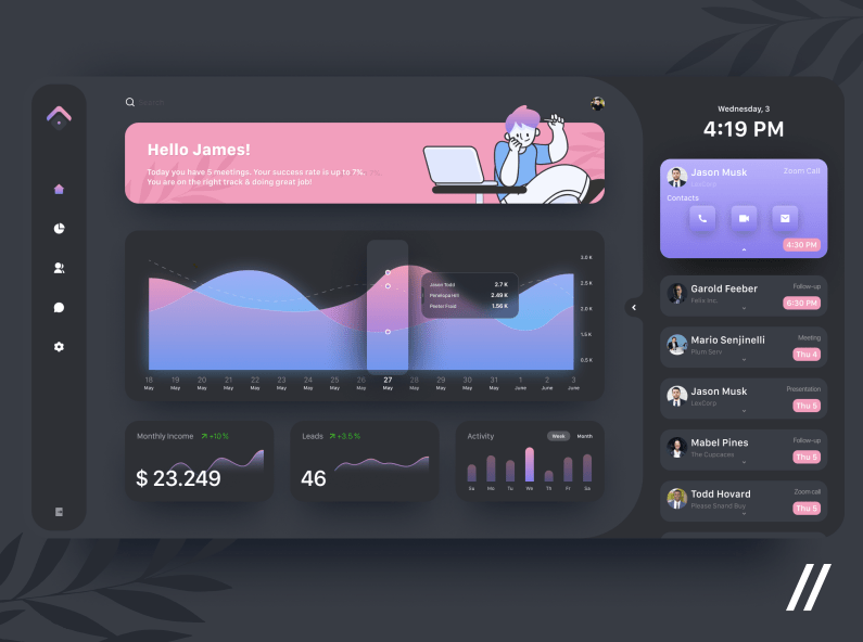
Here is my final viz below which you can interact with here.

But, let’s look at the image that I recreated so you can really see the similarities and how I used this to think through a dashboard and interactivity layout that would work for the data I had.
So now you know I didn’t come up with the design on my own, let me tell you how having a design in mind can actually help you come up with other ideas or teach you how to use Tableau. For me, by attempting to replicate something, it challenges me to figure out how I can make it happen in Tableau.
When I began to look for design ideas, I knew that I had a simple data set that really only had a few ways to visualize. I had age and exposure type. I decided that I wanted to show the percent of exposures by age in one simple bar chart and then have an interactive element where a user could select a button to filter through each of the exposure types.
When I saw the above layout, I immediately thought it would work for my idea.
- On the left side, I imagined my interactive buttons that would change my chart.
- The chart, just like in the image, would be in the middle.
- The top area (in pink) would be perfect for my title. I decided I didn’t need the bottom sections since I didn’t have any additional charts to visualize and I also wanted to create this relatively quickly (in 2-3 hours).
- Then on the right, I imagined that I could highlight, by age group, the total raw count of persons exposed based on the exposure selection.
- In the example image, there were some up and down green arrows in the bottom section. I didn’t have anything to highlight in that way, but since I like to incorporate as much as I can from a design idea, I decided I could use the idea to at least dynamically indicate with a symbol which age group had the most exposures.
So let’s break it all down.
Design Tool: Figma
I tend to use Figma, PowerPoint, and Adobe XD to create my images for my Tableau dashboards. This can include background layouts, buttons, and other shapes.
Here is what I created in Figma. I’m highlighting all the shapes just so you can see how it was put together. Once I had all the shapes, with the necessary drop shadows and gradients, I exported this as an image and imported it into Tableau.

Typically, I create the image as the same size as my dashboard so I can tile it as the base layer and then float everything else on top (often still within containers, as I did for portions of this viz).
Parameter Actions and Custom Buttons
Next, I created a simple bar chart with my ages and percent of all exposures. In order to create the button filter, I created a parameter using the exposure type dimension. Using that parameter I created a boolean (T/F) calculation to ring true when the parameter value equals the exposure value.

I put the parameter calculation on the filter and set it to True.
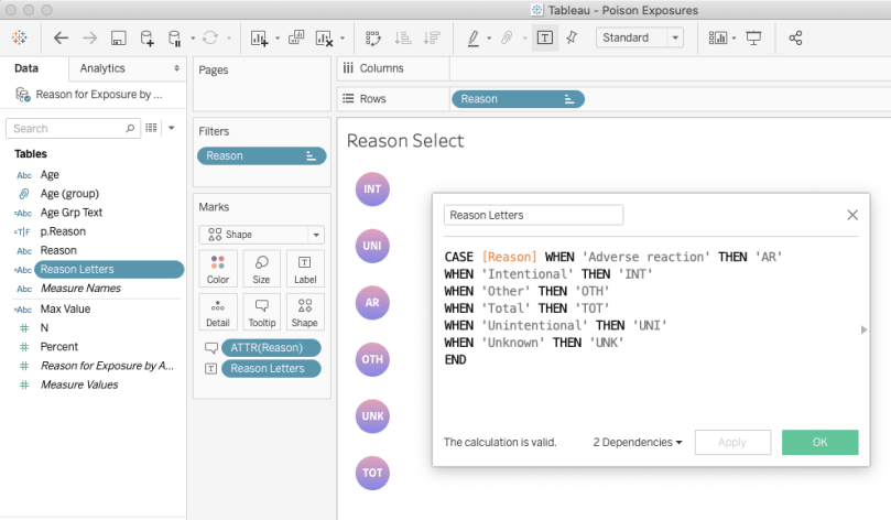
Next, I created another worksheet with just the Reason dimension on rows and changed it to a shape. I created a custom simple circle shape with a gradient in PowerPoint and added that to my Tableau Repository shape files. Then I created a calculation to only show the first two/three letters of the Reason type. The full name is shown in the tooltip. I used a CASE/WHEN statement because I wanted one value to be a different than the rest. If I just wanted the first three letters I would have used the LEFT() calculation.
After placing both of these worksheets on my dashboard, I can set up the parameter action so that the user can filter the chart by selecting the button. To do this, select “Dashboard” from the top menu and then “Actions…”. Select “Add Action” and then “Change Parameter”. From here we can hook up our two sheets. The Source Sheet is the sheet with the buttons and the target parameter is our Reason Parameter. The field is Reason (the dimension we are going to be filtering by). Just a note, an action filter would do the same thing in this particular example. There isn’t really a reason I chose to use a Parameter Action instead of an Action Filter.

Indicator Icons
I find indicator icons (some visual cue to “look here, this is important or different”) visually very effective. In my viz, I used a “fish eye” icon, to indicate which value is the highest out of all the values in the view. While you may wonder, “Well why do you need that if the values are present and someone can see which value is highest/lowest?” This is true – someone can look at all the values and determine by reading and interpreting text, the highest value. However, our brains are much faster at processing non-text visuals than text-based visuals. This means we can interpret the single colored icon faster than we can read text.


This trick is pretty simple.
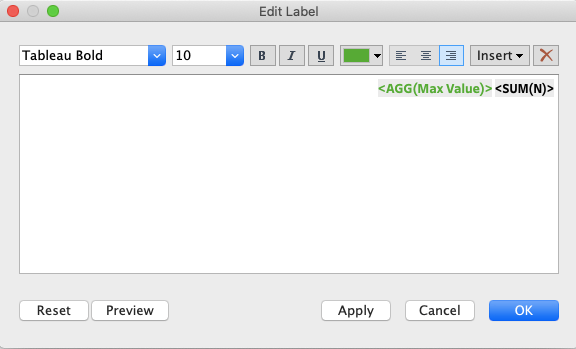
For this part, I added my Age dimension to rows and my Number (of exposures) to text. Then I created a simple boolean statement using the WINDOWS_MAX() table calculation to only show true when the value equals the max value in the window. When it’s not true then I don’t want any text to show up, so we can use the single quotations (or double if you prefer those) to show no text.
The Max Value calculation is: IF WINDOW_MAX(SUM([N]))=SUM([N]) THEN ‘◉’ ELSE ” END
On my Mac, I can pull up any number of icons using my Emoji and Symbols keyboard selector, which I have on my main top menu of my computer. From here, I can just copy/paste the icon I’d like to use. You can also find other symbols (or unicode characters) from websites. Or feel free to copy the one above from this post!

Next, I add the new Max Value calculation to my text.
And there you have it! An icon that will only show up when the value is the maximum value in the view.
Check out the full viz by clicking on the link below the image. I hope you enjoyed it!
Cheers, Lindsay

