

The Gap from Data to Visualization
“Data are just summaries of thousands of stories—tell a few of those stories to help make the data meaningful” -Chip and Dan Heath, authors of Make to Stick and Switch
I don’t think I’m alone here in saying that there are plenty of times where I am handed a data set and with clapping hands told “go, go, go!” Hurry up and visualize those numbers!
In a fury of exploration, calculations, design, and development, I work tirelessly to create a visual that accurately and effectively communicates the information. Additionally, I strive to ensure the visual and the dashboards are pleasing, engaging, and easy to interact with.
There have been times where there was a gap, for me, between the data and the visualization. Specifically, an emotional gap. A disconnect between the data, the people and the stories they had to create the data, and the visualization I created.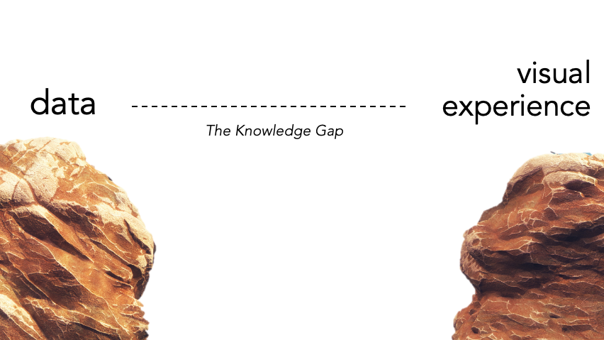
Once, I worked with a hospital system to create an operation room efficiency dashboard—analyzing when surgeries were scheduled, when they actually occurred, how and why they were delayed, etc. Perhaps because the focus was on “operating rooms” it was easy to feel disconnected. In fact, I didn’t really stop to consider how the dashboard was going to have an impact on actual people. While I think there are problems with this leap from data to visualization, I also realize this is often a reality. Additionally, sometimes it’s important to protect ourselves (and our minds) from the details within the data. Data about people can trigger our own memories or emotions that perhaps would not be beneficial and so it’s helpful, at times, to maintain that emotional gap.
However, there have been other data sets, and client projects, that have felt like a plethora of stories has been laid at my feet. So many personal stories. Stories that I know I need to aggregate and analyze, but still are there peeking out beneath the numbers.
One such project involved a patient journey at the end of the analytical flow of dashboards. As with many healthcare dashboards, the final drill-down is at the patient level. Because the data involved cancer patients, some whom had lived and others who died, and their treatments, I felt it was important to use common language to write out information about the patients at the top of the patient journey tab.
Specifically, a statement similar to this (note this is just a fictional example):
“MaryAnn Jones is a 37 year-old female who was diagnosed on 1/5/2015 with advanced stage breast cancer in her right breast. She is currently alive and receiving chemotherapy.”
I used the demographic data to create a sentence that would be reflective of some key elements in the patient’s data, but more importantly, would provide a connection to the person reviewing the information. Here, the data becomes a person–a real person that now you know something about.
When I have the opportunity to visualize data personally (not for work clients), I typically try to tell an emotional story—something that people either can resonate with or feel empathy for those that it does resonate with. But in order to tell someone else’s story mindfully, and with respect, you can’t assume you know what it’s like to be in their shoes.

Seeking Context
The data set for November’s #ProjectHealthViz was on mortality and incident rates for prostate cancer in the U.S. with details by state and year. Given the unfortunate rise in cancer worldwide, many of us know someone who has had cancer or certainly know someone who has lost someone to cancer. So while cancer and cancer rates is a pretty common topic (meaning we are all aware of it’s presence and impact), many of us are not intimately aware of the side-effects of cancer treatments.
A friend of mine approached me last year after hearing what November’s topic was and asked for assistance. I listened, on edge–what help did she need and why? To my surprise, she shared a personal story about her husband. To be honest, I was aware that survival rates were high and treatments were “relatively” easy, but that was the end of my assumptions. I realized quickly as our conversation progressed, that I had never walked in her shoes, nor really knew much about prostate cancer or the treatment side effects.
What I learned in our conversation was that studies have shown that around 60% of men experience impotence at least 18 months after surgery and 40% experienced urinary leaking. Now these were things not being discussed by men who had surgery according to my friend, and she wanted to help others understand that there are other options aside from surgery.
While she had a perspective she wanted to convey based on personal experience, I was left with a new perspective… one which I hadn’t really considered in such depth before: how do you truly bridge the gap from data to data visualization without consulting those who have stories within that data?
Josh Smith mentioned that during his Iron Viz exploration and research on the agricultural feeder that he interviewed and consulted with various farmers to gain insights into the data. He wanted to understand the stories that made the data–to listen to the narratives that the numbers weren’t able to tell alone.
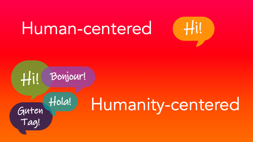
Humanity-Centered Visualizations
As a result of this conversation, I decided that I wanted to explore the “unseen” part of the data–the side-effects, the feelings of shame, the treatment alternatives. In order to do this, I had to consider the stories of many and determine how to share this information from a place of empathy, understanding, and acceptance.
In building the viz, I decided to juxtapose the declining mortality and incident rates (a good thing and openly discussed) and the side-effects (not a good thing and not talked about) with the artistic idea of the perfect man. I decided to take this approach in an attempt to share the “other side” of the data and bring to light the untold stories of many men by providing an accepting space through a visual.

(As an aside, you can listen to a talk I gave about how to create the radial tab polygon chart in this visualization here and download the workbook here and view the powerpoint here.)
Checking Perceptions
Because we are often intimately involved in our own visual designs, it’s not uncommon for us to assume that we are conveying information effectively and with a clear intention. However, without checking in with others on how they perceive our visualization, we may accidentally communicate a message we did not intend to share.
When I created this “The Vitruvian Man” visualization, I sent an early draft to the same friend I mentioned earlier to “check in” on my message. I’m glad I did as she noticed that some of my language may actually result in the opposite message than I wanted to share. This was eye-opening because when I thought I was being sensitive to the subject, I missed a huge aspect of the viz that wasn’t exactly clear.
After making necessary adjustments, I sent it back to her to double check that how I perceived my visual was the same as how she (and her husband) perceived it. Luckily, with the edits, they both did.
Mindful Vizzing
At the end of the day, healthcare visuals are aggregations of people and their stories. Josh Smith wrote a compelling fictional narrative about exactly this: discovering stories in the data and feeling empathy for them. I highly recommend you read it.
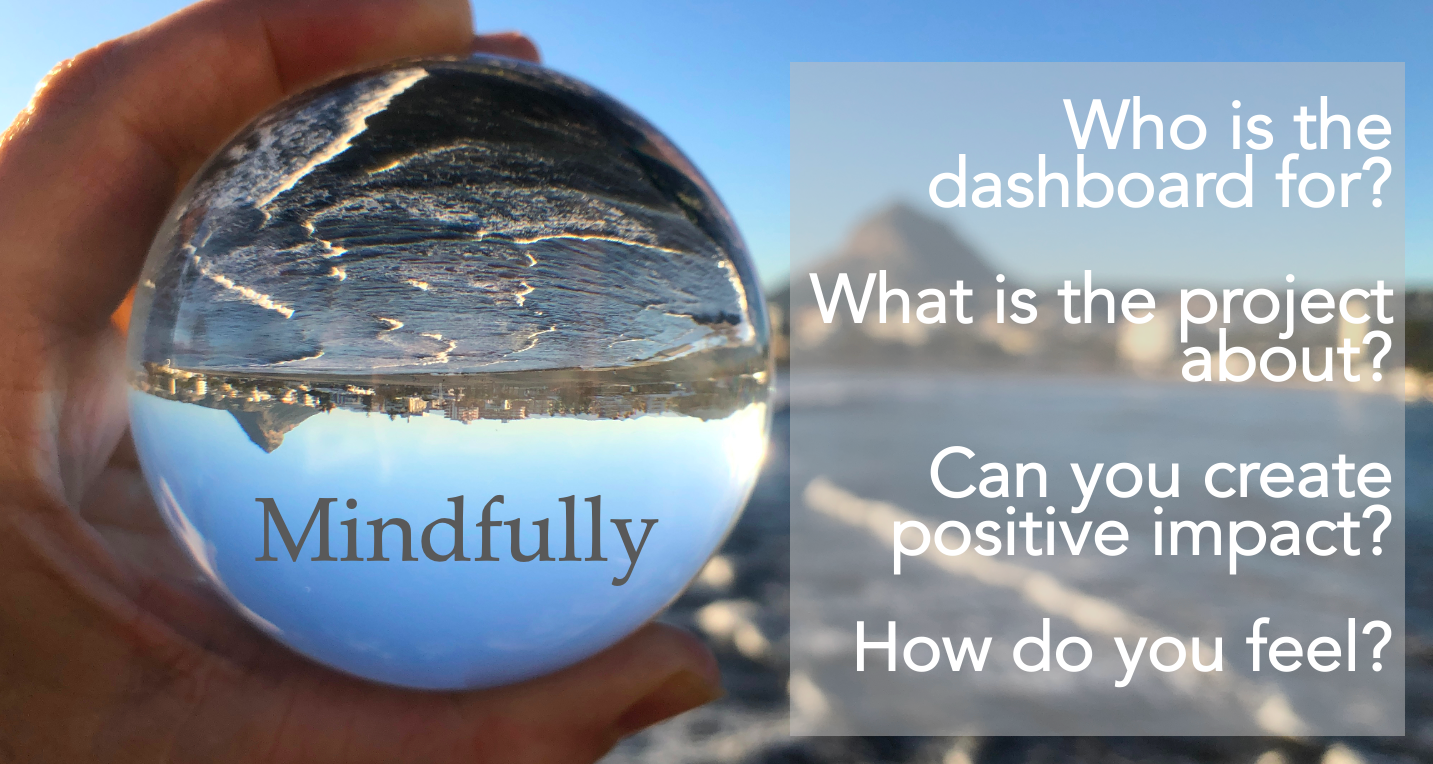
Mindful vizzing means that you attempt, as best as you can, to do the following:
- Consult with those who may know the data better than you or who may have personal stories similar to those in the data. Do due diligence not to miss something very significant in your design and story.
- Check with someone you trust that your intentions are being conveyed exactly as you wish. Have someone else tell you how the viz makes them feel. How does it make you feel?
- Attempt to tell the stories within the data, even if you cannot tell them all, try to tell one, and if you can’t tell one, the I recommend at least personally taking a moment to thank the people behind the data for their stories in whatever way that means to you
- Find a way to connect the data to humanity – how can your visual improve the world? What stories will it tell once you release it into the wild? Will it tell the stories you want it to tell?
All-in-all be considerate and if your viz is about a sensitive topic make every attempt to ensure that at the very least you have done no harm. While I can’t promise to have all the right answers, I am willing as best as I can to provide some “reality-checking” if you need. Otherwise, find someone you trust to provide feedback on your viz as you work on it to provide that perception check.
Community Submissions for Movember (November)
There were 15 submissions (including mine) for November. I’m so happy that so many shared their stories about prostate cancer. Many individuals mentioned that they had a loved one who had had prostate cancer and resonated with the stories. Thank you everyone for submitting and participating!
You can find the links to all the vizzes via the submission tracker.
Cheers, Lindsay


