

Autism Spectrum Disorder
October’s #ProjectHealthViz data was on Autism Spectrum Disorder (ASD). ASD is a complicated disorder that presents symptoms in various ways. This means that not all people with ASD present the same symptoms or even the same severity of symptoms. Technically speaking, ASD is a developmental disorder that affects communication and behavior. While ASD can be diagnosed at any age symptoms generally become apparent in the first two years of life. Research also suggests that early intervention can help young children learn to manage their symptoms and gain skills needed to navigate social situations, which are can be very challenging and overwhelming.
When I worked as a behavioral health clinician, I worked with a number of youth on the spectrum. Some had mild ASD, or what was called Pervasive Developmental Disorder in old version of the DSM (Diagnostic and Statistical Manual of Mental Disorders), and others had quite severe autism with limited ability to communicate and little control over impulsive behaviors.
One thing I learned was that these kids were just like any other kid – they each had their differences and perhaps some similarities. It just took time to learn their personalities and needs just like anyone else. But what I also learned was how much I thought I knew, that I didn’t know about these kids.
If you are reading this, you know that #ProjectHealthViz is about visualizing data and stretching your skills, but also about sharing health stories and awareness. When I found data on Autism, I knew this was a great topic. It’s been more mainstream in the sense that most have heard of the disorder, but that doesn’t mean people understand it or know the facts.
Thank you to all of the contributors this month! Check out the amazing vizzes below and go to the project tracker to access the links to each.
My Approach to the Viz
I was initially inspired by the layout in Luke Stanke’s and Spencer Baucke’s “Trump” viz. What actually stood out was the amount of padding on the sides (effectively making margins like you would see on a page) and the tiny chart under the title. I also decided I didn’t want the viz too large (more like a sheet a paper), which meant that in order to get in all the data I wanted to show, I needed to get creative with space.
Well, I didn’t have to think hard on that one! I used one of my favorite techniques – you guessed it – the collapsible container. You can see in the images below that I set up the viz with three non-interactive charts and buttons below them. Each chart is composed on the real data, but I have a floating blank container over them. I wanted to give the feel of “this is what you will explore if you click on the button”. I also realize that sometimes people don’t read the text at the very bottom of a viz, so I decided to start the viz with the text. Yes, people may still not read, but I thought it may encourage reading before digging into the viz.
Upon clicking any of the buttons the chart will appear with the supporting text.


Using Containers
I’d admit, it took me a LONG time to love containers, but now you won’t find me using Tiled on purpose. I always bring out a horizontal or vertical container as they give me a lot more flexibility in my positioning and spacing of my visual elements. Just take a look at a small portion of my layout hierarchy.
I put the buttons (even though they are floating and I could have just lined them up using the X/Y positioning) into a horizontal container. This allowed me to just select “distribute evenly” and they are all the exact same width. Obviously, in order to use collapsible containers, you (duh) need to use a container.
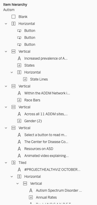
I’m going to save my explanations on how to use containers for another blog post, but know that they are highly useful and once you use them, you probably won’t revert back to using Tiled.
Level of Detail
In my Autism viz, for the racial section, I had a trellis section comprised of bar charts. Each section was a state. Within the bar chart, I wanted any race that had a higher rate than Whites to be highlighted. Because the rates varied for each of these across all the states, I couldn’t just tell Tableau to highlight the bar with the largest value.
I should mention, the reason for this decision is that ASD is more prevalence among whites than other racial or ethnic groups nationwide. However, I noticed that in this sample data, there were some instances where this wasn’t the case and I wanted to highlight this.
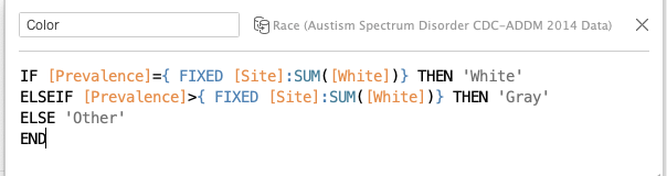
First I separated out the prevalence rate for White youth using this calc: IF [Race]=’White Prevalence’ THEN [Prevalence] END
Then I used that [White] calculation into this LOD below. This says ‘if the prevalence rate equals the fixed value for [White] for the site then that is the White Prevalence rate and color that white, if the rate is greater than the fixed prevalence rate for [White] then let’s make that gray to stand out. Everything else is ‘Other’ – or below.
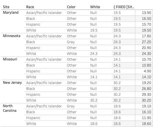
I always like to see how my LODs function as it helps in learning. Here is a table with the parts of the calculation so you can see how it functions.
Below, the column with the field I named “White” shows the value for when the Race=White and null everywhere else. The FIXED portion of my LOD populates the value for ‘White’ for all rows for each site. You can see for Maryland that the value for White is 19.5 and in the column to the right of it, 19.5 populates in all rows.
The final LOD calculation then looks at the actual prevalence for each race and compares to the site’s prevalence rate for white youth, which you can see in the color labeled “Color”.
The final part with this LOD looks like this:
B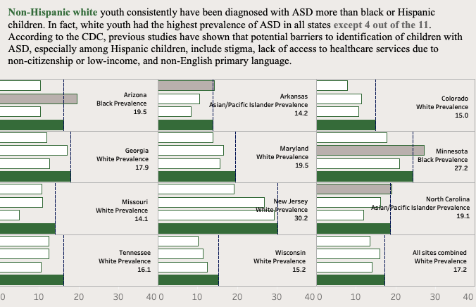
Be sure to check out all of the other amazing community submissions from this month!
Community Submissions
Let me quickly share a snip-it or two about what I enjoy from each of these vizzes this month and one suggestion.
Ghafar Shah – I really love how Ghafar stuck to the 60-30-10 color rule. He uses black for text, labels, and some marks, then gray as a secondary color, and blue as an accent. However, I’m guessing the blue is more prominent than the gray, but still, the concept holds. He also uses a lot of nice spacing between charts. Giving charts room to breathe is very important. I do wonder about the text size. At first I thought the larger text was refreshing, but then I realized I had to scroll both up and down and left and right. I wonder if a slightly smaller text would allow for a dashboard that was also slightly smaller with the same impact.
Michelle Frayman – Michelle also wonderfully used one main color – I think this works well with the data and the visual. Her main chart are are prominent and definitely draw you in. Her viz is very consistent. Elements flow together and fit. Nothing feels out of place. I like the two buttons at the top to learn about ASD, though because one is a hover and one is a “click” I would recommend something to tell me what to do with each. I do think some additional context/help is needed for some of the visuals. Initially the bar chart wasn’t entirely clear. I assume the blue (top) is males and the white (bottom) is females, but nothing tells me that is correct. There aren’t tooltips to explain it either.
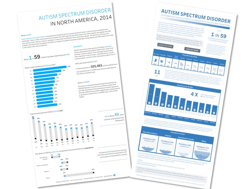
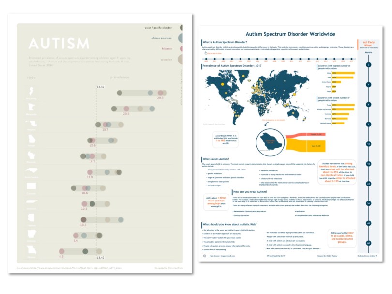
Christian Felix – I’m a big fan of people who can create visuals that can tell a great story with a minimalist flair. Christian’s viz has a muted color palette and uses one main chart with interactivity. I love his clever use of the circles at the top right for sorting the chart. My only suggestion/comment is that I question the use of the state shape. I’m not sure without geographical placement (meaning using a map) that the state shapes are necessary. To be honest, from afar, Colorado and Wyoming look similar. So the shape doesn’t really add much. Plus for those outside of the US, the shape as a header may be very difficult to interpret. A nice text header in a good font would do the trick too and still go with the minimalist theme.
Riddhi Thakkar – For afar you can really appreciate the white space Riddhi used in her viz. I like the dots along the right side which provide information about Autism at various ages. The two bar charts showing the highest and lowest number of people with Autism is interesting, but I wonder if the same countries would be in those groups if the metric was normalized to a rate per 100,000 instead of a raw count. The year selection at top I find a bit difficult. I don’t have a desire to click on every year and if the goal is to see a measure over time, then I’d rather see a line chart. I’d suggest fixing the view to the latest year and then adding a viz-in-tooltip with the trend in the hover for each country.
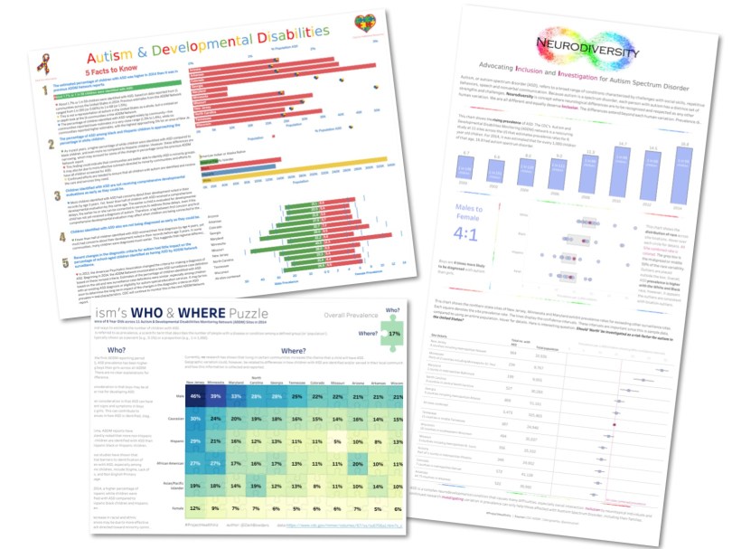
Luigi Cicciari – I love a good tooltip. Let’s be honest, they can be overlooked, but never should be. “Dirty” tooltips are a pet peeve of mine. However, Luigi made sure to customize all his tooltips with color, alignment, font size, etc. He even has a viz-in-tooltip in one of the charts. I also like the simple bar charts. However, I find the dual axis with the heart icons a bit challenging to read. I would suggest using two bar charts side-by-side instead. Additionally, I would add a title to each of the three charts. Even though the axis title gives some indication of what the chart is about, a clear title can do wonders.
Zach Bowders – I like the simplicity of Zach’s viz. The heatmap/highlight table is effective in showing the variation in prevalence between states and population subtypes, such as gender. The subtle puzzle piece background isn’t overwhelming or distracting, so while I typically wouldn’t recommend adding this sort of flair, Zach has done it in a way that doesn’t distract from the actual values we are trying to compare. My only suggestion is to fix the top right explanatory puzzle piece and swap the headers so that “Who” is on the left and “Where” is on the top, as that is how the visual below is actually constructed.
Ann Cutrell – I really like the story that Ann chose to tell in her visualization – one about inclusion and further investigation of ASD. Ann used a gentle muted color palette, which I think is calming and allows for the data to stand out a bit more. I’m a huge fan of the dot strip plot with the floating interquartile range – something I actually had helped Ann consider when giving her initial feedback. It really allows for the viewer to see outliers, but also see where the majority of marks lie. By adding in the total (in magenta), it becomes clear how the total rate is impacted by outliers. The bottom section is similar to the dot strip plot, but instead uses the confidence intervals for the bar range and the point (square) is the value. I think these plots are fantastic. Because I had already given Ann feedback, I don’t have much left. I would suggest, however, to make the font bold or darker on the top header for the states. The font is tiny and could be difficult for some to read.
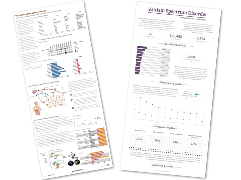
Young Song – Young’s vizzes have a style all his own. They are always packed full of interesting information that often stems from his incredible knowledge of microbiology. Without a doubt, you will learn something from reviewing his vizzes. I have two minor comments for this viz: 1) I’d make the title a bit bigger. In the thumbnail below, you can really see how small it looks. It would be great if it drew you in a bit more so the whole topic was clear. 2) I like that he used gray a lot at the top of the viz. Color really wasn’t necessary in the small multiple chart for race/ethnicity. That said, I’d continue with the same concept for gender since color isn’t needed their either and the male/female colors don’t hook up with any other chart in the viz. In fact, I enjoy that the color is at the bottom showing the variation between healthy and ASD. I may suggest using those colors higher up. So perhaps the title should be in that same orange, or all the charts at the top be the color orange since they are related to ASD. However, if Young were to do that, then I may reconsider that bright orange, but connecting the colors would be nice.
Meera Umasankar – Meera has really developed a wonderful style for herself as well. I love her use of headers, separation elements, white space, her 100% bars that have one color plus white and a border, and her simple color palettes. My only suggestion is regarding the waffle chart. I realize sometimes people want to use different charts simply to try them out. However, because the values are all so low, the dots don’t show much difference so I’m really left to read the value label anyhow to make any meaningful interpretation. So while I like them, I just don’t think they do too much. A dot strip plot may show this a bit better or even just a bar chart.
Thanks to everyone who participated this month and shared their visual on an important topic.
Cheers,
Lindsay
