

Small but Mighty
A huge component about #ProjectHealthViz is bringing about awareness and spreading insights about health data that otherwise doesn’t rise to the mainstream media. That can mean that there are times I feel like I’m banging against a door that I know will never open. Or I realize the group of people who are participating are only a few fish in a huge pond.
But that doesn’t stop me. During this quarantine life, my husband and I have tried our best to wind down after out stressful days of working and attempting to be teachers and parents all at once by relaxing in bed for a few minutes and watching something on TV. We don’t watch a lot of TV, so mindless stuff is fine for a few minutes.
“If you think you are too small to make a difference, try sleeping with a mosquito.” – The Dalai Lama
For whatever reason, Naked and Afraid is often on around 9 or 9:30 when we are ready to relax. Once thing I discovered quickly on, is that I wouldn’t survive much more than a day or two due to two factors: the cold nights and the relentless little bugs. It wouldn’t be the lack of food or the strenuous days. It would be the little bugs. Those small details can break someone. As the Dalai Lama said, “If you think you are too small to make a difference, try sleeping with a mosquito.”
So why not try to make a difference with each viz? It’s certainly better than not trying. I’ll keep being that mosquito, trying to make a difference with the details.
Details Matter
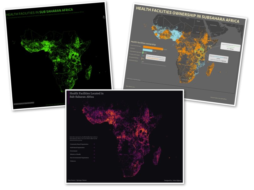
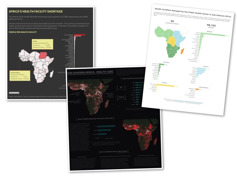
The data set for December’s #ProjectHealthViz was a highly detailed list of Sub-Saharan healthcare facilities provide by an article on Nature.com. The data included details such as country, city, facility name and location, and ownership. The list included over 98,000 health facility locations. Without context, that felt like a lot of facilities. But given other information I was aware of (plus working in healthcare for 15 years), I knew that this value did not equate to amazing access to care or nearby health services to the people in Africa.
My current boss, during our data viz trainings, always teaches the students to consider the question “compared to what?” A number floating in space has no importance or value until it’s compared to something. If I tell you that 200 people in my town contracted Lyme disease this past year, what do you think? Well, okay, is that a lot or a little? How would you know? What other details do you need? The overall population of my town would certainly help. If the town is only 500 people, then 200 people is a lot! However, if the town has a population of 1 million, then 200 people is a small fraction.
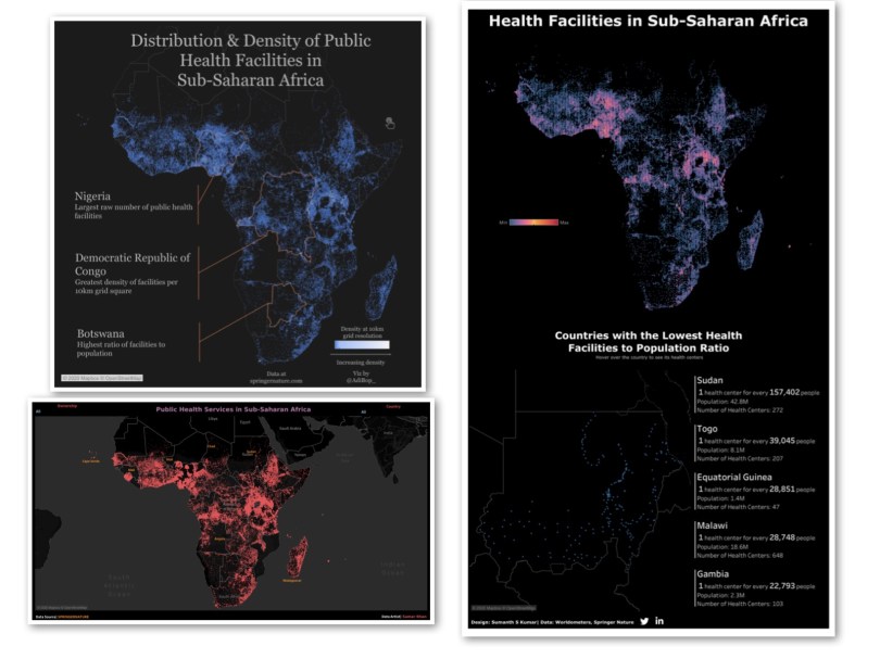
I mention this because at first blush, the Sub-Saharan health facility data set was dense. When visualized in Tableau, the resulting map was saturated. That is partly because Africa.. is.. big. Distance can easily become obscured. What appears to be many dots on top of each other really shows health clinics miles apart from each other. This translates to people who cannot get quick access to health services. There may not be a hospital for over 100 miles and, trust me, there no urgent care around the block.
No Really. Details Matter.
So, when I attempted to visualize the data set, I did what many did – I plotted the coordinates on the map and looked at this bright glowing map of Africa. Ah, yes, healthcare is wonderful.
Well, everyone knows that is not the reality. So, I couldn’t stop there. What were the details? How can I find out more? There has to be more.
With any data set, we need to explore the data. This often means creating tables, attempting various calculations, trying various graphs and charts to see what relationships emerge, and filtering and digging to see what analyses are valuable and actionable. That is what many of us do day-to-day.
While there is nothing inherently wrong in visualizing all of the data (many submissions did – and they were beautifully done!), I knew I wanted to find some specific story within the data. It’s usually my goal to learn something that will change my perspective on life.
Since the data involved coordinates and locations, I knew I wanted to utilize a map, but not just any map. I wanted to begin to learn to use Mapbox. So my exploration of the data was initially a little self-fulfilling as I searched for a country near the coast at first so that I could use some techniques to make a pretty ocean. (Note, that if you want to learn Mapbox, Jonni Walker has a great overview video you can check out. He initially helped me learn a few new skills to enhance this viz dramatically.)
However, it was this exploration that led me to the details in Liberia, a small coastal country. (PS I didn’t end up using any ocean techniques as clearly the data led me to a more important exploration than just making a pretty map.). It was here, in the data, that I discovered details I didn’t expect to find, but I’m so glad I did.
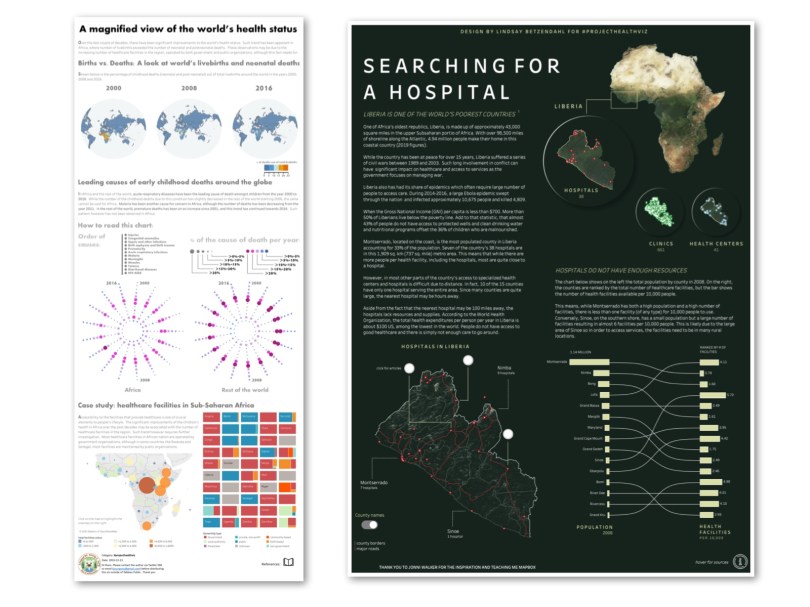
Searching for a Hospital
Once I decided I would focus on the country of Liberia (a country that, to be honest, I didn’t know too much about), I started to put the country into a context that I could relate to. So I looked up some simple details: the population, GDP, and the area, in square miles. I wanted this information to get a sense of how accessible health facilities were for people in the country.
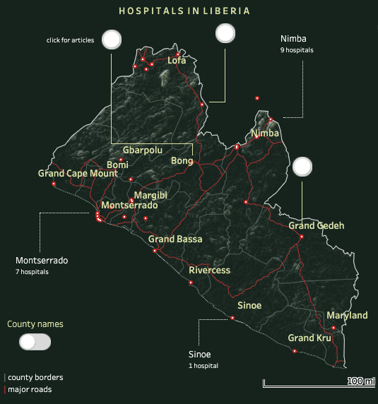
I discovered that Liberia is about the size of Louisiana, both in population and area, yet while Louisiana has over 200 hospitals, Liberia only has 38. That was startling. That means fewer facilities per person as well as a longer distance to travel to a hospital.
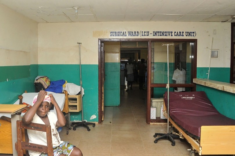
Sometimes the best way to really understand the data is so “see” it. So the next thing I did was look up the names of actual hospitals that were identified in the data set. I found some news articles and images of these facilities. They did not look like hospitals I’ve been in. This was eye opening. Now I had a story that I wanted to tell: Liberia had few hospitals available to its citizens and many of them lacked funding, resources, and supplies.
With the goal to share information about hospitals in Liberia, I was able to focus on plotting the location of health facilities in such a way that you could see their distance. In Mapbox, I created a dark map with main roads and county borders. This makes it clear that some counties only have one hospital, while others have a few. I added in some buttons to direct viewers to some of the articles about specific data points (hospitals).
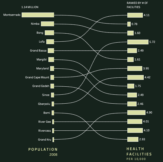
Lastly, I added a chart to show the population of each county in Liberia, the total number of health facilities (hospitals, clinics, and health centers), and the facilities per 10,000 people (a standard rate of comparison to show access).
The viz may be simple, but the message was powerful. There were people impacted by this data. Among the 98,000 records in the data set were individual stories. By no means does this mean that you need to tell everyone’s story. That’s impossible. Also, this isn’t to say that those who plotted all the locations on the continent of Africa didn’t do the data justice. That’s not true either.
My point is that in healthcare, we are often faced with data that directly will impact people. The decisions people make on the dashboards I create, inevitably are used in healthcare decisions and healthcare is about people’s health.
So it’s important, every now and again, to consider that a data point is a person. Even in this case, when the data was location information, still is about people – the people who access (or cannot access) these facilities.
Remember, the story is in the details, and the details are within the data, if you are willing to go exploring through such narratives.
Community Submissions
As always, thank you to the people who submitted their vizzes for December 2019. They each told a part of this story and I’m appreciative for each one.


If you want to get involved with #ProjectHealthViz, you can visit the page with details and use the submission tracker to submit your viz!
Cheers!
Lindsay
