

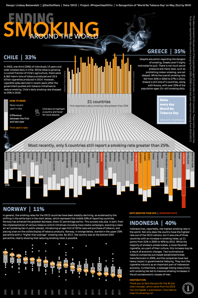
Ending Smoking Around the World Viz
May’s ProjectHealthViz data set was from the OECD on tobacco consumption to bring awareness to smoking habits from many countries around the world. May 31st, according to the World Health Organization, is World No Tobacco Day.
I was inspired by Sam Parsons’ Iron Viz entry on US agriculture to create a chart that starts with bars showing the starting rates of tobacco use for each country and ends with a chart that shows the most recently recorded rate along with the difference, or improvement, from the first year. I thought this would be a dramatic display of the data and feel like a “no smoking” infographic as the bars resembled a cigarette.
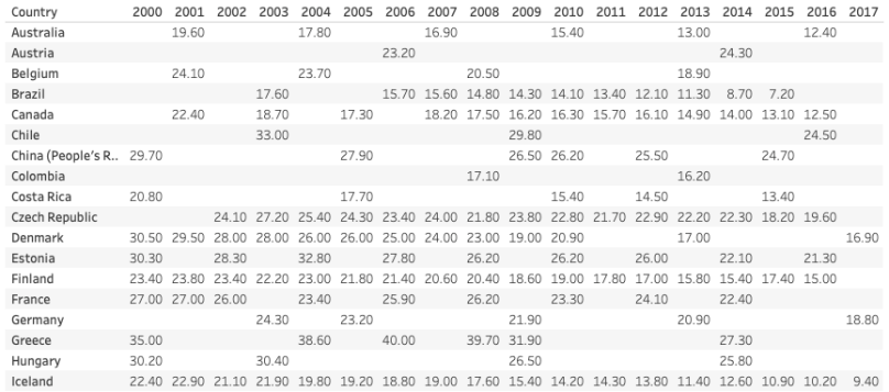
The challenge was that not every country reported their rates on the same year. This meant that I needed to create a level of detail (LOD) calculation that would return the minimum and maximum year for each country and compute a difference even if those years were not the same across countries.
The Data
Here is what the data looked like… Lots of holes. What I wanted, was a calculation that for Australia, for example, would compare the rate from 2001 to 2016, but for Austria would compare the rate for 2006 to 2014. The result would ultimately be the net difference for each country, regardless of the years they reported.
Level of Detail
Level of detail expressions, or LODs, are extremely powerful methods of aggregating your data at higher or lower levels of detail than what is displayed on your chart. LODs took me awhile to really wrap my brain around, but once you understand how they work, they can transform your calculation power!
LODs have their own syntax in Tableau, which starts out with a curly bracket ‘{‘ followed by one of three expressions which determine how your LOD will function: FIXED, INCLUDE, or EXCLUDE. Next you add in zero or more dimensions that you want to be fixed, included, or excluded from your calculation followed by a colon. The second half of the calculation requires an aggregated measure, such as SUM(Value) and the final closing curly bracket.
Here are a few great resources to get more information on LOD calculations: Ryan Sleeper, Tableau, The Data School (fixed), The Data School (include/exclude), Andy Kriebel
{FIXED : MAX(Year)} – By fixing the aggregation to no dimension, the calculation is called “table scoped” and the aggregation takes into account the entire table. You can see below that this calculation will give me 2017 for all countries for all years because within the ENTIRE TABLE 2017 is the maximum year.
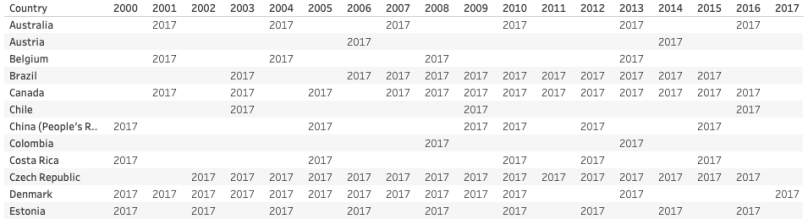
{FIXED [Country]: MAX(Year)} – If I add in a dimension, such as Country, to the LOD calculation, now the computation will only look at the country and no other dimension in the table to calculate the maximum year. This is getting me closer to what I want.
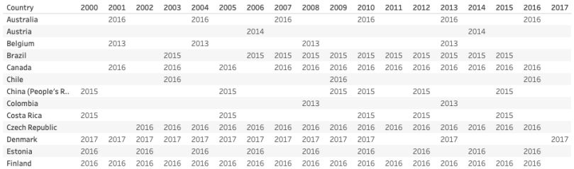
When a create a minimum year in the same format, I will get the minimum year for each country: {FIXED [Country]: MIN(Year)}
So now we can see how the LOD is working, but what I really needed was the rate to populate so that I could calculate the difference and show that visually.
LODs and Logic Statements
In order to have value for when something is true only, you can use an IF/THEN statement, or an IIF if that method applies. Here, I wanted the statement if it is the maximum year reported for a country, then I want the smoking rate for that year. If it’s not the max year, I don’t want anything. That calculation looks like this:
Max Year Rate
IF {Fixed [Country]: MAX([Year])}=[Year] THEN [Percent of Population (15+) Who Are Daily Smokers] END
I did the same for the minimum year:
Minimum Year Rate
IF {Fixed [Country]: MIN([Year])}=[Year] THEN [Percent of Population (15+) Who Are Daily Smokers] END
Because I wasn’t going to have the year in my viz, the table in the background only has two values for each country since all the other years will be null. I could now use these values to create my difference calculation, which is pretty straightforward.
Diff Rate
SUM([MAX Year Rate])-SUM([MIN Year Rate])
Creating a Viz with the Min & Max Values
In order to put this all together here were the steps I took.
1. I put country on columns and the Max Year Rate on rows. This gave me a usual bar chart. By reversing the axis, I was able to have my bars point downward as that was the end result of my viz after the flow from the minimum year through the polygon mid-section to the bottom section with the maximum year and color comparisons.
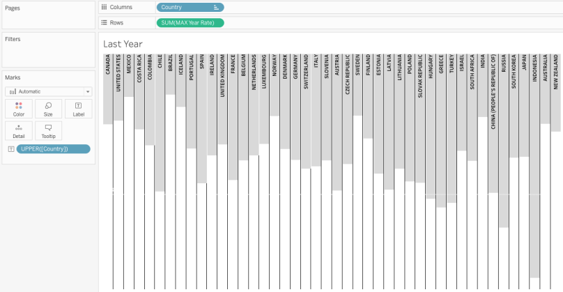
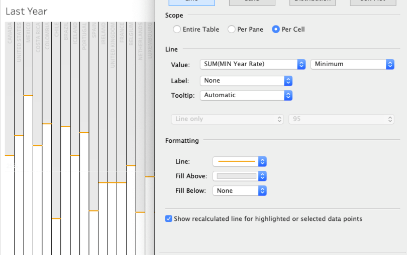
2. Then I added the Min Year Rate to the Detail card and used that to add a reference line. Here is where it appears that it may be a dual axis, but it’s really an orange reference line that is then shaded above in the light gray color.
Now I had my max and min year on the same viz with the difference noted in the tooltip. I could have graphed the difference rate instead, but this allowed me to visually see the starting and ending rates, and the difference, all in one chart.
3. Lastly, I wanted to call out two key factors related to smoking: what countries had an increase from the min to max year and what countries still had a population smoking rate of 25% or greater. In order to do that I created a calc to show me if the change was positive (increased) or not called “Diff Positive”: [Diff Rate]>0. Then I created my color calc.
IF/THEN statements work in order, so it’s important to note how I wrote this because there could have been (and are) countries that had a positive increase AND were greater than 25%. I wanted the calc to look first at if a country had a change in the “wrong” direction (more smoking). That was most important so it is red. Secondly, I wanted the calc to check for if the max rate was greater than 25 and make that orange. Everything else could be gray as those countries had a negative change (good thing) and were below 25 (also a good thing).
Color
IF [Diff positive]= TRUE THEN ‘red’
ELSEIF SUM([MAX Year Rate])>25 THEN ‘orange’
else ‘gray’
END
I then put this on the color card which colored my max year bars accordingly.

This gave the final look I was going for. What is important to note, is that LODs allow you to make new measures that you then can use for comparisons and use in other calculations. As you saw, there was only one measure (the population rate), but I was able to break that out into the min and max year so I could create a visually appealing chart and begin to gain insights about the change from one year to another without both years being in the viz. In fact, the dimension of year isn’t in the viz at all!
Tableau Community Participation
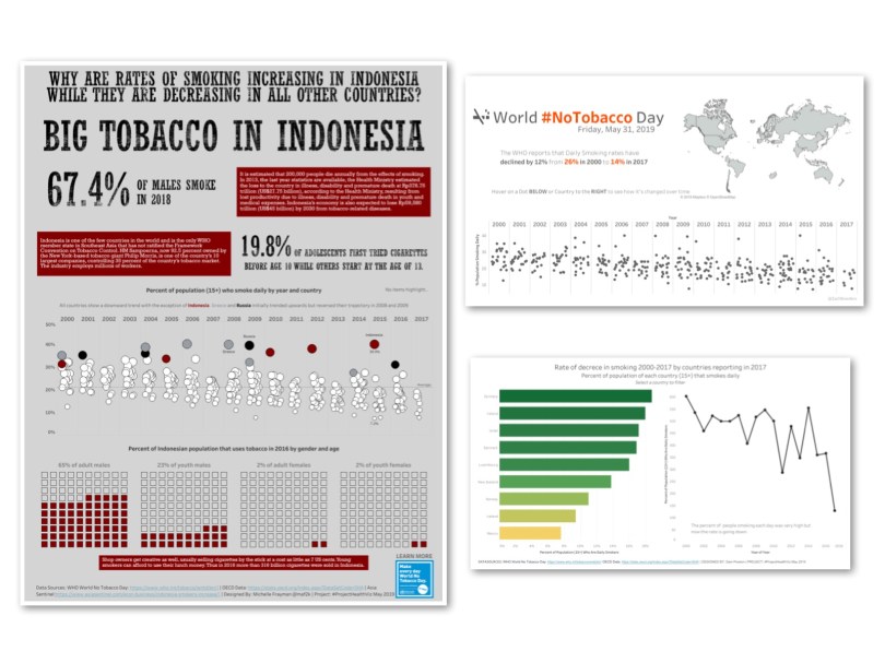
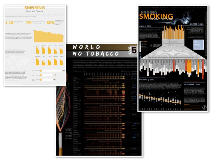
Check out all the other FANTASTIC vizzes done by the community on the OECD’s smoking consumption data. Links are below each collection.
As always, if you want to find out more about ProjectHealthViz, check out my page on my blog and my data.world profile where all the data is located for each monthly project!


One comment