

Recently, I’ve wanted to create dashboards in Tableau that mimic website navigation. There were three reasons for this:
- People are used to how to navigate websites – clicking buttons, expanding selections, toggling forward and backwards through pages.
- The dashboards I was creating were going to be embedded in a website, so I wanted it to look and feel like a website.
- I often dislike Tableau’s native filter customization, especially for dimensions with few values. I don’t like the radial buttons and that is the only choice for showing all the values.
What I envisioned was simple buttons that changed colors when selected and would simultaneously filter the remaining sections of the dashboard. Something sort of similar to the CDC’s website, but with graphs.

In order to do this, I needed to use set actions. I’ll admit, I’ve been a little intimidated by the concept, but then I realized how powerful they could be. So let me share how to build a dashboard with buttons that both filter the underlying data while also changing color to indicate which one is selected.

The Worksheets
The first step to create this dashboard is to build the individual graphs/worksheets. Let’s start with the top left one as an example.
Here, I wanted to be able to select a button for region and have the chart adjust so I could compare the selected region’s annual sales to the average annual sales for the remaining three regions together.
There are three parts to this worksheet build.
- Create the set that will be used to change the values in the chart.
- Create the calculation that will show only the selected region’s sales.
- Create the calculation that will show the annual average sales for the non-selected regions.
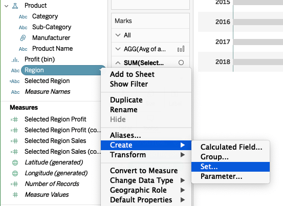
Creating the Set Values
In order to create a set, right click on the dimension you want to use, in this case I used “Region” from the Superstore data set. You do not have to select any values. Just name the new set “Region Set.” We will use this set in much more detail later.
Creating the Selected Region Sales Calculation
What we need is a calculation that only shows the values for the set when they are “in” or true. This “Selected Region” calculation looks like this:
IF [Region Set] then [Sales] END
Creating the Non-Selected Region Sales Calculation
Creating the non-selected average requires a Level of Detail (LOD) calculation. We want the annual sales for each of the non-selected regions, or those that are not in the set, and then take the average of them. This calculation takes the regions not in the set (“out” or false) and then sums their sales individually, by region, and then averages across the three. The “Avg of all other Regions” looks like this:
AVG({INCLUDE [Region]:SUM(IF [Region Set]=FALSE then [Sales] END)})
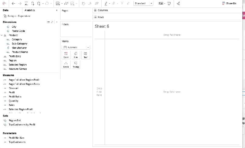
Building the Chart
At this point the sets aren’t going to do anything unless they are used in a worksheet or dashboard action, or as a filter.
In this example, I’m building a dual axis bar chart of sorts with the “Average of all other Regions” and the “Selected Region” on columns, and the “Year of Order Date” on rows. Make the your two measures a dual axis. Change the “Avg of all other Regions” to a bar and the “Selected Region” to a circle. Format as necessary.
At this point, you will bring the “Region Set” onto color on the “Selected Region” marks card (be sure to remove the Measure Names from color as Tableau may have automatically placed it there). Your worksheet should look like this:

Next, we need to build the buttons and the sheet that will filter the one we just built.
Building the Buttons
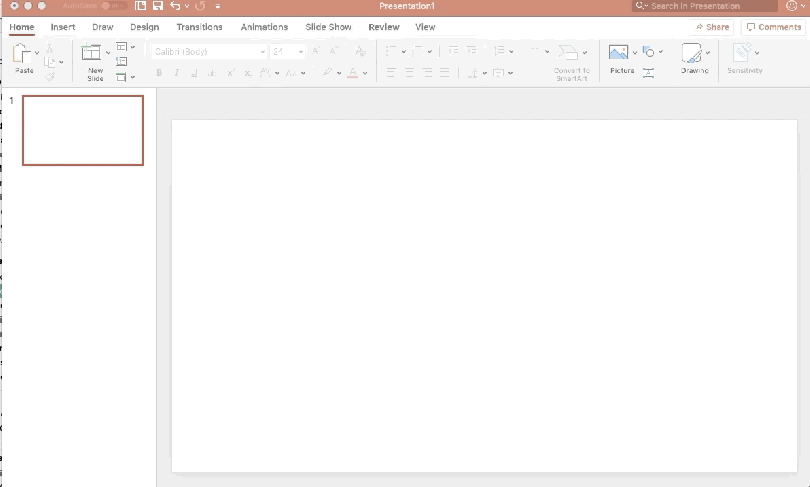
In order to create the look of a button, I used Powerpoint to create my shape. Use the rounded rectangle shape and customize to your liking and then save it as a picture. Save the image to your Tableau Repository shape file and reload your shapes in Tableau.
Next, we need to build the button selection worksheet. This requires only two fields, the dimension we are using, Region, and the set, Region Set. Using the button shape you created above, we set the mark to a shape and use the in/out of Region Set for the color. This will be used later to highlight which region is selected and it will be triggered by clicking the “button”. All of this is to mimic a button you may see on a website or application.
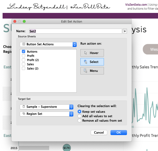
Connecting the Dashboard Set Action
The final step is connecting the button selection sheet to the regional sales sheet on a dashboard. After placing both of the sheets on your dashboard, navigate to “Dashboard” then to “Actions.” Here is where you tell Tableau what action changes the set. I’ve selected my “Buttons” sheet as the trigger for the change of set values. I want the user to select a Region button and have the values in the graphs change. The target set is the Superstore data set and the set is the “Region Set.” Lastly, I want the action to run when the user selects the button and I want to keep the selected set values filtered in the graph until another button is selected. This means that by unselecting the button the values won’t change. It’s only the selection of a new one that changes the values.
And here is how it works when all put together (below GIF). You can view this workbook and download it here. Additionally, if you want to see the “real world” application that I created this for, check out the viz on HealthDataViz’s Tableau Public page. The visualization is a patient view for hospital quality measures – pretty slick!
I hope this is useful!
Cheers,
Lindsay


One comment