

The Drug Crisis in CT – January 2019 #ProjectHealthViz
January’s #ProjectHealthViz was detailed data from ct.data.gov regarding accidental drug overdose deaths in Connecticut. I’ve actually visualized this data few times before: once in 2015 with an update in 2018 and again in 2018 with some design changes. Why did I visualize it so much? Well, originally, it was because it was one of the first data sets I came across. Later, however, it became a frequent topic at work as we focused on the opioid crisis and I was compelled to update my public dashboard while maintaining the original.
Perspectives: Why Visualize Something Again? Why Visualize as a Group?
So why viz it again for #ProjectHealthViz? For a few reasons. First, it’s very detailed data set and despite some “dirty” sections, the data is relatively easy to use. It’s a rich data set with a plethora of information about each death: gender, age, race, place of death, city, type of drugs involved, outcome of the death, etc. But the biggest reason I decided to use this data set again, is because #ProjectHealthViz, and many other social visualization initiatives are done, in part, to draw attention to a topic. When many people visualize the data in various ways, we have the opportunity to see a multitude of compelling stories covering different facets of the data. We can learn so much from our different perspectives and lenses. Overall, visualizing the data brings about awareness of the topic.
When many people visualize the data in various ways, we have the opportunity to see a multitude of compelling stories covering different facets of the data. We can learn so much from our different perspectives and lenses.
Ultimately, this was an interesting challenge for me. I had a new perspective on the data and a new story I wanted to tell. Coming from a different angle changed how my viz turned out this time around. I think every now and again it may be helpful to challenge ourselves to “re-visualize” an old viz. How do you understand the story now? What have you learned since then? What didn’t work before? See if you have a viz you did a long time ago that may spark you with new stories to tell.
January’s Submissions
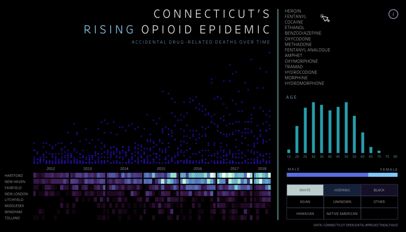
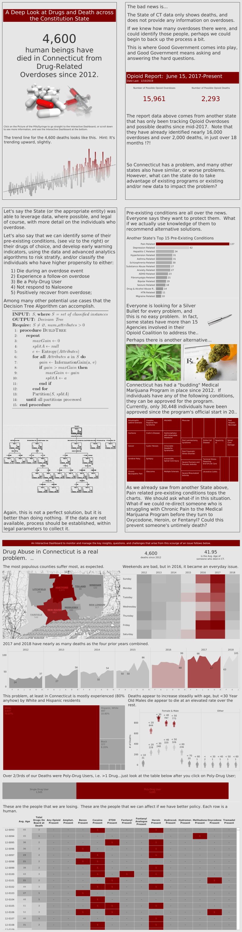
Each of these visual story displays were well done. The stories were impactful and emotional. Just to highlight a few: Anna Dzikowska‘s viz (below right) received the Viz of the Day (#VOTD) by Tableau Public for her simple, but emotional design. Tim Lafferty‘s viz struck my attention immediately for its title, colors, and clean story about fatal overdoses and the differences in demographics. Ellen Blackburn‘s viz felt dark and mysterious, focusing on the ever-present opioid epidemic. The colors were bright on the black and brought to light the intense increase in the crisis over time. Anthony Young took the data set and added a ton of researched context, which made it flow like a research paper or article.
You can check out all of the vizzes below, including mine at the very bottom. Thanks so much to everyone who shared this story with the world.


Tim Lafferty and Anna Dzikowksa


Ann Cutrell and Regis O’Connor


Keep vizzing everyone! The work that is being done to visualize healthcare data is overwhelming. I’m so pleased with everyone’s contributions and work towards this important effort.
Cheers,
Lindsay

