February 2019 #ProjectHealthViz
Late last year Gregg Lathrop, of Stroudwater Associates, a leading healthcare consulting firm, spoke to me about a data set that he managed (and visualized) regarding the closures of rural hospitals across the US. The raw data set is publicly made available by The Sheps Center for Health Research at the University of North Carolina. Gregg informed me that he had a viz developed for this data set already, but thought that the Tableau Community may also have interest in exploring, and visualizing the data. I immediately was excited to share this data with the community and it became the data for February.
Sharing Our Stories
Here is the cool thing about healthcare, in my opinion: Health, and health care, is about people. People like to be connected. People like to tell stories. People like to be connected by the stories they tell about their experiences. Health data is no different. We each can probably find a way to connect to each month’s health data set or, at a minimum, find a story that resonates.
This month I saw many new people share their visualizations. In fact, I believe there were 7 or 8 new people – so THANK YOU! However, what I also saw were stories.
Many people chose not just to make a dashboard – “A business intelligence dashboard is a data visualization tool that displays on a single screen the status of business analytics metrics, key performance indicators (KPIs) and important data points for an organization, department, team or process.” – but to thread the elements of the data into something meaningful. Something that was interesting to read. Something that provided information and made an emotional connection with the reader.
Stories Don’t Require A Lot of Text
My son has a book called “Good Night Gorilla,” which has only has the word good night and the names of each animal the zookeeper says “good night” to. The book clearly tells a story without words. How? With colorful pictures which are organized thoughtfully to create flow and movement from one scene to the next.

When I read this to my son, I often add in words explaining what is going on and make up sounds the animals are making as they trudge across the zoo following the zookeeper home. Yes, it takes a little more creativity to read a story without words. Certainly, it takes more effort on the part of the illustrator to create a story that can carry words or emotions without text present on the page.
How does that translate to dashboard design and story telling with our data? Well, lucky you, I will share my thoughts on the matter.
Psychology of Colors
Let’s start with Sean Miller’s, which was quite the minimalist viz, but perfectly highlights my thoughts about color. What I mean by minimalist is that it has a similar feel to the “Good Night Gorilla” book as I mentioned above. Sean’s viz doesn’t have many words. This means that each word is pretty impactful. Additionally, the viz is separated into three sections, each which (I’d argue) evoke a different emotion as a result of these few words and the colors he chose, intentional or not.
Colors and emotions
Let’s look at the first section in gray. Gray is a color of psychological neutrality. That means that it literally has no psychological properties. It’s suppressive and, frankly, almost dull. It has a dampening effect at times. Here, the title, “Rural hospitals are closing…” and the color make me feel like a rainy day, which feels appropriate. If he had used red here (which some people did this month) I may have initially felt angry, or surprised, or warm. Those would have been fine too, depending on your story.
Gray is psychologically neutral, suppressive and dull at times. It can dampen other colors.

Okay, so I first feel a little bit of nothing, maybe a little glum. I see the impact and the cumulative effect of the closures each year. Wow.
Next, he moves us into the second section, which is red. As I alluded to, red is a physical color. It evokes feelings of ‘fight or flight’ and excitement. It’s visually impactful as the longest wavelength of light. It’s a strong color that demands our attention.
Red is a physical color that brings energy, strength, and ‘fight or flight’ feelings. It grabs attention, but can be perceived as aggressive.

Here, Sean brings our attention to the decisions states made about Medicaid expansion and the possible impact that has had on closures. If you live in one of these states, and a hospital near you has closed, this can sting. It draws a lot of attention to those decisions. People have opinions about government, laws, and the choices that our representatives in the legislature make. It was a good choice for this section.
Lastly, he rounds out the story with something positive, stating that many of these facilities are still serving their communities through other services aside from inpatient.
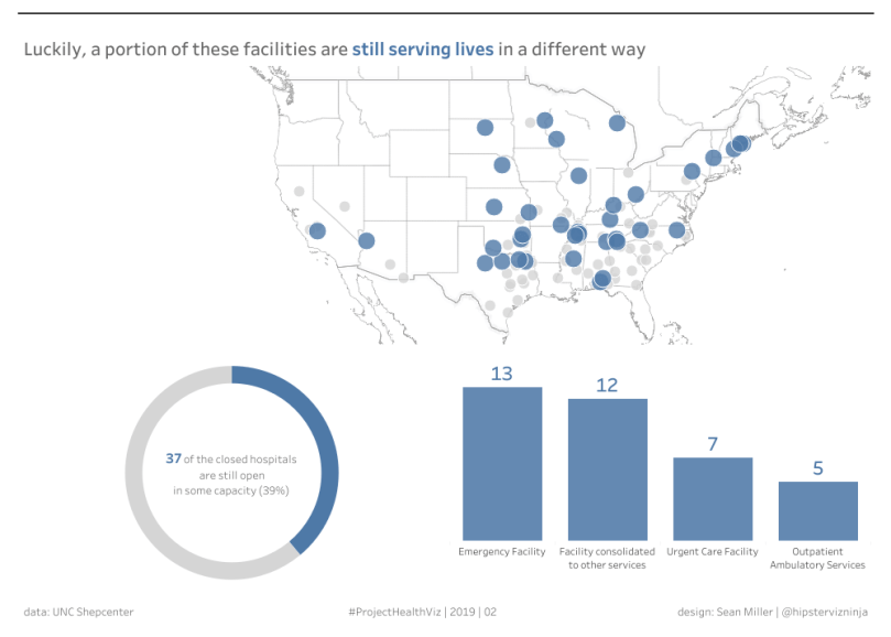
Again, color is a huge factor here. Blue is an intellectual color. It communicates trust and a sense of calm. This chills out the fact that there is an issue by sharing that good things are still happening. At the end of the story, I’ve learned the impact of the hospital closures, but also feel relieved that it’s not all doom and gloom. This is a great example of a story told well with simple visuals, few words, and appropriate colors.
Blue is an intellectual color that represents trust and calm. It affects us mentally (versus physically like red) and improves concentration.
Color as a Theme of the Story
I try in all of my vizzes to consider the implications of color and the rationale for using it. Yes, sometimes I choose colors because I just liked them on the fly, or I saw the palette somewhere else and it was appealing, but that is the exception rather than the norm. I’d argue, though, that if I had an emotional draw to use the colors in the first place, then they should have some positive impact on the story of my visualization.
For my version of the rural hospital closure data, I chose one main color, a bright green, to complement the black, gray, and white. Historically, I strayed away from black backgrounds but they have grown on me. I still think they should be used with caution. In this case, I used the black background for two reasons.
Using a black background
-
- To allow another color (in my case, bright green) to pop out that may have otherwise been washed away in a white background.
-
- For visual impact. Our eyes will naturally be drawn to color (black) over the lack of color (white). Black is perceived as heavy – it’s all the colors absorbed together. It’s menacing at times. Emotionally, this was a great polarization to the green, both visually and psychologically.
Black, as the result of all colors absorbed together, has considerable psychological implications. It absorbs all energy and can be oppressive. It can feel heavy and serious. Black communicates sophistication.
Let me say one more thing about black backgrounds. Use them with purpose. I see a lot of Tableau visualizations with black backgrounds that I feel would be so much better with a simple white canvas. You also need to be really careful with what colors you put on a black background. Often times the colors aren’t bright enough and people can struggle to visually interact with your dashboard.
Choosing the main color
Why did I choose green you ask? Interestingly, green is the center of the color spectrum – the middle ground, if-you-will. It evokes feelings of balance, restoration, and peace. These were not my reasons for choosing green.
I spoke a bit about choosing colors for emotional parts to your story, but colors are also important for drawing specific attention to parts of your visualization.
Since I kept the parts of the dashboard limited to green, white, and gray, each part has a clear purpose.
- White = Important text (such as “Closed” in the title, or the text throughout – which I also secondarily emphasized with bolding in case you really didn’t want to read the whole thing.
- Gray = Secondary information (such as in the map)
- Green = If you read nothing else, read these parts (headers, key parts of each viz)
Lastly, the final question in my viz was “Is the grass any greener?” This was a question posed to the viewer to spark a curiosity about the data. Based on what you read, do you think the states that expanded Medicaid are better off? Is this a result of the Medicaid expansion? Could there be other factors? Why did those particular states not expand Medicaid? This last question was purposefully added at the end to tie up the entire story and to link the color, green, to the visual image of grass. The thin bar chart above the question that looks like grass was clearly no mistake either. *wink wink*

The TL;DR Version
- You can tell a story without many words, but you must then create visuals that guide the viewer and evoke the emotions you wish to convey through color and flow, for example.
- Use colors wisely, especially background colors.
- Consider the emotional (psychological) impact of your color choices. Are they appropriate a) for the data and b) for the response you want your viewer to have.
- Seriously contemplate if the colors are necessary (or so many of them) and what adds value. Andy Kriebel’s viz is a good example of a viz with just black, white, and gray. Anna Dzikowska’s viz is another one with a light background, black text and one bright color palette, which takes up a small portion of the viz’s entire real estate.
Again, these were all awesome submissions and I appreciate everyone’s efforts in visualizing this data. You can view all of the dashboards below. Links to each person’s viz are at the bottom. Enjoy!
Cheers,
Lindsay