

Recently, at work, I’ve used trellis charts to create a grid dimensions (states or counties) with various measures available via parameter/calculation combinations to change the color highlight and the details of the chart itself. Additionally, I’ve spoken to a few people who didn’t know how to make a trellis chart yet so I thought I’d create a post about it (clearly not the first) with simple directions.
What is a Trellis Chart?
A trellis chart is a grid of small charts – often called ‘small multiples’ and basically is a repetition of a chart across a grid. This grid usually is defined by the number of dimension values and organized in a way that either is a complete square (with leftovers) or another determined pattern (meaning a defined height/width).
Okay, so a trellis chart is anything that is charted in a grid. This means it could just be a singular value (think of a heatmap), but also you can make a grid of small charts that have two axes or measures.
For example, you could graph time along an x-axis (horizontal) and a value such as ‘sales’ or ‘claims paid’ or ‘enrollees’ along the y-axis (vertical) with a dimension such as state, county, payor type, or something that has a lot of values to create the grid. Of note, if a dimension has only a few values, then I don’t think that I grid is necessary. I find these trellis charts really helpful when there are quite a number of dimension values. Plus, there are lots of other options to visualize multiple-value dimensions, so this is just one option.
First Steps: The Calcs
In this example, I’m using David Vellca’s Throwback Data Thursday data set regarding employment/unemployment rates in the US over time.
The first task is to set up your row and column calculations. These are the basis for constructing the grid.
HONESTY ALERT. I actually have both of these calculations on a ‘sticky note’ on my computer desktop so I don’t have to remember them. Also, I didn’t come up with these calcs on my own, but they are widely used by many. I am aware that Chris Love has a post about these from back in 2014 that may also be helpful to read.

Trellis Chart Calculations:
Row: int((index()-1)/(round(sqrt(size()))))
Column: (index()-1)%(round(sqrt(size())))
These calculations, while they appear complex, really are just making your grid. It’s a square root function which takes the number of dimension values you are calculating by (determined by size) and then making a square using the modulus (%) function to give us the remainder from that square onto a new row/column.
Anything that doesn’t fit into a square, ends up on the bottom line. So if you had 49 values, you’d get a nice 7×7 square. Otherwise, you end up with an 8th row of a few values.
What is important, is that this method/calculation isn’t effective if you want a long or wide trellis. This calc just makes squares. There are other alternatives to adjusting this calculation to be variable using a parameter, but I’m not going into that here. This post is meant to be simple!
Building the Viz
Now that you have the two important calculations, you can start to build the grid.
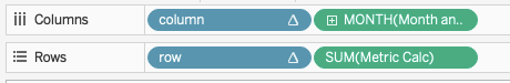
First, put your dimension (State) on details, then Column on columns and Row on rows, make them both discrete dimensions, and then “Compute Using” the dimension (State) for each of them. You should end up with something like this:

Clearly, we can see the grid take shape.
Next, you add in your other measures such as Date and Unemployment Rate to create the chart that will end up within each grid section for each state. Go ahead and hide the headers for the row and column calculations. You can also choose to hide the other headers depending on your use case. Your shelves should look like this:
You should then have something like this example of unemployment rate over time for the states (in alphabetical order in this case). Of note, labeling each grid section can be challenging. There are ways to do it, but I’ve never found them overly dynamic when I am working with client data.
So, you can stop here if your goal was just to make the trellis, or continue reading if you want to add in some custom color highlighting to make sort of a trellis/heatmap and those pesky labels.

Adding Interactive Highlights
I may be on a trellis chart kick at work recently, but that’s mostly because with large sets of dimensions it really does help to organize all of the data into a small space. However, I like to add in a number of dynamic and custom features to allow the chart to change. I mean, why not kill 2 birds with one stone, right? In my final dashboard, I have both a metric selection and color view parameter to add that interactivity.
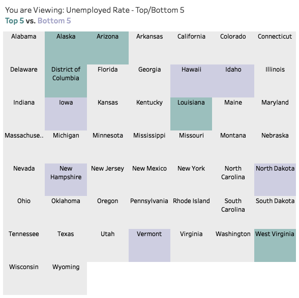
I find it helpful to add in a highlight feature to the grid in order to draw attention to certain key metrics such as the top 5 and bottom 5 dimensions for a measure. In the unemployment data set, I wanted to highlight the top 5 and bottom 5 states by the most recent unemployment rate, as well as the 5 top and 5 bottom states by the overall rate change from the first date to the last date in the data set.
There was a recent Workout Wednesday challenge that had a similar approach, but used one sheet by using an area chart. I don’t personally like how this approach shows the user other points upon hover (meaning you can tell there is an area chart and points get highlighted) and labeling an be a bit tricky.
The approach I use to create my trellis chart with highlighting is by using two sheets (one transparent). This also makes it much easier to add labels.
This form of a highlight chart, where certain values are highlighted, I find is often a great alternative to typical heatmaps when only certain parts of the data set really need to be called out for attention.
Highlighting the top and bottom 5 (or whatever rank value you want) allows a user to quickly see what 5 states have the best and the worst rates. In business cases, this helps viewers quickly hone in on possible areas of concern. Maybe you show the top/bottom products for percent change in sales from the last two months. Or perhaps the top/bottom most recent length of stay value for inpatient hospitals in a state. You get the idea.
In order to create the highlighted trellis chart below, I created a parameter with three string values: Top/Bottom 5, Top/Bottom Change, Top/Bottom % Change.
I then created three calculations that would give me the values by which I connected the final calculation to.
One example was the overall top and bottom 5 for the most recent month (the Max Date Metric only returns a value for the max date – IF [Max Date]=[Month and Year] THEN [Metric Calc] END).
Top/Bottom 5 Metric:
IF RANK(SUM([Max Date Metric]),’asc’)<=5
THEN -1 ELSEIF
RANK(SUM([Max Date Metric]),’desc’)<=5
THEN 1
ELSE 0 END
Change Color:
CASE [Choose Color View]
WHEN ‘Top/Bottom 5’ THEN [Top/Bottom 5 Max Metric]
WHEN ‘Top/Bottom %’ THEN [Top/Bottom % Change]
WHEN ‘Top/Bottom Overall’ THEN [Top/Bottom 5 (min-max)]
END
Then, same as before, add your State to details and row/column calcs to the view, set as discrete and compute using State. Then put the “Change Color” calculation on the color marks card and set to “Compute Using” your dimension (State, in this example).
Make the chart type a square and adjust the size accordingly. I also added the labels to the top center on this chart so that when I layered my charts I easily had the state name on my trellis trend chart in an appropriate and fixed position.
Transparent Sheets for the Win
The last part is just layering these two sheets on your dashboard. I had the highlighted trellis chart tiled on my dashboard and the trending one hovering over with a transparent background.
Now I have an interactive dashboard with various color highlight options, plus labeled states and my trending rates over time with clear tooltips for the trend lines. Voila!
I hope that was helpful, but please reach out with questions! Click the image to view and interact with the dashboard.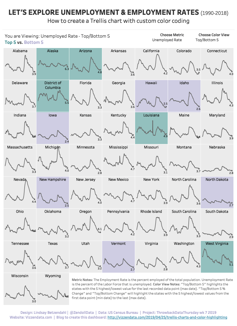
Cheers,
Lindsay

Hi Lindsay, thanks for the post! Is there any way to show ‘All States’ in the same view as well?
Thanks!
Pauline
LikeLike
Only if it’s already aggregated in the data source. You’d need a row for “all states”.
LikeLike
Thanks a lot, Lindsay!
LikeLike
Do you have more information on how to create the highlight table?
I only need the top/bottom 5 so I don’t think that I need the Case/When formulas.
However, in my current iteration, the Rank formula works in table view, but aggregates in a strange way when I try to use it on the trellis chart.
LikeLike
The trellis chart only works if there is a value for every combination of dimensions in the view. So in my case where I have state and year – I need a value for every state for every year. You cannot have any nulls in the data or the trellis won’t work correctly. Could that be part of the issue? As far as information – what else do you need? Or what may not be working? The trellis part is just using those row/column calculations to get the grid for your desired dimension. Then you place your x/y axis values on rows/columns.
LikeLike