

How a Workout Wednesday challenge, an Iron Viz submission and a Tableau resume contributed to the inspiration for this month’s ProjectHealthViz visualization on Eurostat’s survey of chronic health conditions in a number of European countries in 2014.
Cottonwood Seeds of Inspiration
I’ve spoken a lot both publicly and here on my blog about inspiration. Sometimes inspiration doesn’t come all at the same time or on the same day. I tend to catch inspiration like those little cottonwood seeds that float through the air. Depending on where you live, you know what I’m talking about.

Sometimes they just float on by. Sometimes a few pile up and stick around. Other times they seem to build up like snow. Piling up into big drifts in the early summer grass. Sometimes you notice them sometimes you don’t. They can unintentionally spark a memory as you watch the float weightlessly through the breeze.
But the next thing you know, that damn seed is in your house floating on up towards the ceiling by the pull of the fan’s current.
Inspiration, for me, is like these seeds. I can’t predict how they arrive, how many I receive, and how long their memory last. In a way, I pocket inspiration and ideas.
In fact, I use Tableau Public as a way to favorite vizzes that have neat techniques. I practice concepts, charts, and design elements in an effort to be able to easily reference how to do it in the future. I find it easier to peruse my own library of visualizations and those of others that I’ve favorited than to actually remember how to do everything under the sun.
In this case, one concept was from that ‘library’ and one was a new idea but inspired by two other vizzes I’d seen. Let’s explore this.
Where One Door Fails to Open Another Springs Open
I failed miserably at attempting the April 2019 Iron Viz feeder on US agriculture. I won’t lie. I put a TON of hours into nothing. I tried and tried again, but it just wasn’t sparking ideas or joy. It’s a discussion for another time, but the lesson is: it’s okay to give up when the juice isn’t worth the squeeze. The day I gave up, I felt motivated to work on April’s ProjectHealthViz. In fact, the whole viz was done in less than 3 hours.
My typical process goes a little like this:
Step one: Review the data.
Step two: Determine your story.
Step three: Identify the best graphs for the data and the story.
Step four: Pull from the corners of my mind for recent (or past) inspirational sparks.
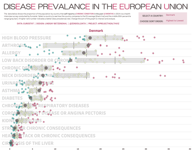
The data, as I’ve mentioned, was the prevalence of various chronic conditions for a number of countries in Europe. After going through the above steps I decided that there were three three important parts of the data I wanted to visualize: the overall spread of the prevalence rates, the EU average, and how a country ranked among all the other countries. The best graph, that I’m aware of for this case, was a jitter plot. Plus, I’m a big fan of variations of the dot plot (see my resume here where I share my top three favorite chart types) so this chart type ‘felt good’.
Those Pesky Memories
Here is where the inspiration comes in. Sometimes, ideas about vizzes keep me up at night. (Just me?) In this case, the jitter plot gave me ‘boat loads, pant loads’ of ideas (Dragons Love Tacos book reference). See, a jitter plot, is a a dot plot (dimension plotted along one continuous axis) with random variation along a ‘fake’ axis so that variables with the same value are ‘scattered’ a bit and can therefore be more visible.
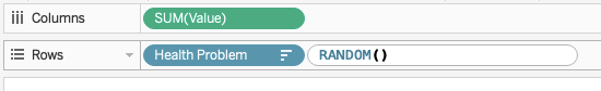
In this ProjectHealthViz example, I added in a ‘jitter’. Usually, I just type in RANDOM() into the row shelf (see below), but in this case I used another alternative since I wanted a way to force the selected country to be centered.
So for this jitterplot, I used the following calculation below, which first ensures that the selected country (parameter) is centered within the random jitter. When I did the INDEX()%25 it spread out the countries so that it was unlikely that any overlapped (You can play with the value to adjust the spread).
IF MIN([Selected Country]=TRUE)
then 12.5
else INDEX()%25
END
Now with the jitter, I needed to add some detail. There is an old Workout Wednesday viz by Andy Kriebel that I love which uses a Gantt chart to create a ‘bar’ between the 25th and 75th percentiles. I’ve used this with clients at work as well. It’s a fantastic method in my opinion and makes the bars separated instead of using filled reference lines/bars.

The problem was that I couldn’t use the Gantt chart and the jitter on the same chart, so I considered the use of transparent sheets. One sheet with the Gantt chart (download my viz to check it out) and one with the jitterplot. So far pretty good. But I was missing something critical.
I needed to label it.
I didn’t want to waste space with the header for each chronic condition. And as memories go, I remembered two recent vizzes I’d seen. The first was Anna Dzikowska’s Iron Viz submission where she manually labeled her bar chart. I liked the custom location of the label and I wish Tableau had more options such as this. But the bold, gray lettering in the white space was surprisingly effective and memorable.

The second memory was Justin Davis’s recent resume built in Tableau. What caught me about the resume was his custom use of headers faded into the background. These were images he imported into Tableau so he could use fonts that wouldn’t render in Tableau Public, but it got my thinking about text faded into the background.

In order to do this part, I created yet another worksheet with the health problem dimension as text. I made it large and faded and ensured it was in background by making it the bottom floating layer on the dashboard.
There are three worksheets to this viz. Each floating. The text is first, layered on top with the percentile range ‘bar’, and finally layered with the jitterplot. This just took a little bit of lining everything up using the pixels to move things around and adding in some temporary reference lines to ensure that the axis were, in fact, all lined up. (This also meant I had to fix all the axes to be the same
Threading the Needle
I used to quilt. A lot, in fact. I made a lot of baby quilts and a few giant king-sized quilts. How is this relevant? Threading the needle, to me, isn’t about the common phrase which means ‘cutting it close’ through something challenging. I literally mean, pulling everything together and tightening up the graphs into a visualization, like sewing.
So I had three layers that together created a nice, cohesive visualization. But there was one other piece I wanted to add. Custom sorting.
This is a relatively simple element to add to a viz. In this case, I created a string parameter called “Choose Sort” and provided four sort options.

Then I created a calculation that would sort the values differently based on the parameter. In all three worksheets, on the dimension of “Health Problem” I assigned the sort order to be this calculation. This would ensure that when the parameter was changed, all three sheets would change their sort order and act as if it was one fluid sheet, even though it is not!

In the end, there are a number of details in this viz that I think are impactful and perhaps useful for you in other situations.
- Labels in the background
- Jittering and centering your highlighted mark
- Custom sorting
- Colors to indicate above/below/within ranges (I didn’t review this, but I did this for the percentile ranges)
- Layered worksheets to get the effect you want.
Check out my final viz here. I hope you enjoy it!
Cheers,
Lindsay

One comment