

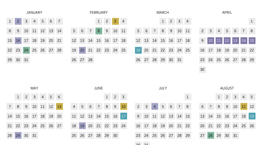
About a year ago I got the idea to create a data-driven calendar of my family’s events; things like birthdays, vacations, parties, sports games, etc. Yes, I have a calendar in my phone and on my computer, but I’m still one that likes a physical calendar. Not to mention, it’s nice to print up a calendar so my kids can see it too because they are too young for phones and synced calendars.
The calendar I started (and never finished) had some bones to what I wanted, but my creativity at the time was lacking. With the release of dynamic zone visibility, I thought that it could be neat to create a calendar that other’s could customize depending on their preferable print layout. And so this viz was born.
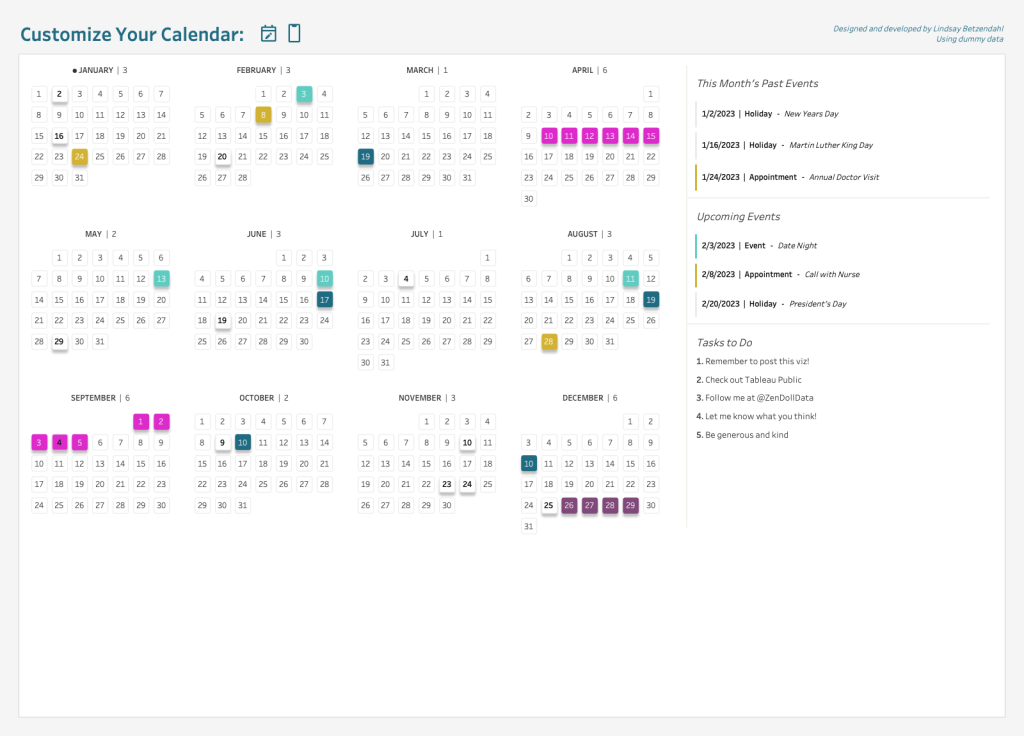
This calendar visualization, created in Tableau, has two main elements that make it “customizable”.
- Ability to change the number of rows/columns that for which the months populate (2×6, 3×4, or 4×3)
- Automatically adjust the placement of the calendar details based on the month layout selected
In this post, I’m going to walk you through how to do #1 on the list above. A second post will address the dynamic zone visibility technique used for #2.
Set Up Your Data Source
You will need two data sources (these can be two tabs in an Excel workbook):
- All the dates in the year
- All your events with dates and details
You can use my template if you’d like (built for 2023) and simply change the data for your events. Once in Tableau, you can join the data together using a left join on Date. This will bring in all the dates but means you don’t have to keep a spreadsheet with all possible dates for your own data – just the dates you have events. Note that the current structure only allows for one event per date as the marks will stack. You can put more than one event in, but know that only one will show in the view as currently built.
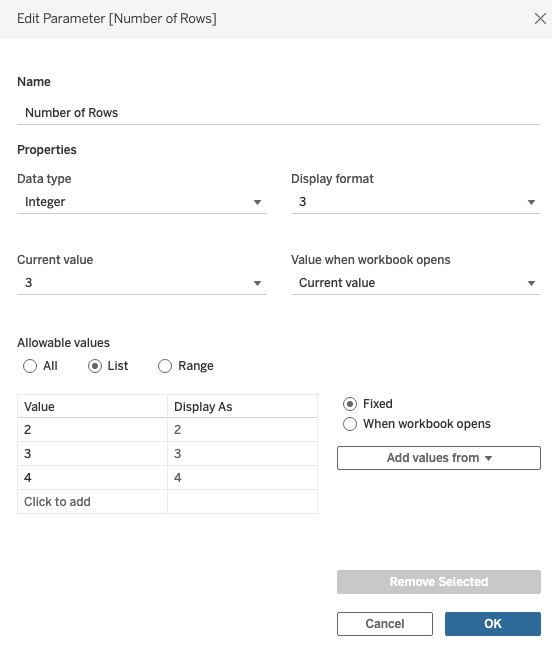
Calculations for Variable Row Layout
You will need 1 parameter and 2 calculations for the customized variable row layout. These are what will determine if there are 2, 3, or 4 rows for the calendar for the months. Typically people will hardcore the row/columns (January is row 1, column 1; February is row 1, column 2; for example), but this calculation allows a user to decide on the layout.
First, create a new parameter called Number of Rows. Set the date type to be an integer with allowable values of a list and then put the values of 2, 3, and 4 into the value options. Press OK.
Next, create a new calculated field called Dynamic Rows.
IF AVG(MONTH([Date]))<=12/[Number of Rows] THEN 1
ELSEIF AVG(MONTH([Date]))>12/[Number of Rows] AND AVG(MONTH([Date]))<=12/[Number of Rows]*2 THEN 2
ELSEIF AVG(MONTH([Date]))>12/[Number of Rows] AND AVG(MONTH([Date]))<=12/[Number of Rows]*3 THEN 3
ELSEIF AVG(MONTH([Date]))>12/[Number of Rows] THEN [Number of Rows] END
Last, create a calculated field called Dynamic Columns.
AVG(MONTH([Date]))%(12/[Number of Rows])
With these three calculations we can build the placement of the months for the calendar. Next up is building the calendar!
Building the Calendar View
In order to make this view work, we have to create axes for Tableau to place both the weekdays (Sun-Sat) and the weeks within a month (weeks 1-4 or 5). Axes are needed because they allow for more flexibility to their spacing, so we can adjust the start/end of them which will provide that nice spacing between the months in the calendar.
First, create a calculation based on your main Date field. Right click on the field and select “Create – Custom Date” and select Weekday. This creates a field that is an integer but automatically displays formatted as a weekday name. We will use this on columns shortly to space out our weekdays. Also, create one for Week Numbers in the same way.
Next, we need a week calculation for our rows. Make a new calculation called Week Index with the following syntax (from a post by Andy Kriebel): FLOAT(DATEPART(‘week’, [Date]) – {FIXED DATEPART(‘month’,[Date]): MIN(DATEPART(‘week’, [Date]))})
Two more calculations area used for the month label. First Month Name: UPPER(DATENAME(‘month’,[Date])). Second is Month Label: IF [Date (Weekdays)]=4 THEN -1.5 END
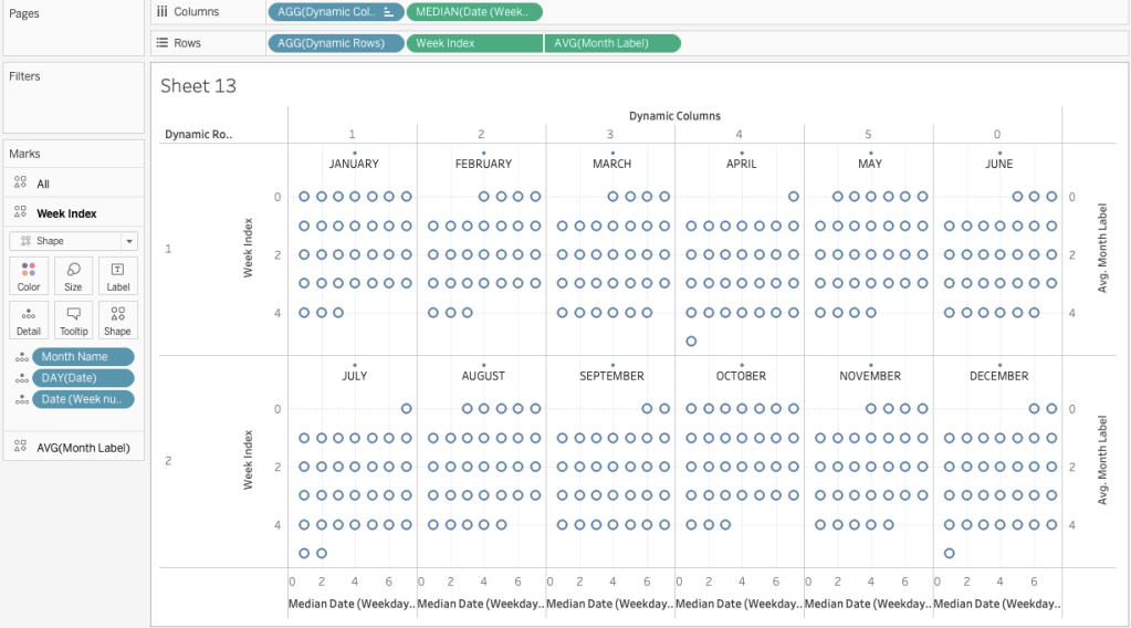
Here are the following steps for the calendar:
- Place Dynamic Columns on columns and Dynamic Rows on rows (make sure they are both blue dimensions)
- Place Weekday on columns, set to a continous measure and the aggregation of median
- Place Week Index on rows and make a continuous dimension
- Add Month Name to detail as well as DAY(Date) and Date(Week numbers) – you can put the Date field then adjust to Day
- Change the mark type to a shape (you can customize this later)
The view should look like this about now:

You may have noticed that the days are all backwards, so you need to reverse the x-axes on your Week Index so that 0 is at the top. To give that nice spacing, adjust the y-axes as you would like. Tableau may auto adjust based on any shapes you use, but you can customize that spacing by increasing the start and end values.
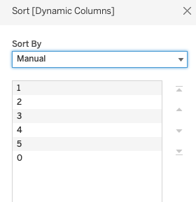
You may have also noticed that 3 months are out of order. This is due to the nature of the dynamic column calculation. Make sure your parameter is set to 2 and then change the sort of the Dynamic Column field so that 0 is last.
The calendar is getting close! At this point you should be able to see how the dynamic rows works.

Last up is getting the month labels in the view. Add the Month Label calculation to rows and create a dual axis with the Week Index calculation. Be sure to synchronize the axes together and change the aggregation to AVG. Remove all fields from the marks card except Month Name. Move Month Name to text.
Your calendar should be looking like a calendar and functioning with the parameter (bring it into the workspace if you haven’t already to test it out). Only thing left here is a bit of formatting clean up and adding your data!
Formatting Your Custom Calendar with Your Data
Lastly, is some formatting so your calendar looks like a real calendar and adding in your events!
- Remove all grid lines, borders, dividers, and zero lines; then hide all axes headers after you have adjusted them to your liking (you can always show them again to make adjustments later).
- Reduce the size of the shape on your Month Label mark and change the color opacity to 0% (we don’t want to see the shape here as the placement is just for the month name).
- Change the shape and size of the main shapes as you wish and add DAY(Date) to text to populate the days of the month on the shapes.
- Add Type from your data to color and adjust as you wish. I recommend making the Null type a light color so it fades into the background or use custom shapes instead of colors to create a white shape with a border, like I did.
- You can change and customize the shapes as well to your liking or stick with a simple square or circle. I created a shape for each event Type that were also formatting with the color I wanted because I wanted both the shape and color to vary.
By now your calendar is complete and you can format your tooltips as desired. For more information on how to utilize the dynamic zone visibility and show upcoming and past events for a month, stay tuned for part 2 of this tutorial!
For more calendar inspiration, check out these other Tableau Public visualizations!
- Stacked Event calendar by Nick Coleman
- One Week calendar by Autumn Battani
- Relevant Values calendar by Kim Tricker
- Annual Sunburst calendar by Lindsay Betzendahl
- Heatmap with Labels calendar by Andy Kriebel (also linked above)
Lindsay
Cheers,

Gettin’ Vizzy with it!
Sent from my iPhone
<
div dir=”ltr”>
<
blockquote type=”cite”>
LikeLike
I can see why this was the VOTD! Great job. I love the look and feel and will use your tutorial to recreate. Thanks for sharing your work!
LikeLike
When will part 2 be released?
LikeLike
It was released a few weeks ago. 😊
LikeLike
Awesome. Anyway you can link it? I am having trouble finding it. Thanks for the tutorial. So helpful!!
LikeLike
Sure! https://vizzendata.com/2023/03/30/custom-calendar-layout-using-dynamic-zone-visibility-part-2/
LikeLike
Any ideas how I can add the days of the week (S, M, T, W, T, F, S) to the top of each month?
LikeLike
Hey Lindsay,
What if you have 2 events on one day?
-Christopher
LikeLike