

This may not come as a surprise, but I love enhancing client Tableau dashboards with simple effects that make someone’s experience a tad more enjoyable and easier. Recently, I saw an amazing business dashboard visualization by my friend Sam Parsons. If you haven’t checked it out, I highly recommend you do because it is full of really great techniques and design choices. I particularly love his right side panel for navigation and the repeated annotation, action, filter, and information icons at the top of each section. It’s really brilliant.

But one of the techniques he used, was a custom sort button feature, which you can see on the first column of charts. There are three of these “buttons”: Profit/Loss, Period Change, and Descending/Ascending. A user can click on the rectangle and two things happen: first, the rectangle changes color and second, the charts sort according to the selection.
It’s not like I haven’t used parameters to sort charts before. I have. In fact, I use them very often.
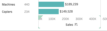
You can also use Tableau’s native sort feature that can be found in the text header or axis header, but I find this unintuitive and people often don’t realize they can sort by selecting this area. In the image below you can see the little “descending bar chart” icon on the axis, which only appears when you hover. I don’t think it’s obvious to sort by selecting an axis, but it is quite common for people to select something that looks like a button to elicit an action.
So, when I saw Sam’s visualization and the sorting feature, which both changed colors and added an arrow, I was intrigued. This blog post will go into the details on how to create these custom sort buttons. I took a slightly different approach than Sam, so if you are interested in his approach, definitely check out his workbook. This method is a bit simpler and has fewer steps, but I think understanding various ways to do something ultimately may lead you to new ideas and skills!
Please note, these really aren’t “buttons” in the general sense. We actually will be creating worksheets and parameters to drive this technique. So let’s get started. You can find the template workbook here.
Setting up the Calculations
The first thing you want to set up is your sort parameter because this will be the starting place to create the calculations which will drive the sorting and the color change. The parameter just needs to have a list of numbers, one will be set for each metric in your small multiple table (so if you have more or less metrics, set those accurately), plus 0, which we will use for the default sort. That can be alphabetical or something else. In my example, I’m going to default the sort to “Quantity” value because I will have that metric as a discrete measure but not one as a bar in my view.
“Sort Metric” Parameter:

Create the correct number of color calculations based on the number of metrics you want to use that use the parameter set up above which we called “Sort Metric”. For my example I have three metrics in my final small multiple chart.
Color calculations:
- p.Button Metric 1 | Color: [Sort Metric]=1
- p.Button Metric 2 | Color: [Sort Metric]=2
- p.Button Metric 3 | Color: [Sort Metric]=3
Selected calculations that result in True values:
- p.Button Metric 1 Selected: IF [p.Button Metric 1 | Color] THEN ‘▼’ END
- p.Button Metric 2 Selected: IF [p.Button Metric 2 | Color] THEN ‘▼’ END
- p.Button Metric 3 Selected: IF [p.Button Metric 3 | Color] THEN ‘▼’ END
Metric True calculations:
- p.Button | Metric 1 True: 1
- p.Button | Metric 2 True: 2
- p.Button | Metric 3 True: 3
Those are the calculations. One “Color”, one “Selected”, and one “Metric True” for each metric in your view. These will hook up to drive the sorting action. Now let’s build the worksheets.
Setting the Sort Order
Finally, you need a calculation that will drive the sort based on the parameter action we will set up. Create a calculation called p.Sort Order by Metric. Use the parameter created for the sort and the tell Tableau what field you want to sort by. See my example below.

Next, select your dimension you want to sort by in your worksheet view. I’m sorting on Sub-category. Select the drop down caret and choose “sort”. In the window, pick the field to sort by that we just created. This will be driven by the parameter action we will set up shortly.

Building the Sorting “Button” Worksheets
The “button” worksheets are made by simulating a mark on axes using AVG(0) on both rows and columns then a square shape, which is colored using the “p.Button Metric 1 | Color” calculation. Set the True to one color (I used a magenta) and False to another (I used gray). You can do this by manually changing the parameter value to get both the True/False options to show up and then selecting the correct color. Next, add AVG(0) to size. This allows us just to increase the size of the square so that it fits our rectangular header. You can use custom shapes, but this method is much easier.

Next, add the “p.Button | Metric 1 True” to detail and set to MIN(). We will use this in our parameter dashboard action. Lastly, add your text fields – double click on the marks card and type ‘Sales’ then move that to text and add “p.Button Metric 1 Selected” to text. Format as needed to ensure the arrow is in front of the metric label.

Now that you have one button worksheet created, you can duplicate this 2 times and replace the calculations with the ones for Metric 2 and Metric 3.
Setting up Dashboard Actions
Once you have your button worksheets, you can place them on your dashboard above your small multiple worksheet. I recommend adding a vertical container and dropping in your 3 header worksheets. This will allow you set the exact width of each of them to match the width of your columns.

Once everything is in place, we can set up the parameter actions by going to the menu bar and selecting “Dashboard” then “Actions”. We will make three actions to drive the parameter for the three header worksheets.
Select “Add Action” and name it “Metric 1”. The source sheet will be your Metric 1 worksheet, which I have named “Sort | Metric 1”. Run the action on “Select”. Target Parameter is our “Sort Metric”. The next part is what will change the value from 0 (our default sort) to 1 (which is the value to trigger Metric 1 to be the sorted field). In the Field drop-down, select “MIN(p.Button Metric 1 True)” and set the aggregation to MIN. Lastly, we want the parameter to reset to 0 when we clear the selection, so in the “Clearing the selection will:” option, select “Set value to” and insert the value 0. You will now repeat this for the other metrics by creating 2 more parameter actions. Each should target the correct metric calculation and default to 0 when the selection is cleared.

If all was done correctly, your visualization should respond like so!
You can find the workbook here. Please let me know if you have questions and I hope this is helpful!
Cheers,
Lindsay

Hi Lindsay, Great job on the Dashboard! I love the design and modifications! I would love to share this with our Tableau User Group! Is that ok? I would include the credits!
Thank you,
Bradley
LikeLike
Certainly! Please share the knowledge. 😊 Glad it’s helpful.
LikeLike
Love the design and I’m trying to recreate it and I’m having trouble getting it to actually sort. I’ve downloaded your workbook and have matched everything in yours to mine and when I select the buttons nothing sorts and I don’t know what I’m missing. I’m going to try again but if you have tips on why it might not sort I’d be interested. Thanks
LikeLike
Hi Kate! Did you set up the Dashboard Actions on the dashboard? I’m assuming yes… Other things to check would be the referenced field in the parameter action and the reset to 0. If your workbook is something you can share, you can email me a packaged workbook and I can see what might be going on.
LikeLike
Hey Lindsay. Thanks for the follow up. I think I found the issue. You have a field called p.Sort Order by Metric and I never saw it reference in your ‘how-to’. I went back and looked and still don’t see it referenced. Was that an oversight in the instructions or was that something I should have understood already? But once I added that field and sorted the Sub-Category by that field everything worked. What I don’t understand (yet) is why that field separate from the the color or the True metric? Couldn’t we have used the p.Button Metric 1 True? It just seems like there’s a lot of calculations and I’m trying to wrap my head around them and how to consolidate?
LikeLike
Good god you are right! My ADHD and lack of proofreading finally caught up to me. 😛 I have (quickly) updated the post, but THANK YOU for pointing it out – you are right – the calc that is on sort is what is driven BY the parameter, so it’s crucial. Thanks for reaching you and I hope now it works for you!
LikeLike