

Getting Vaccinated
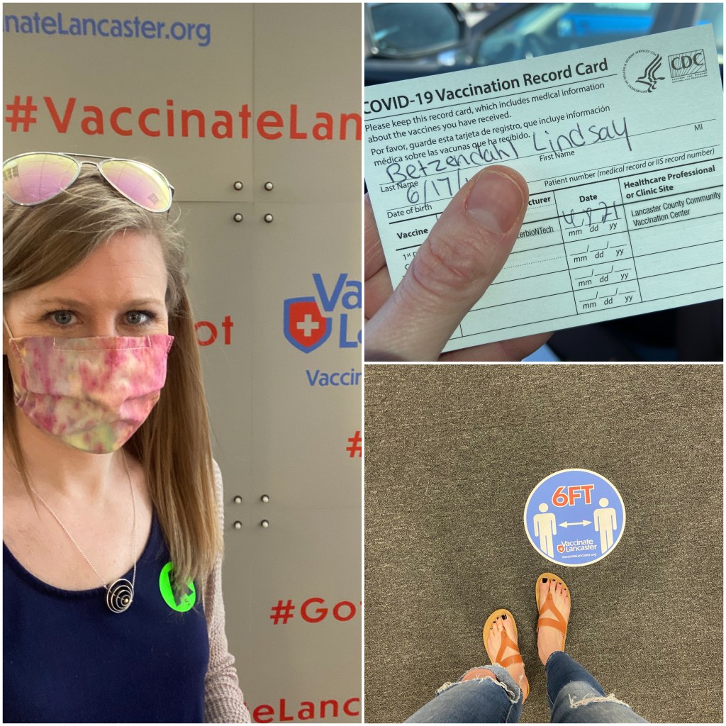
I recently received my first dose of the Pfizer COVID-19 vaccine. It was quite a momentous day actually. Not really because I got the vaccine, but I was witness to the amount of effort, organization, and tireless hours healthcare workers had been putting in to pull off vaccinating millions of people every day in the United States.
Due to limited doses in my local area, I had to travel an hour into the country. After my beautiful drive, I pulled up to a mall where a large “Vaccinations – by Appointment Only” banner hung on an old BonTon department store that had gone out of business years ago. After parking, I walked to the entrance and was met with a line of around 100 people quickly shuffling along as they made their way inside. “This is going to take forever,” I thought. Followed by, “Wow, there are so many people that are getting a vaccine every day.”
Inside was nothing short of phenomenal. Staff directed everyone with huge smiles and “this way Sir, over here Ma’am” and a plethora of kind and cheerful comments. But what almost brought me to tears was that we were all accepting of getting this vaccine – trusting the science – and doing something to hopefully help the whole world from this pandemic. I saw people from nursing homes, being escorted by nursing staff, I saw older men, I saw young women, I saw every race, gender, age, and sociodemographic of a person you could think of. People in sweats, those coming from the office, others with children in tow.
A lovely nurse gave me my vaccine shot. While I sat for 15 minutes under the required observation, I thought, “I can’t even imagine how many vaccines she has likely given out. Thank you. Thank you for your hard work.”
Now that vaccine distribution is beginning to open up across the nation to all people 16 and over, I’m curious how distribution rates and administration rates continue to change. Will they keep increasing? Will there be a plateau? What will the end “vaccination rate” be? Is “herd immunity” even a possibility?
The Visualization
With various COVID vaccines now becoming available around the world, many organizations and individuals have created data trackers, visualizations, and dashboards. In a collaboration created with the help of the Tableau Foundation, Urban Institute and HealthDataViz worked together to create a visualization on the vaccination progress in the United States. The Tableau dashboard looks at not just trends in vaccination rates, but also where those vaccines are available and how that distribution intersects with sociodemographic information such as percent of people of color and percent of people working in different sectors.
To build this dashboard, I’ve been working closely with Jon Schwabish, Ajjit Narayanan, and Claire Boyd from Urban Institute over the last few weeks. We pulled vaccination data from Our World in Data, which is scraped from the Centers for Disease Control (CDC) website (we built this approach because OWID has historical data and has done the relatively hard work of cleaning the CDC data). We combine those data with annual sociodemographic data that was pulled from the Bureau of Labor Statistics and the US Census Bureau using the tidycensus package in the R programming language. The data are all piped into a Google sheet, which is then read and automatically updated in the Tableau dashboard that I designed and built.
You can view the dashboard below or on Tableau Public. I encourage you to please circulate it to friends, colleagues, and other stakeholders who may be able to use these data and/or these specific layouts.

Cheers,
Lindsay
