

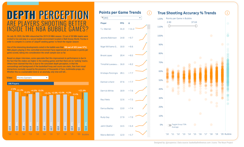
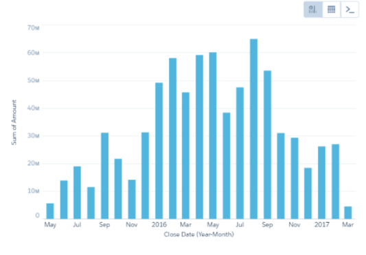
Not too long ago, I came across a really fantastic viz by JR Copreros on NBA shooting accuracy. While the layout, design, and analysis really drew me in, I stuck around for the little details that made this viz quite memorable. First, was the little bars to the right of each thick bar on the bottom right chart. I was very intrigued when I saw this technique and had to download it to find out exactly what method he used.
What I love about adding in this visual variance indicator is that while bar charts are super easy to interpret and compare the length of one bar to another, the variance bars allow us to compare the difference between the bars visually. So often, both the value of the bar and the difference between bars is needed and I think this chart type is one we all should have in our toolbox of chart types.
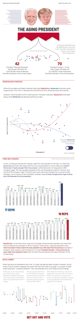
In fact, I liked this technique so much that I used it in my recent “The Aging President” viz.
So, I asked JR if he would be willing to write up a guest blog post on exactly how he constructed this viz and thankfully he was willing to share this technique with all of you!
If you don’t know JR Copreros, you are missing out! His Tableau Public profile is FULL of amazing visualizations. JR works as a BI & Analytics Manager at PwC. However, prior to becoming an analytic professional and data viz enthusiast, he was a Chartered Accountant. He enjoys exploring and visualizing topics and data on sports, music, culture, finance and social good. You can follow his work on Tableau Public, as well as his blog (http://jrcopreros.com) where you can read about his approach behind his vizzes.
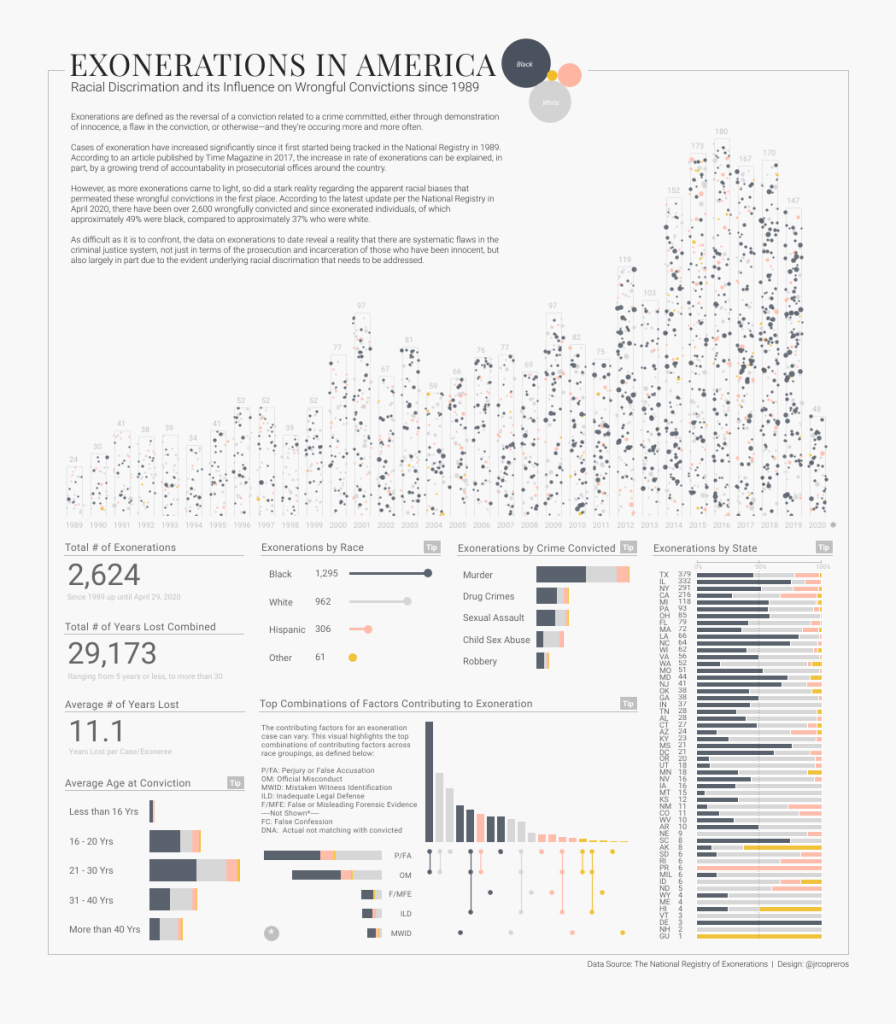
I asked JR to share his favorite viz that he’s published publicly and he shared his Exonerations in America and The Influence of Racial Discrimination, which is a really amazing visualization and you should check it out!
~Guest Post~
Time Bar Chart with Variance Indicators
Despite its simplistic and humble appearance relative to other charts in existence, the bar chart is arguably still the most widely used visualization today.
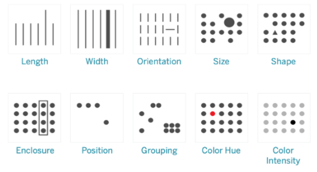
Initially invented by Scottish engineer and political economist William Playfair back in 1785, the bar chart is most effective and easy to comprehend when used to provide a visual presentation and comparison of values involving categorical data or at times, continuous data (more on this later). Its effectiveness is primarily due to the fact that it leverages the basic pre-attentive attribute of length (pre-attentive attributes are visual properties that we as humans notice without using conscious effort).
As we alluded to earlier, bar charts can sometimes also be used to visualize values over a continuous axis such as distribution bins or date/time, the latter of which is often referred to as “Time Bar Charts”.
As its name suggests, a time bar chart is essentially a column chart with the horizontal axis showing a date or time dimension. Like a line chart, a time bar chart is great for visualizing changes or trends over time with vertical bars. However, keeping in mind the pre-attentive attribute of length that bar charts leverage, this chart type allows viewers to better estimate the relative magnitude changes between time periods, especially ones that are adjacent to each other.
Although this chart in and of itself is quite effective already in communicating trends and changes overtime, let’s explore how we can “reduce time to insight” even further through the use of dynamic in-chart indicators to display to users what the % variance change is between dates in the view. (Note: The idea for this technique was first introduced by Ivett Kovac on the Starschema blog shared on 6 August 2020)
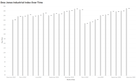
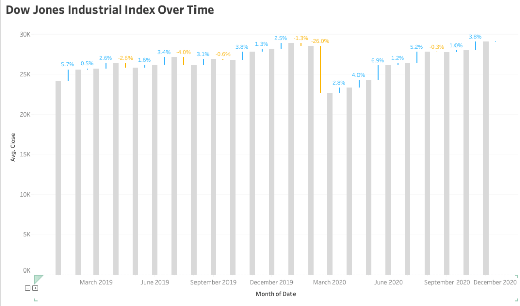
In this tutorial, we will be creating the following time bar chart visualization with the variance magnitude indicators enhancement. We will be using data from Yahoo Finance which looks at the performance of the Dow Jones Industrial Average Index (DJIA) from the past 5 years.
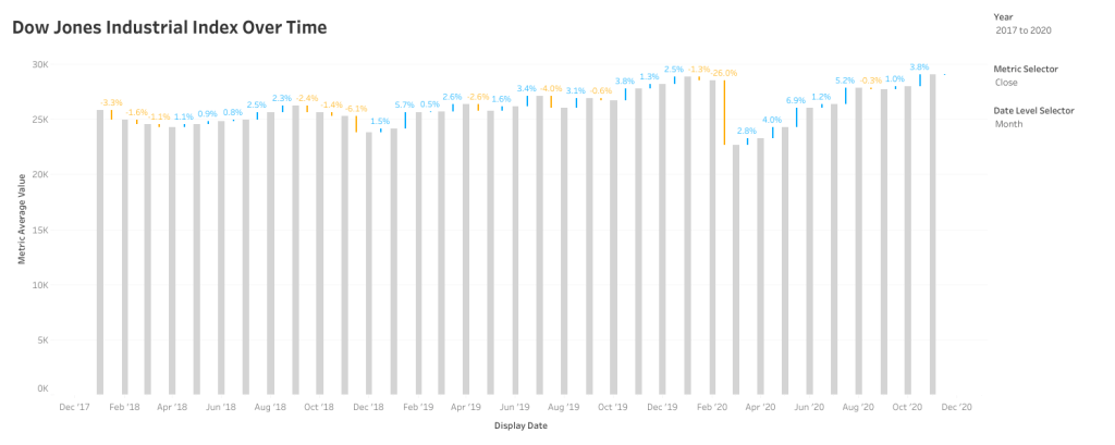
STEP 1 | Create a Bar Chart visualizing the DJIA performance
- Drag the “Close” measure to Rows
- Drag the “Date” dimension to Columns; set pill to ‘Month’, continuous
—Enhancement Options—
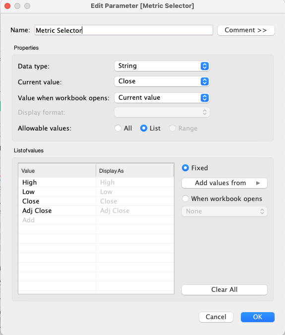
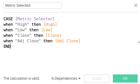
Create a dynamic measure using Parameters and drag this to Rows. This allows users to switch between ‘Close’, ‘High’, ‘Low’, etc…
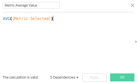
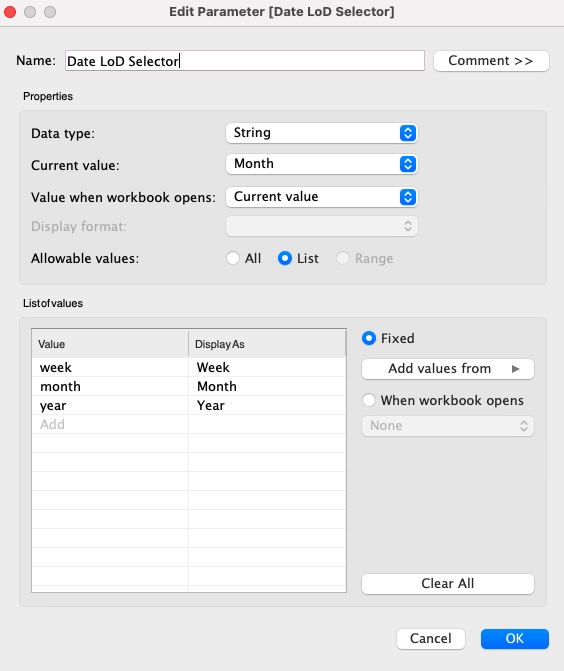
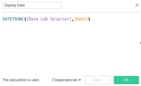
- Create a dynamic Date dimension called ‘Date LoD Selector’ using Parameters and drag this to Columns; set pill to ‘Exact Date’. This allows users to switch Date level to either ‘Week’, ‘Month’, ’Year’; more on this later!
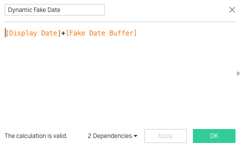
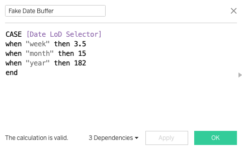
STEP 2 | Create a Fake, Indented Date Axis Field for the Variance Indicator
- Create a new calculated field and call it ‘Fake Date’ and insert the following function:
DATETRUNC(‘month’,[Order Date]) + 15
Note: There are 30 days on average for each month, so in order to place the Variance indicator in between two months, this fake date axis must be indented by 15 days (30 days / 2). Similarly, if your date is in ‘years’, you would need to add a 182 indent (364 days / 2) and so on.
- Drag the ‘Fake Date’ we just created next to the ‘Month(Date)’ field in Columns from Step 1; set to ‘Exact Date’
- Right-click and set to ‘Dual Axis’, select ‘Synchronize Axis’ afterwards; hide this axis when done.
- On the Marks card for this ‘Fake Date’ measure, change the chart type to a “Gantt Bar’. This what we’ll use to visualize the size of the variance between periods in the next step.
—Enhancement Options—
- Create a dynamic ‘Fake Date’ dimension using the ‘Date LoD Selector’ parameter we created in Step 1 and replace the static interval in our DATETRUNC function. drag this to Columns; set pill to ‘Exact Date’.
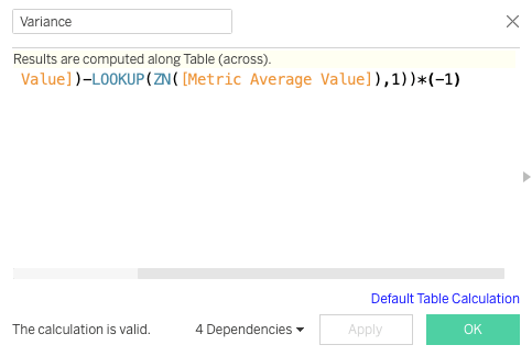
STEP 3 | Calculate and Display the Variance Between Dates
- Create a new calculated field and call it ‘Variance’ and insert the following function:
(ZN(SUM([Close])) – LOOKUP(ZN(SUM([Close])), 1))*(-1)
- Drag this ‘Variance’ field onto the Size mark of the ‘Fake Date’ Gantt bar we created in Step 2.
- Create a new calculated field and call it ‘Variance %’ and insert the following function:
Variance / LOOKUP(ZN(SUM([Close])), 1))
- Drag this ‘Variance %’ field to the Text mark on the ‘Fake Date’ Gantt bar, as well as the Color mark; set to 2 steps so that any variance below 0% is encoded as one side of diverging color scale and vice-versa and helps to highlight direction of variance.
- Adjust the size of the Gantt bar as appropriate
—Enhancement Options—
- Replace the static measure aggregation in the ‘Variance’ functions with the dynamic measures created in Step 1. This will ensure that the sizing and of the Gantt bar adjusts as a ‘Date LoD’ changes based on user input

SUMMARY
There are certainly lots of use cases for this enhanced Time Bar chart, provided that the goal of the visualization is to highlight trends as well magnitude of changes during over time.
In this viz on the performance of NBA players during the NBA Bubble, I used this technique to highlight increases in points scored per game over time leading up to the restart of the NBA season earlier this year.
As another example, this Presidential Age viz by Lindsay Betzendahl shows the age of each US president and change in age to the next one over time.
And finally, this viz on sales of Nintendo Switch by Tamas Varga also employs this technique to show the magnitude increase of sales year over year.
To close, please do check out the linked workbook for more information on the viz and how to reverse engineer it. I hoped you enjoyed this tutorial and please don’t hesitate to reach out if you have clarifications or questions!
Take care and much love!
JR


thanks for that post, it is very useful trick my projects
LikeLike