

As I write this, we are reaching one year since COVID-19 appeared in our world and turned our lives upside-down. In March 2020, most of the world underwent strict lockdowns in a concerted effort to “flatten the curve” and prevent our healthcare system from reaching critical capacity. In retrospect, we managed to keep many people out of the hospital, which allowed healthcare workers to treat those in dire need. Lockdown started in the US (at least in Pennsylvania) on March 16th. While the coronavirus was still new to most of us, it certainly was all people were talking about. Given the importance of understanding the data, even the limited data we had at the time, I decided it would be the dataset for March’s #ProjectHealthViz.
However, the idea of visualizing this “new” COVID case data, wasn’t entirely met with acceptance. Many people believed that only “the experts” should analyze and visualize this information and that it was possible that misinformation would be spread if we shared this data. I 100% disagreed with this position as I believe that as analysts and data visualization experts, it IS our duty to use our skills to share this information.
In March, yes, we didn’t know everything we know now, however, I believe that the community created some fantastic visualizations to help us all not only understand the information but also normalize it a bit. The more we “get in the weeds” of the data, we begin to be less afraid of it. In my opinion, perhaps less afraid of COVID as we research the trends, the concerns, the ways in which it spreads, how to protect ourselves, and the reality about case and death rates.
I also believed that, at least for me, exploring and visualizing the COVID case data helped me to understand what really was happening locally. With so much attention on the US as a whole, I needed perspective on what mattered in my community and what the risk was. This was exceptionally helpful for me to put it into perspective and create something useful for myself and my family.
This is all to say that we cannot be experts in all the data we are confronted with visualizing. At work, there are plenty of times that I know very little about the data I have to work with. This doesn’t mean I don’t visualize it out of fear of getting it wrong. In fact, it’s quite the opposite. I explore. I’m curious. I test theories and ideas. I ask questions of those who know more about the data than me. But I don’t NOT visualize it.
One thing that comes relatively natural to me, is to be me. This means I stick to my guns even in light of criticism or perhaps even when I may end up being wrong in the end. Being wrong is okay, but I would hate to not do something out of fear and have it turn out that either I was right or I end up with regrets. So I encouraged others to do what they felt was right and what they believed in. (You can listen to a candid conversation Hall of Fame Zen Master, Johnathan Drummey and I had on my YouTube page.) Turns out, that March’s #ProjectHealthViz had the largest number of submission in the two years that the project has been running. I received 39 submissions on COVID. A few people even did two visualizations. Not to mention that many are still being updated regularly even 9 months later!
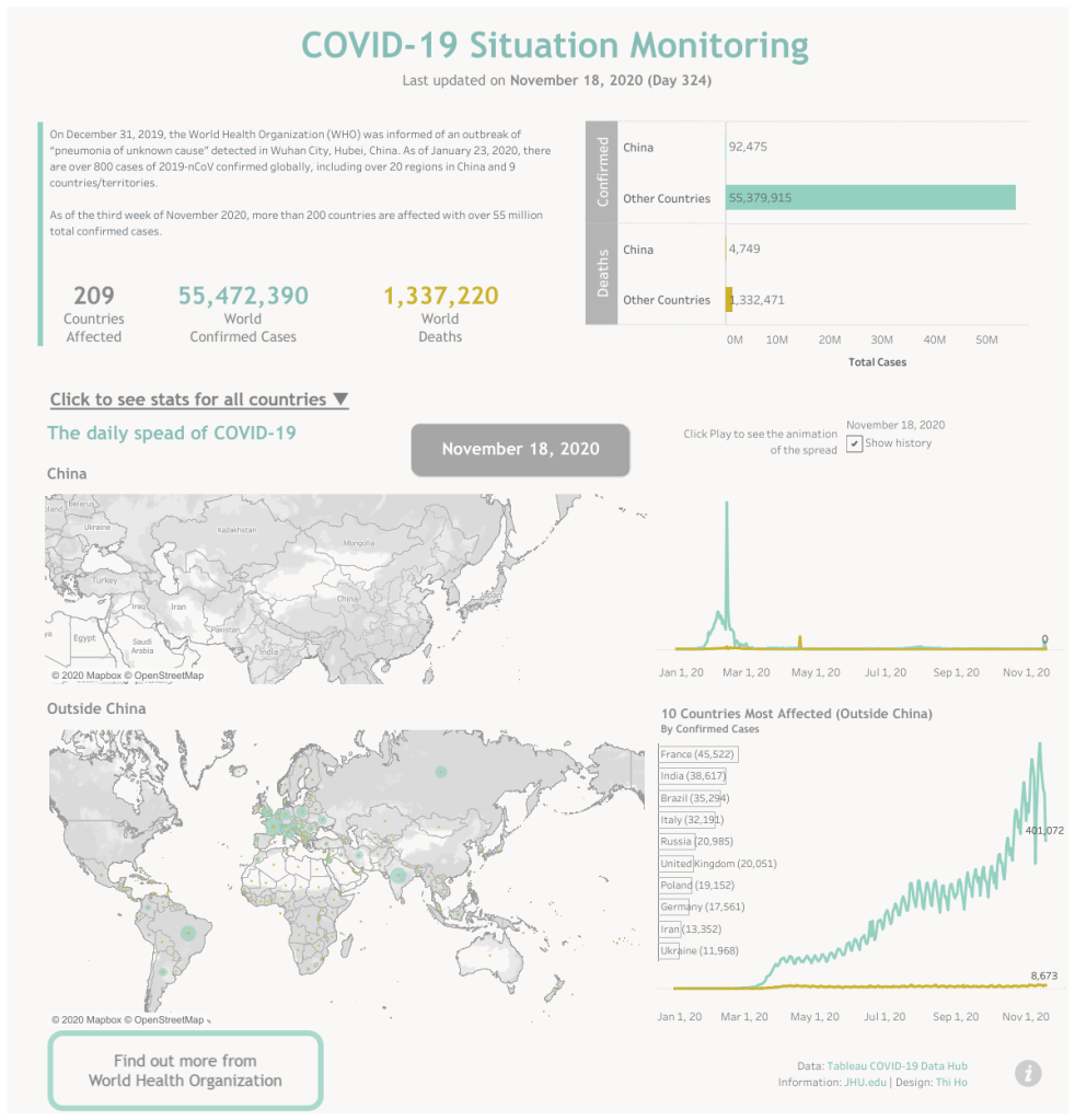
Numbers aside, what is really powerful is how some people took this as an opportunity to learn and test boundaries despite the unsettled climate at the time. Thi Ho, a Tableau Social Media Ambassador and Tableau Featured Author, initially hesitated to share her COVID viz after hearing many conversations on the internet criticizing visualizations on COVID for being “irresponsible” or “not an expert.” Thi decided to challenge herself to complete the viz and while she reached out to experts and respected her limitations, she was able to produce a beautifully insightful visualization that was chosen to be featured in Tableau’s COVID viz gallery, which you can find here.
Thi explains her thoughts about participating in March’s #ProjectHealthViz and what she learned:
In March 2020, the dataset for #ProjectHealthViz was about COVID-19. At that time, there were many pieces of advice and warnings from the dataviz community that those who were not healthcare experts should not viz about COVID-19. After reading those, I felt very hesitant and almost discontinued my work using the dataset as I had no prior knowledge in healthcare and healthcare data. However, Lindsay Betzendahl did encourage me to go on as my purpose was just to learn how to visualize such a pandemic dataset. Lindsay even had some courageous conversations to defend our stand from the point of view of learning and practicing. Thanks to Lindsay, I did complete the viz and got feedback from her to ensure the accuracy of the reported numbers besides other things such as clarity of texts in the viz etc. I also followed the guidelines I had read and being cautious with the usage of visuals and colors. I did learn a lot from Lindsay and from the whole process. I was so amazed when Tableau featured my viz in the COVID-19 Viz Gallery. Had I not gone on to complete the viz, I still would not know what I did not know at that time, and still would not have confidence in visualizing such a dataset. I would like to thank Lindsay for being bold and giving us the encouragement we needed to push ourselves in learning new things and improve our skills and knowledge.
Thi Ho
Sarah Burnett also shared with me how initially she was conflicted when publishing her COVID viz and almost took it down due to the negative chatter on social media, but ultimately ended up keeping it up as it provided useful and important data for both Singapore, where she lives, and the world. Her viz is a wonderful representation of a continuously updated viz that stands the test of time.
Singapore was one of the first reported countries outside of China to have a confirmed case of COVID-19. The Chinese New Year celebrations had just completed, and over 10,000 people from the province of Wuhan had come to Singapore before the borders closed. Within days, the government had set up a WhatsApp Group to give us up to 3 messages a day reporting community and imported cases, people in ICU, and deaths. The following week I picked up 3 Track-and-Trace devices for myself, my 7-year-old son and my helper, who lives with us. My son would not be allowed into school in January without the device and QR Code scanning and masks have been compulsory since February.
Friends in the past who have travelled here used to joke that Singapore was like living in the future because we have so much data at our fingertips. This turned out to be a level of comfort for me in these trying times. I built 2 COVID-related vizzes. The first focused on Singapore data, but when the numbers grew and we went into our lockdown I had to stop updating for my own sanity. The second looked at the publicly available John Hopkins University datasets on Confirmed, Recovered, and Deaths due to Covid.
When people started publishing their vizzes up to Tableau Public, there was a lot of controversy on ethics and people stating if you weren’t a virologist should you even publish a visual on COVID. I took a long hard think about this. Twitter was going nuts over it. I was publishing the facts. I wasn’t drawing any conclusions from the data.
I manually update this viz, and over time, I’ve moved from updating it daily, to weekly to monthly. At the time of writing, the viz is published on the Tableau Public Coronavirus (COVID-19) Viz Gallery and has had over 12k views. I hope the people that view it get the insights it was intended for.
Sarah Burnett
What is important in all of these examples is that with difficult topics, it’s best to visualize what you feel comfortable with. If you feel like you don’t know enough to “do right” by the data, then you have a few choices: seek out information from others, perhaps experts on the topic, do your own research, or don’t visualize it. There is no harm in recognizing our limitations. However, there is also a huge benefit for following your instincts and using your skills as a data visualization expert to accurately and effectively communicate important information. It’s easy to follow the herd or feel compelled to stay quiet when the loud are talking. It’s more difficult to stand for what you believe it and be proud of that.
I’m very proud of those who took the challenge to visualize the COVID data early on. There are so many great examples of how data can help people understand what is going on in their world. You cannot own how people react to it (for example, some become more anxious, some less worried with more information) but you can own how much effort you put in to ensure your viz is accurate, appropriate, considerate, and effective. I hope this was helpful reminder that you can do this work and you can do it well.
Additionally, Tableau has a COVID Viz Gallery in which a large number of great visualizations can be explored. I encourage you to check it out if you haven’t already.
Here are a few other favorite submissions from this month:
Praveen Jose – “Flatten the Curve”

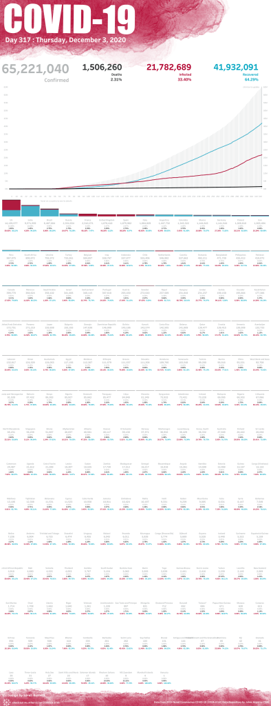
Christian Felix – “COVID-19 In the United States”

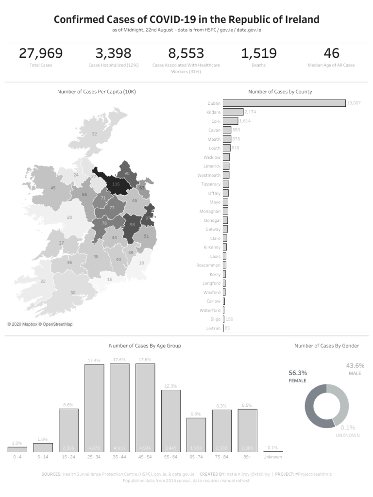
Katie Kilroy – “COVID-19 in the Republic of Ireland”
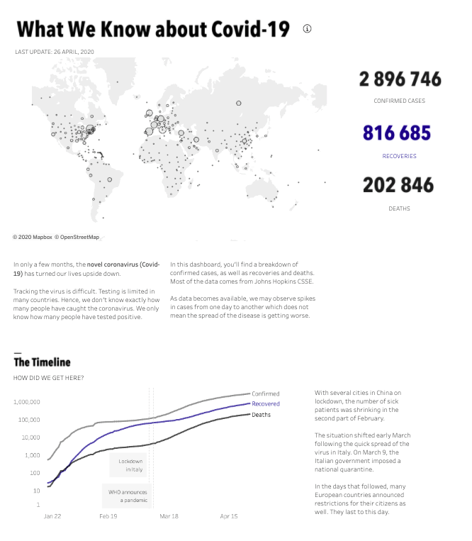
Evelina Judeikyte – “What We Know about Covid-19”
*note actual viz is much longer, click for full version
You can view my visualization for March here. As mentioned earlier, I chose to visualize the data for my home state so I could keep tabs on what was going on close to home. This allowed me to share relevant updates with friends and family and see trends in my country and those I neighbor. Additionally, I was able to reduce my fear and anxiety by putting this data into perspective and to realize that simply by being smart and safe, I would be completely fine during this pandemic. That was a game-changer. Data can be freeing.

To all 39 who submitted, Thank you! You helped people understand this data and you took a step forward showing that you are a data viz expert and can visualize challenging and complex “real-time” data.
Cheers!
Lindsay
