

Actual to Target (or Expected) Values
Comparing actual to target values is a common client request. Organizations regularly set targets or benchmarks and need to visualize progress towards the target. Bullet charts and bar charts with reference lines can be very effective in showing progress towards a target, to compare current year-to-date to a prior year-to-date, or track actual values to expected values.
Choosing a visual display to show both the actual and expected values over time can be challenging. Diverging bar charts can show the difference from the target – how above or below the value is from the target. This is a good solution when the difference from the target is the most important analysis.
However, when the actual values of the target and current values are needed, then a dual line chart can be used plotting both values. While useful, the biggest con is that the crossing of the lines can quickly become confusing and it’s difficult to tell quickly where values were over/under target and by how much.
Diverging Chart Solutions
In healthcare, the term “observed vs. expected” is a common phrase. This can mean the observed surgery time compared to the expected (or scheduled) time, the actual length of stay compared to the expected length of stay in a hospital, or the expected patients scheduled compared to the patients that came to treatment.
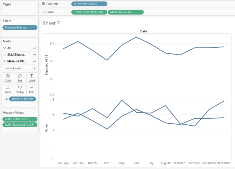
Recently, I worked with a client who needed to compare actual and expected average length of stay (ALOS) for hospital patients. The typical chart may have two lines and look like this (actual in teal, expected in gray):

What I dislike about these dual line charts is that it’s hard to quickly see what months were above or below the target and by how much. I can’t see quickly which months were above or below (or how many months were above, for example) or even by how much without using a tooltip or doing math in my head.
You may think that a diverging bar chart may be a good solution. You are correct that a diverging chart (either a bar or a line) can show the difference between the actual and expected values, but it cannot show the absolute value.

This works really well if the goal is to show how much the actual is from the expected or target. But for a hospital, the actual average length of stay can vary by month as can the expected ALOS because patient population varies each month and there is often seasonality in hospital visits. Certain criteria are used to estimate a patient’s length of stay, resulting in a variable expected ALOS. So while the difference matters, it also matters what those values were. A high ALOS wasn’t necessarily bad if it was still below the expected.
Diverging Icicle Chart
An icicle chart is an effective chart to show both the values of the target and actual values as well as the difference from the actual to the target.

What I love about these charts is that you can plot the expected values (gray line) and then how far above (red) or below (gray) the actual value was from that expected value. Visually, I can see that the months of May, August, and December had a higher than expected ALOS and by a larger margin than other months. September, on the other hand, was above the expected ALOS, but not by much, evidence by the short red line (or icicle) above the gray line. I can also see that June had a high ALOS compared to months like April, July, and September, but June’s expected ALOS was high and the actual was actually lower than expected. All of these insights are easily obtained from an icicle chart.
Building the Icicle Chart
The icicle chart uses a dual axis line chart. One line is the expected value connected by the time period and the icicles are created using both the expected and actual values and connecting the line by the measure name.
Step 1: Plot the expected value

Step 2: Plot both the Actual and Expected Value
Drag out measure values and just leave the two values you need by removing any others.
Step 3: Change the second mark type to line (if it’s not already) and move Measure Names from the detail to the Path shelf
Next, select dual axis and synchronize the axes.

Step 4: Create a calculation for the color (above or below) and add that to the color shelf
You can also add the circle marks to the measure values lines to make the values more pronounced and label only the actual values.

Step 5: Add labels if desired to the actual values
And there you have it!
The full viz, with all the other deviation examples can be found here.

As always, reach out if you have questions or download the workbook to recreate all of these “actual to target” graph options.
Cheers!
Lindsay

Great viz! Any idea if it is possible to have more than one diverging Icicle chart in one chart?
LikeLike
Thanks for the informative viz, could you please tell me where can I get the data set to practice?
LikeLike
Hi! You can download the workbook here (https://public.tableau.com/app/profile/lindsay.betzendahl/viz/DeviationChartingActualtoTargetValues/ActualtoTarget) if you want to explore further. I just made up the data set. It’s very simple. The data has 3 columns: Date, Expected ALOS, Actual ALOS. Each row is a value per month/year. You can practice the same techniques either by downloading my workbook or using Tableau’s native Superstore data set and using measures such as Sales and Profit. Or make up your own data!
LikeLike
Hi Lindsay, is there any “AUTOMATIC” way to show labels of the actual values? When I dragged the measure values to the “Label” shelf, it would show duplicated values for two lines. If we do not want to remove label one-by-one on the graph manually, is there any methods that we can display the label only for one measure value in this case? Thanks!
LikeLike
I didn’t put any field on labels directly, but just selected “show mark labels” and then selected “line ends” and “start of line” which plotted the label for the below values below the line and the above values above the line. You can download my workbook too if you hadn’t already. The link is in the post near the end.
LikeLike