

The Preattentive Attribute of Hue
One of my favorite visualization techniques to use is adding the preattentive attribute of hue, or color, to draw attention to a particular data point, or story, within a larger chart or dashboard.
Preattentive processing is the immediate cognitive experience of processing the visual world before our higher brain is even consciously aware of what we saw. It happens within milliseconds.
Colin Ware, author of Information Visualization and Visual Thinking, states that if we follow perception-based rules, we can present our data in such a way that the important and informative patterns stand out.
Hue, or color, is one preattentive attribute that is highly effective in data visualizations.
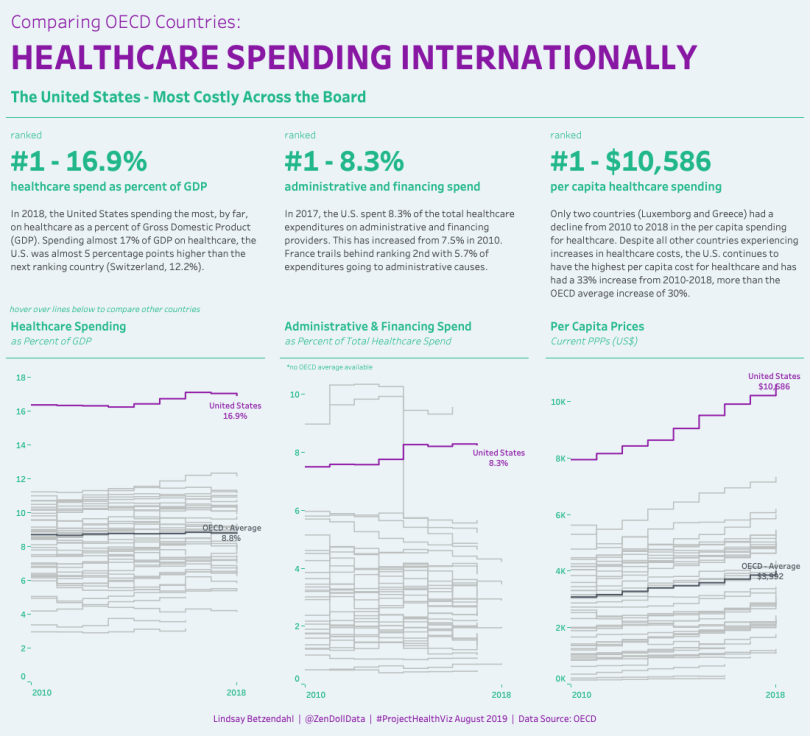
The ProjectHealthViz for August was a the data set about healthcare spending in the OECD countries. Almost everyone this month used color to highlight the United States as a huge outlier in their spending on healthcare.
In my viz, I used a very saturated purple to distinguish the United States from the other countries (in light gray). I also used a more saturated gray to help the OECD average stand out, but not enough to compete with the purple of the United States.
I also tried to follow the 60-30-10 rule of applying color that artists often use. When considering color, your primary color should dominate 60% of your viz, 30% should be dedicated to the secondary color, and 10% allocated carefully to an accent color which is the color that will highlight important information in your visual.
In my viz, 60% is green (background and title text), 30% is gray (paragraph text and lines), and 10% is purple (main title and highlight on one country).
Using this principle, you can direct attention and ensure that you are using color with the right intentions – to show the data.
I hope that was helpful! Check out all the other awesome submissions from August. You can find the links to them via the Submission Tracker.
Community Submissions


One comment