The Data Set | A Little Girl’s Story
July’s ProjectHealthViz
When Rodrigo Calloni (@tableauing) reached out to me asking if I’d be interested in utilizing a dataset he had been collecting on his daughter’s medical treatment appointments, I immediately said, “Yes, of course!”. Rodrigo has been very open about the treatment his daughter has been receiving to help correct visual impairments acquired after suffering from a traumatic brain injury when she was 6 months old. Since many of these specialized doctors were out-of-network, and appointments were possibly not covered by the family’s insurance, Rodrigo started tracking information. Data such as date, doctor name, type of treatment, total cost, paid amount, owed amount, and location of the doctor providing the treatment.
ProjectHealthViz is, and has always been, a platform to tell the stories of our health. As the tagline for the project, it’s important to me that 1) there is a variety in the types of data sets I provide and people learn something (either from the data or as a result of practicing vizzing), and 3) that people have the opportunity to relate to them. The third point also means that I’m interested in data sets that provide platforms for others to tell their own stories or feel that they can connect to the stories told from the data.
July’s dataset was, as I mentioned, about the use and cost of healthcare. Many of us can relate to getting treatment for ourselves or a loved one, receiving the estimated cost of the treatment, only left to review what the health insurance company paid and what is left for us to pay.
The Dashboard | My Approach
The data was simple. Nothing tricky about it. What isn’t always simple, is deciding how to tell the story you want to tell (or that needs to be told) and utilizing various design and analytic techniques to accomplish that. I’ve been asked a number of times how I work through the design process and what steps do I take. I can’t promise that this is the flow I use 100% of the time, but it’s the thought process I went through with this one.
The Canvas | Dashboard Size
It may seem counterintuitive, but more times than not, I begin my dashboard development with many of the decisions people usually leave for the end. Specifically, dashboard size. I’ve spoken before about “dashboarding in reverse” during my Tableau Fringe Festival talk in late 2018, which you can watch here.
Choosing the size of your dashboard before you even know what elements you will place into it, is certainly unconventional. I view a dashboard similar to a paint canvas. Could you imagine if artists started with one canvas (in the traditional sense, not an electronic one) and after painting decided they needed a bigger or smaller one and just could magically change the size? Yeah me either. That seems silly. Artists use their canvas to hold and confine their ideas. Often this means visualizing the end painting spatially before starting to paint, even if the painting evolves along the way. It also constrains the artist and ensures that they are thoughtful with their choices during the process.
When I started thinking about the data on Alice’s treatments, I knew I wanted to be constrained to a smaller canvas, if you will, because I thought that would allow me to keep the story and my ideas limited. July happened to be the month that I was frantically packing up my house to move my whole family a few states away. By limiting my dashboard size, I knew this would result in fewer charts and a more succinct story.
The Palette | Colors
I’m drawn to the colors of a visualization, as many of us are. The color choices people make fascinate me. I find myself wondering how someone decided upon and chose colors, especially when we have an infinite range of hues, saturations, and brightness to select from.
When I thought about Alice and her struggle with vision, I immediately thought about color. Color is a visual sense and while Alice doesn’t have color impairment, I knew I wanted the visualization to have bright, intense pops of color to underscore the story around Cortical Visual Impairment (CVI). The more I thought about CVI and its cause (damaged neural pathways from the brain to the eye), it prompted me to hand-draw a brain with these colors. Now, I don’t normally draw my images (in fact, this was a first), but selecting images (if they are used in the viz) is also something I do right away.

When Kevin Flerlage and I began our Race for Survival viz on cheetahs, we did just that: searched for an image before we even had data or a plan. Sometimes the image sets the tone for the viz and the story so it’s key to get it right. You can read about our discussions over images and the entire process here.
My image is bright and playful, just like a child, and since this was a viz about a young girl, keeping with that theme worked with the emotional feeling I wanted to elicit in my audience.
The Subject | Research
With data, I often don’t know what story needs to be told. Here is where I often begin to play around with the data to see what I can uncover – what revelations speak to me.
While the data was really about treatment cost and counts, the subject behind the scenes was Alice and her experience with CVI. Having been unfamiliar with the diagnosis, its symptoms, and treatments, I did a bit of research before starting the visualization. Now, I could have easily made the subject healthcare costs or explored more about the various treatment types she received but educating others about CVI was the story I needed to tell.
This meant, by this point, I had my dashboard size, my colors, image, and subject. It wasn’t until this point that I really started building my visualization by placing the image, title, and contextual text in my visualization.
The Painting | Charts
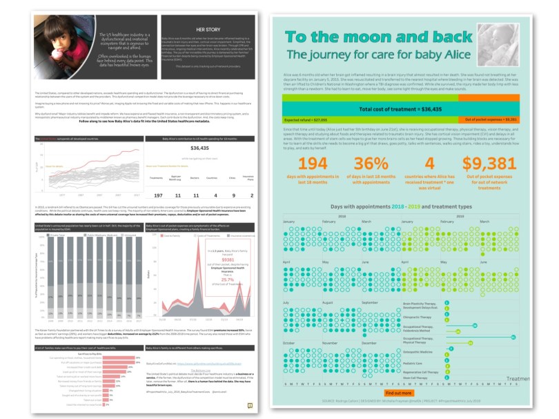
There is a total of 8 charts in the final visualization, while only 4 are likely to be obvious. This is because, even in a static data set, I always create worksheets with text if there are values from the data set. For example, the text that states the number of doctors Alice saw and the number of appointments is a worksheet. I take this approach because it’s good practice to use the data in text fields so that it can update if the data changes and you don’t have to remember each and every place that you manually hard-coded information into your viz.
Let me share a bit about the other 4 charts.
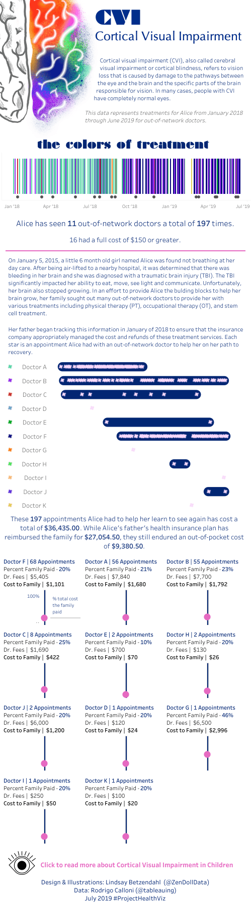
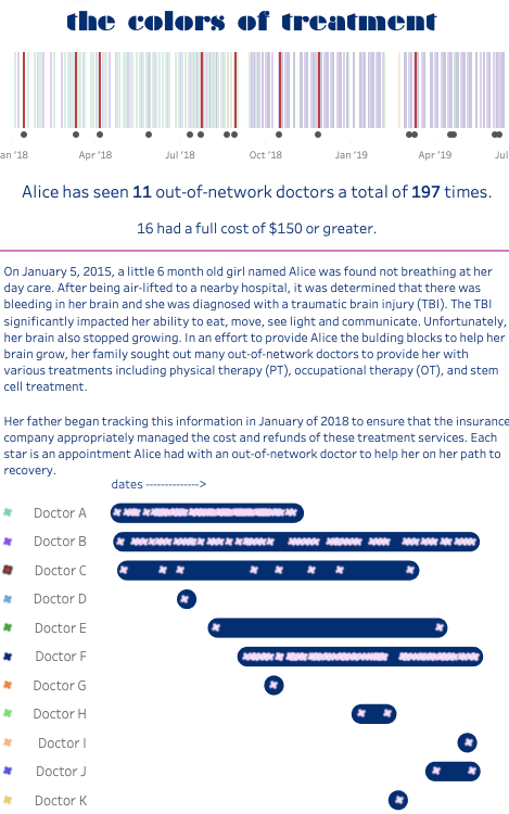
Gantt Chart and Dot Strip Plot
The brightly colored barcode-looking chart is really a Gantt chart showing each date that Alice had an appointment during the timeframe of the data set. Each bar is colored by which doctor saw her. This chart is not meant to provide details about her care (in fact, I don’t even have a legend near it), but instead it is meant to visually give you a spectrum of her care. I selected particular colors to emphasize the change in some of her doctors over time and also to show the magnitude of appointments evidenced by the many, many compact lines.
The dot strip plot beneath the Gantt chart, points out and draws attention to the specific treatment appointments that had a bill of over $150.
Together, these two charts lay the foundation for the remaining charts. Contextual information is sandwiched between the first two charts and the more detail charts towards the bottom.
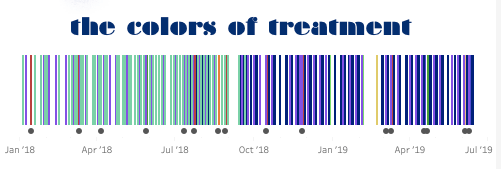
Stratified Dot Strip and Trellis Progress Slider Chart
I used another dot strip plot to show each appointment Alice has had over time, stratified by the doctor. My goal was to show two things: 1) the number of times she has seen each doctor and 2) the time between appointments for each doctor.
What is clear from this chart is there are some doctors Alice only saw once and others that see her very regularly. Additionally, while Doctor E has a wide timespan of being one of Alice’s doctors, he only saw her twice and there is a large gap between these two appointments.
The trellis progress slider chart was almost entirely designed as a result of my first choice: a small and narrow dashboard size. A trellis chart is a collection of many of the same chart broken out by a dimension and arranged in a grid where each chart is assigned an x/y coordinate, or row and column values.

I find trellis charts particularly handy when space is limited. However, they can pose challenges for adding more detailed headers and information into them, but there are tricks to combat that.
There were two other things I wanted to accomplish in this chart: 1) written summary details about each doctor and the percentage that Alice’s family had to pay out of the total treatment cost for each doctor.
This chart allowed me to create some header text as well as a visual indication of what percent the family paid. While a bar chart would have worked just fine, I wanted to minimize the ink in the chart since the header had so much.
You can read more about how to build this chart in my blog post here.
The Framing | Arrangement
Once I had all the elements in place, I was totally out of space. There was no more room to add anything else and I didn’t really want to take anything away. But there was something key missing still – a more in-depth explanation about CVI to really frame the story. I still needed to tell the audience why Alice required so many treatments by so many specialist doctors.
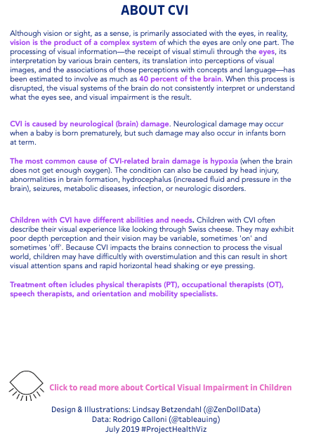
At the very bottom of the viz, is an eye, which when clicked on will reveal text about CVI, the causes, the symptoms, and treatments.

Using the show/hide floating container, the following text pops up when the eye is clicked on.
The Details | Final Touches
The goal of the dashboard was to educate people on CVI, highlight the cost of healthcare, and share the story of one little girl and her family as they navigate her needs.
The final touches included some highlight action filters and detailed tooltips. The highlight action filters aid the audience in analyzing the Gantt chart at the top since the doctor legend is a little further below.
Caveats
This approach is unlikely to be effective or needed in a business case. Typically, the analysis and visual requirements (metrics, charts, filter options, etc.) are designated in advance by your stakeholder. However, I believe that some parts of this are useful to consider. Specifically, the dashboard canvas. Knowing the size of your dashboard in advance helps you to spatially think about how and where each element will need to be placed. Using a typical grid layout is often the best approach to any business dashboard.
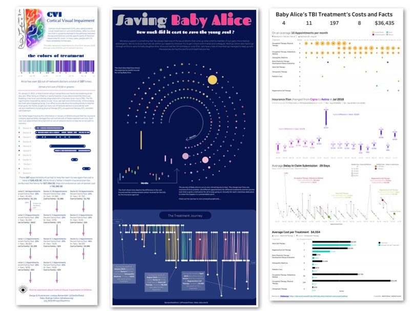
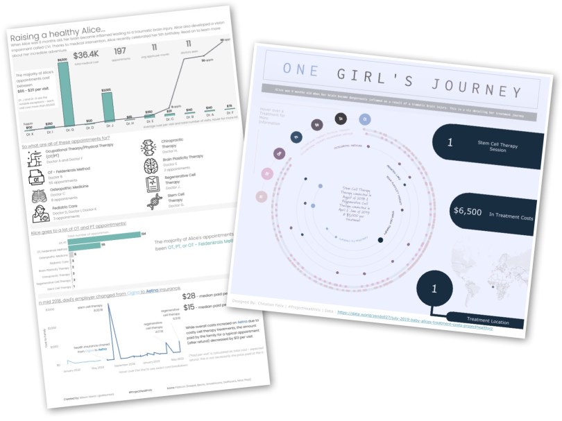
Community Submissions