

The History | Textile Roots & Stacked Bars
Many in the data visualization space use the term “Marimekko” to signify a stacked, contiguous (touching) bar chart where an additional element–width–is added to show a second quantitative variable. Marimekko is a Finnish textile brand that has patterns primarily of overlapping oversized shapes in vibrant colors–squares, flowers, and dots.
In other circles, the Marimekko is called the Mosaic Chart, which I actually find makes more logical sense when you look at it.

Marimekko charts are ultimately stacked bar charts or 100% stacked bar charts (two dimensions and a measure) with an additional quantitative variable (so now we have 2, one on the axis and one for width). One dimension can have many values (see above with multiple years), but the second dimension should be limited to two values. So while you can have more, the chart can get overly complex and hard to interpret for the same reasons stacked bar charts are hard with more than 2 dimensional values (examples: male/female, Company A/Company B, rural/urban/suburban).
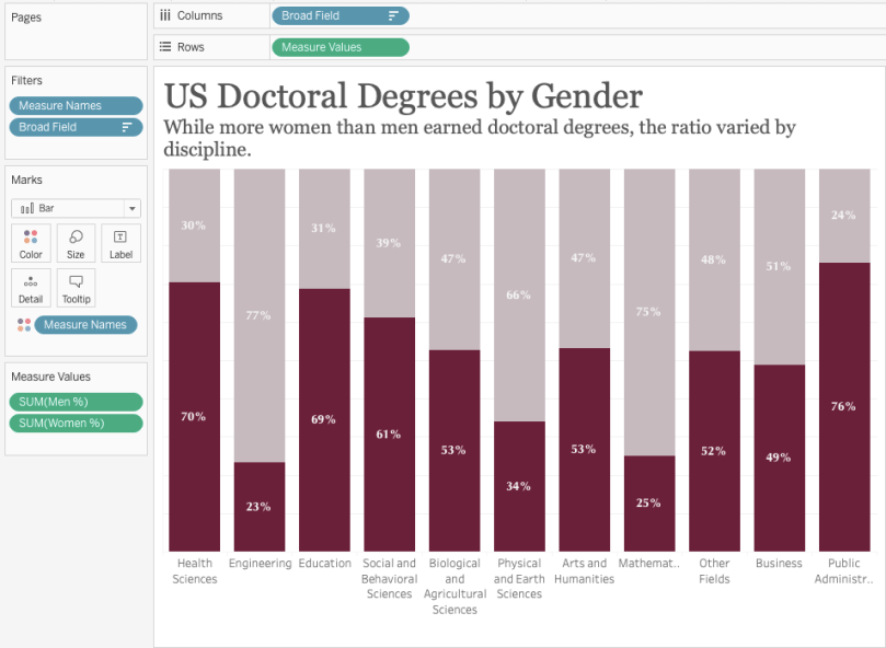
Below is a regular stacked bar chart showing the the portion of doctoral degrees for each broad field type that was earned by women and men. It’s pretty clear already that women receive most of the doctorates for Public Administration and Services as well as Health Sciences, while men dominate in the Engineering doctorates.
So you can see we have two dimensions (broad field of study and sex) and one measure (percent of doctoral degrees awarded). A Mekko chart can add in one more variable–volume, or the raw number of recipients to give each of the normalized percents a “weight”–or how big is the field really? How much does the field contribute to the overall percent of women receiving doctoral degrees?

Its Purpose | When to Use
The challenge with any non-traditional chart is that they can appear complex. Often that is just because they aren’t used very often so the average person has never seen one and doesn’t know how to read it.
Now, don’t get me wrong, I don’t think Mekko charts are the most complex at all. Talk to me about stream graphs or chord diagrams or a convex tree map–those ones are challenging for the general public to make sense of, myself included at times.
Fundamentally, charts should make data easier to understand, and if we have to explain how to read the chart to the user, then it may be too complicated.
All that’s to say, Mekko charts are slightly complicated and a little education and direction can help, but they still aren’t totally intuitive when you look at them. You have to do a little work to interpret it. So, the use case has to be very specific and very appropriate to use a Mekko chart. I wouldn’t recommend them in the workplace, especially not in a business monitoring dashboard. They take too long to interpret (I’ll show an alternative later).
So when should you use one? (and ONLY when you should use one)
- To add “weight” – If you are doing a 100% stacked bar, the values are all normalized. This means that if a dimension, such as our example with the fields of study actually has one a few raw values but a large percentage a viewer may immediately look to that data point without realizing it’s overall small. Percents are great at normalizing, but they can inflate some areas that don’t need to be. Adding a width to the bars, shows the “weight” of the dimension–how big is it really.
- You have only two dimensional values – Just like a stacked bar chart, adding more than two values gets super messy, in my opinion. Okay maybe three, but THAT’S IT! Mekko charts with multiple segments just are confusing. I mean check this one out. It may be pretty popular, but your aren’t getting any immediate insights from it. I promise.
- To give a general overview of the data – Similar to stacked bars, it becomes hard to compare values when there are multiple segments stacked on top of each other. Mekko charts can be used as a 100% stacked bar or also as a regular stacked bar. In a 100% stacked bar, it’s easy to compare just two segments and in a regular stacked bar, the purpose is to show the overall height/value of the data, not make comparisons between each. The link in the bullet above is a great example of how you simply do not have enough bandwidth in your brain to make all the comparisons you want to make in that chart.
- There are clear outliers, or variation, that should be seen – If all the weighted values are relatively the same, the addition of the width doesn’t result in a higher context to complication ratio. If there are clear values that should be highlighted so that the percents aren’t taken to mean more than they should, then the increase in complexity is outweighed by the increase helpful context.
How To | Let’s Build It in Tableau
The chart below is the same data as the first stacked bar chart we looked at earlier. The only difference is that the bars now each have a unique width to them to indicate the actual number of degree recipients and the bars are snuggled together like sardines in a can.
Ironically, that sardine on the left is taking up a lot of space. He’s gotten a good fill of plankton. However, that poor skinny one on the far right needs some food, fast!
Jokes aside, you get the point. I can tell which field actually has the most, or least, number of recipients as well as the percent of women vs. men in each field.

Data Structure
This data set was set up quite simply, which makes this tutorial also simple. A disclaimer – you data set structure may mean you have to adjust how you complete this chart. However, the concepts of adding width are the same, but the width calculation may change, especially if you need to add an LOD.
The data structure has the dimension (broad field) and the two dimensions of number (men and women) and percent (men and women).

Make The Bar Chart
First, make the fundamental bar chart. Put your categorical dimension on columns and your measure on rows. If you have one measure for your second dimension then use a table calculation to do a percent of total. In this case, I used the measure values on rows and added the women % and men % to the measure values card.
Adding Width
To add width to the bar chart we need to create an x-axis by which to horizontally “stack” the bars.
The width calculation is as follows: If the value is the first one in the partition then assign the minimum value for the measure, otherwise if the dimension doesn’t equal the prior dimension (which is everything other than the first one) then take the previous value and add the current value to it (essentially a running sum).
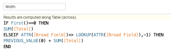
Each segment of the calculation looks like this when separated out. I find this helpful so you can see what each part actually does in the final combined calc.
- IF FIRST()==0 THEN SUM(Total) END
- ATTR(Broad Field)<>LOOKUP(MIN(Broad Field),-1)
- PREVIOUS(0)+SUM(Total)


The next few steps are as follows.
- Replace the dimension on columns with the width calculation and compute using your dimension (make sure it’s on the details shelf).
- Add your second measure to the size marks card.
- Select the size card and select “fixed” and “align right”
Clean up your formatting and tooltips and you have a Mekko chart!
Interactive version here.
Alternatives | Things To Consider
Now that I’ve shared how to create a Mekko, let me share two alternatives that communicate the same information in a less complex way.
Option 1: The Gradient Color Bar Chart
An alternate way to highlight the overall raw value of something while showing a proportion is to use color.
Below is a bar chart showing the percent of doctoral degrees awards to women only (as that is the focus of the chart’s topic so I didn’t show the other portion of males–you can do the subtraction). By adding in the raw volume as text in front of the bar, the viewer can easily see which fields have more recipients than others. Additionally, adding a continuous gradient color to the bars can visually indicate which fields are larger without distorting the function of the bars.

Option 2: The Marginal Histogram
Starting with the stacked bar again, we can add a second chart with the total value of all recipients of doctoral degrees simply by adding the Total field to the columns shelf (no need for a second chart). Then, format the row divider to be very thick and white to give more space between the two charts.
A marginal histogram

I hope this was helpful, but as always, reach out if you have questions or comments!
Cheers,
Lindsay

2 comments