

The Data
Obviously, I love Project Health Viz for many reasons. I recently shared during a presentation that health and healthcare data is something that can resonate with all of us. Health is about our mental and physical well-being. Typically, with these topics, you often have some personal relation to the data or know someone who has. Take November’s data, for example.

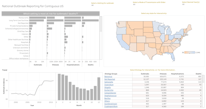
The data was from the Center for Disease Control (CDC)’s National Outbreak Reporting System (NORS). Granted, I have never been a statistic, myself, in an outbreak by actually becoming ill, but I have been exposed to the repercussions: news media discussion, increased precautions such as washing your hands, and even walking the aisles at the grocery store wondering where all the romaine has gone. Seriously. What do they do with it all?
As Sean Miller wrote on his blog, the data set was a little messy. As with any data set, or when you start a new project, it’s important to review the data and see what is contains. In this case, these were reported outbreaks, which meant that sometimes the report had additional, helpful data, and other times information, such as the etiology or setting, was unknown.
Finding and Telling a Story
This month folks really took time to explore stories about outbreaks. I, honestly, was amazed at all the interesting, and often different, stories that were generated.
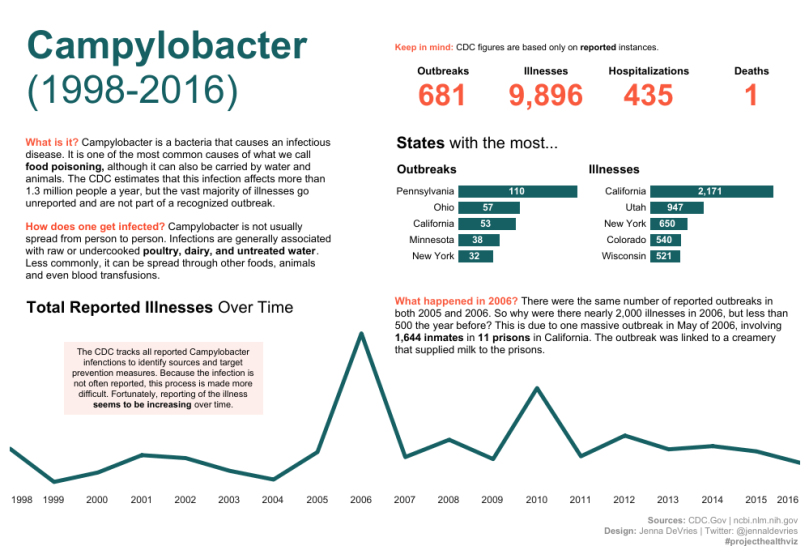
For example, one of my favorite vizzes this month was created by Jenna Devries. She found a very specific story about Campylobacter, otherwise known as food poisoning, buried in a data set of almost 42,000 rows. She framed the story with three key points: what is it, how does one get infected, and what the heck happened in 2016 where there was a spike in illnesses reported. Upon further research, she found that a massive outbreak occurred across 11 prisons in California linked to milk. How interesting!!
Aside from the enlightening story, she used a few key data viz factors that I thought were right on. 1. Large, clear title. Boom – I get it. We are exploring a disease within a time frame. 2. A story with text frames the graphs. Nice, I can follow along. 3. BANs are provided to give me quick access to important numbers. Good thing I’ll likely not die from food poisoning. Whew. I can sleep better tonight. 4. Simple, appropriate graphs. I see clearly the spike the story focuses on and the bar charts about states with high outbreaks/illnesses gives me a little more information. Shit. I am planning to move to Pennsylvania. Maybe I should reconsider. Kidding.
Themes
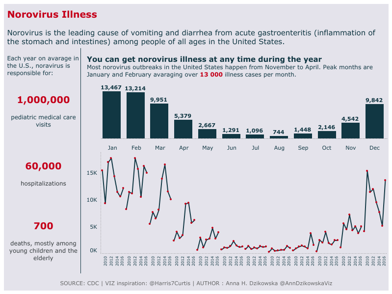
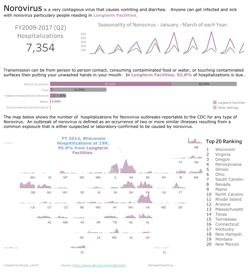
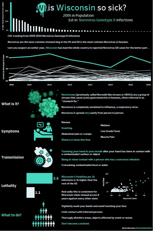
There were some themes that people found this month including a large focus on Norovirus outbreaks, illnesses in Long Term Care facilities, and some strange phenomenon that is still unknown about the cause of the high volume of Norovirus illnesses in Wisconsin, specifically in the long term care facilities. Hmmmm. Note to self, maybe hold off on visiting the cheese state.
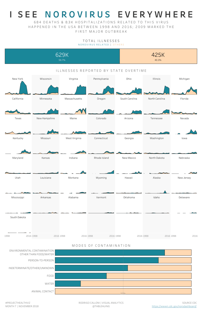
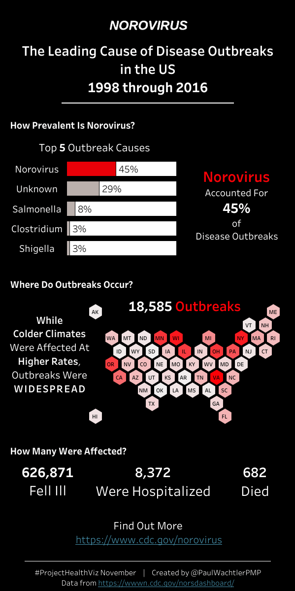
Rodrigo Calloni actually received Tableau Public’s Viz of the Day, affectionately known as the VOTD, for his Norovirus viz. Well done Rodrigo! His viz, along with Nicole Lohr, Anna Dzikowska, Paul Watchler, and (by the skin of his teeth) Zach Bowders, looked into Norovirus, but each took a different viz approach and told a different story.
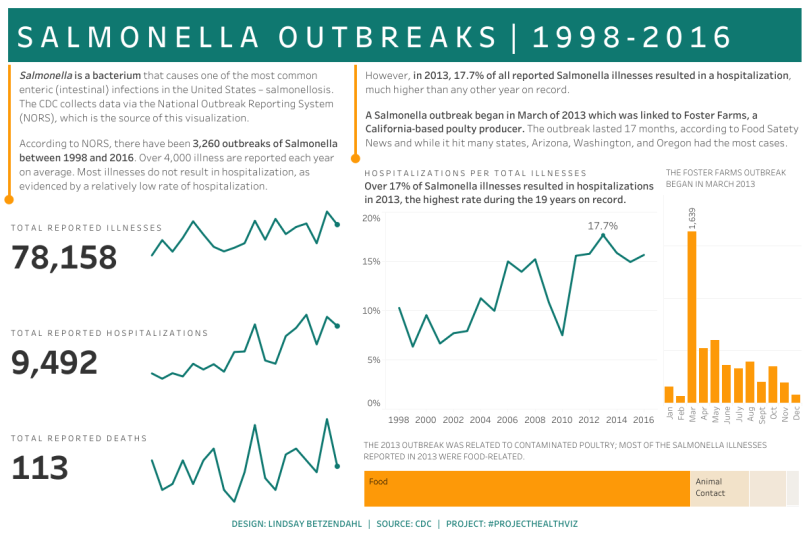
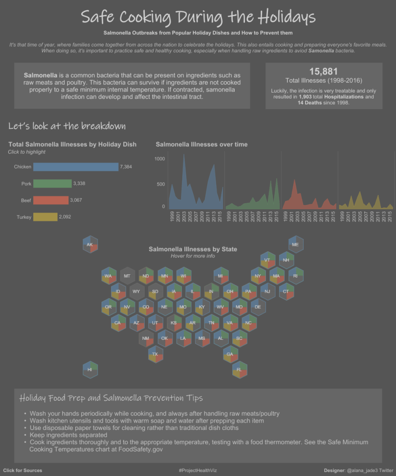
Similar to Jenna, when I was exploring the data I decided to focus on Salmonella outbreaks. When I was doing research on the topic, I learned that most people who contract Salmonella do not require hospitalization. In order to normalize the number of hospitalizations each year and the number of outbreaks, I calculated a simple percent to show me the rate of hospitalization each year. While the rate has been increasing, I saw that in 2013 almost 18% of all reported Salmonella illnesses resulted in a hospitalization.
I clearly wanted to know what was going on. I discovered that there was an outbreak related to contaminated poultry in March of 2013 where almost 23% of people who contracted the illness that month were hospitalized.
Maybe it’s just me, but finding these nuggets of information in health data is very exciting. The reality is that any of us could be impacted by disease outbreaks so for me that makes it much more interesting to become immersed in the data and seek to learn something.
You can find my viz here.
Below is everyone that contributed this month! Awesome work and thank you!


Cheers,
Lindsay

One comment