A Big Month
October was a fabulous month. In general, I usually enjoy October for some stereotypical New England reasons: it’s the start of fall, pumpkin beers are acceptable to drink, I enjoy playing football or frisbee in the yard with my son, we get to decorate for Halloween, and every few mornings I can turn on my car’s seat warmers – I love a toasty heiny!
However, the pinnacle of the month was the Tableau Conference, something I had been waiting for for two years ever since I missed TC17 because I had just given birth to my second son. I couldn’t wait to meet new friends and absorb all of the data energy.
I also had the honor of speaking at Fanalytics, the last big event at the conference, in which I shared my Tableau Community journey and Project Health Viz, which I started in May of 2018. October’s health data was the first data set since the conference, so I’m thrilled by the number of people who participated for the first time and thankful for those that have continued on this journey with me. I cannot wait to see what 2019 brings!
Quick reminder: Please submit your viz to data.world in the discussion section – it helps me keep track of vizzes Also, there is a submission tracker too, which I encourage you to use. At the end of the year, I may have a ‘prize’ for someone!
My Inspiration
October’s data came from HHS.gov and provided information about adolescent pregnancy rates by race/ethnicity. It was a simple data set and I was curious how others would approach such a simple table. For me, I used some fresh inspiration from the Conference.
I attended “A Day in the Life of a Data Analyst” by Adam Crahen and Pooja Gandhi of the DataDuo (video here), which was a fabulous presentation about some typical challenges analysts face when asked to produce visualizations. I wrote down a few new things I wanted to try in a later viz, some I’d done before and others I hadn’t, so definitely not all together. Those things were: 1) padding to create lines, 2) padding to actually create padded space, 3) a black background, 4) bright colors, and 5) BANs (Big Ass Numbers).

Creatively Vizzing
It’s not uncommon that I work backwards – starting with a dashboard concept, a dashboard size, a color scheme, or a technique I want to try, and then create the graphs and charts or find the data even.
Typically, perhaps especially in a work environment, we are given the data and then asked to produce graphs and subsequent dashboards. This is an appropriate flow – review the data, analyze the best approach for a chart type, create and clean up the graphs, and then assemble them into a dashboard.
In this case, I knew I wanted a black dashboard, with bold colors, BANs that used padding to create a line, some sort of indicator in the text BANs and a vertical title. Once I knew those pieces, I started to build my dashboard – literally choosing the dashboard size and formatting the title and color. Then I developed the graphs, tooltips, etc.
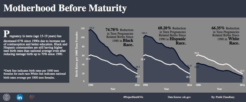
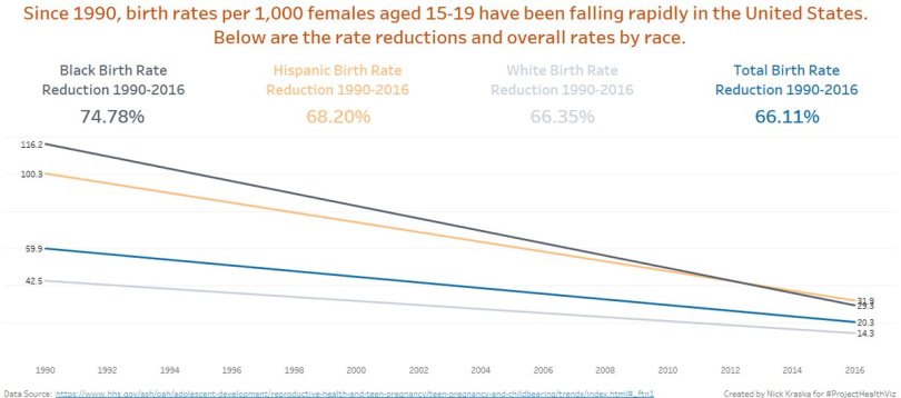
Below is my final dashboard. I enjoyed this data set because, while it was simple, it provided the opportunity to try out some new design skills when I didn’t have to focus as much on any complicated data analysis.

October Favorites
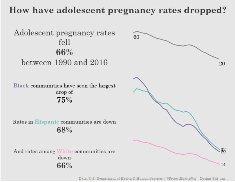
Zach Bowder
Overall impressions: His viz had an intriguing title, which immediately pulled me in to look at the data more. I also really enjoyed the dark background and color choices for this data set. The cascading subtitles was a nice effort to provide the context and overall story of the viz while also using it as an opportunity as a legend. A few other folks this month also used the colors in the title
Suggestions: I’d clean up the tooltips. I’m a big fan of tooltips and it annoys me when they are left as default. Given my experience in healthcare, I’ve found people want to know every number and often the percent change and the actual counts of people if it makes sense, or is available, for the data set. A tooltip is a great place to put that extra information.
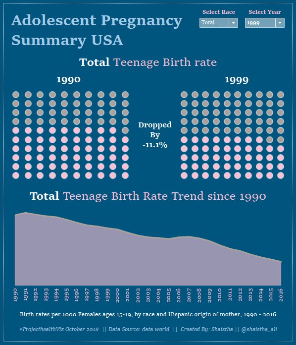
Daniel Ling
Overall impressions: Daniel set up his viz with a very clean layout: a simple font for the title with a smaller subtitle to the right (often I see subtitles below) and lines to separate the two sections. The BANs are a great way to call out key information and, again, his simple aesthetic here was wonderful. Lastly, I thought the area charts were an effective way to show this data because it helped me to see both the initial height of the data and the decrease.
Suggestions: A hex map may be a better alternative a regular map of the US so that it’s easier to see the smaller states and how they compare to larger ones.
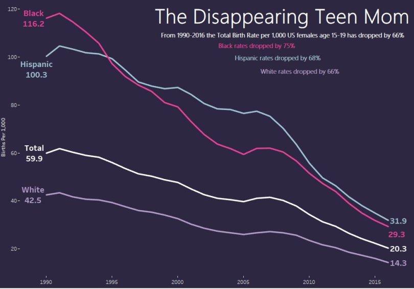
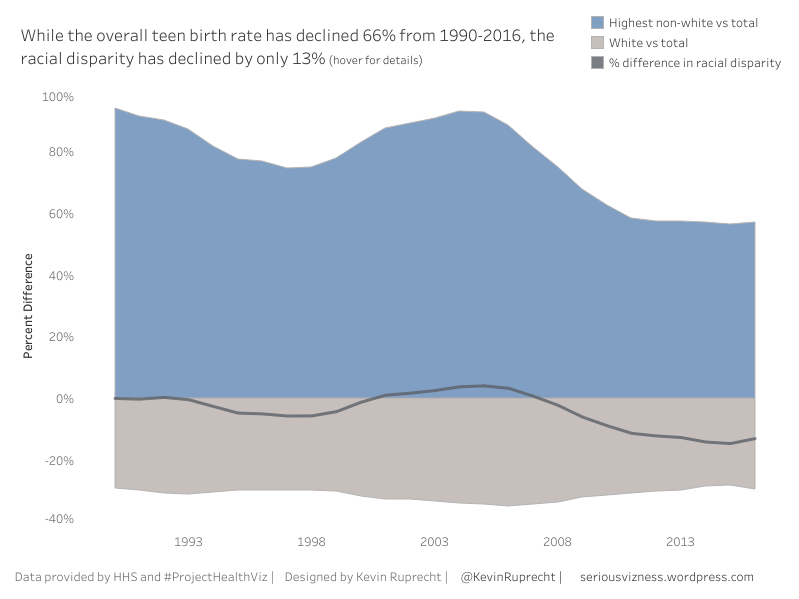
Rodrigo Calloni
Overall impressions: Rodrigo’s color scheme is spectacular. Don’t forget this important part to creating a visualization. I like how he focused on one story in the data, that about the decline in African American teenage birth rates, and used that in the title and the one data label. In the interactive version, Rodrigo also uses reference lines upon hover which then shows the label instead of a tooltip, a technique that I find effective in this viz.
Suggestions: My old suggestion is to fix the title, which says “1900-2016” and it should be “1990’2016”. This is a simple oversight and it happens to the best of us! Otherwise, I really enjoyed the entire viz.
Check out everyone’s submissions below and join in if you haven’t already. I’d love to see how you visualize healthcare data!