Into the Wild
I love finding vizzes in the wild. Sometimes it feels like I’m encountering a rare species – a viz type I’ve never seen before or a chart type I’d love to try. Think of Alex Jones‘ recent stream plot – I was like “Whoa, how do I do that?” Other visualizations, let’s be honest, leave me seriously confused. Literally, I’m like “Wait, what is that? Why, oh why?” But I like running into both types of data animals. One makes me curious about how to create it: what data would also be good for the chart type, what calculations were used, what best practices were used or, alternatively, broken? The other makes me think about what I would do differently, perhaps what are some best practices that were overlooked, or what would other members of the community do with the data instead.
It’s been fabulous to see how people can take the same data set and create such variety. Project Health Viz has been my attempt to show how healthcare data doesn’t have to be boring – that creative visuals and unique charts can certainly find room in healthcare.
In fact, if you haven’t seen the October 2018 Virtual Healthcare TUG video you should check out Dr. John Jeans talk. In it, he shows the Sankey diagram used to show patient flow! You can also listen to my talk about data literacy, which I expect to soon write a blog post about as well.
Medicaid HEDIS Data
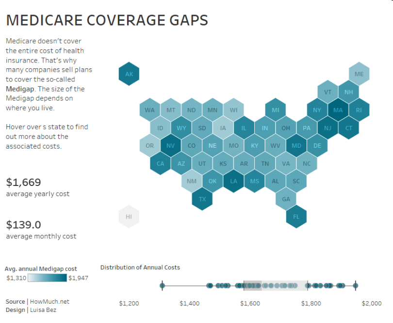
Howmuch.net recently shared this map of Medigap plan costs in the US by state. I wasn’t familiar with the gap between what Medicare pays and other expenses, such as co-pays, deductibles, and health care if you travel outside of the US. Apparently, Medicare doesn’t cover other needs such as dental care, vision care, hearing aids, eyeglasses, and private-duty nursing. This means people can buy additional insurance called “Medigap” plans. Medigap policies are available to people who already have Medicare Part A (covers hospital services) and Medicare Part B (covers doctor services).
The original viz does a decent job of showing where there are pockets of high gaps (dark reddish pink) in cost (parts of the Northeast, California, Nevada, Texas, etc.) and where the gap in cost is small (Hawaii, Oregon, New Mexico, etc.).

When to Use Maps
Who doesn’t love a map? They give perspecive to location, look like an infographic, and are often initially more exciting than a chart. However, as with any chart type, they have a purpose and while they tell particular stories, they simply cannot tell all of them.
I’m impressed because this month the original data visualization was a regular choropleth map of the US and yet many people didn’t use a map at all, or if they did they used a hex map (which I like better because then each state is the same size, which is helpful when area is not a factor in the story).
Review the Data
Just because data has location, doesn’t mean it’s necessary to the visual story. In this case, the data was regarding Medigap costs, which could be impacted by a state’s location, but it’s more likely impacted by many factors: political view of the state, taxes, spending, general socioeconomic status, region of the country, age demographics of the state, etc. It’s important to first determine if location is imperative to your story of the data.
Find Your Story
When I explored the data, I immediately saw that some states, such as my neighbor to the north, Massachusetts, had the highest Medigap annual cost. My current state of Connecticut was #6 – also high up in the ranks. Just these two data points led me to explore the costs by region.
After seeing Luisa Bez‘s #ProjectHealthViz dashboard, I was inspired to do a box-and-whisker plot to show states by region. Clearly, I wasn’t going the map route; however, I wanted people to be able to search for a state (we often visualize states in our heads by their shape or where they are on a map), so I decided I’d use a map as a legend for the regions and a highlight filter for the states.
The small map is a hex map that uses a spatial file instead of the hexagon as a shape option. There are many approaches to the hex map concept. One uses a hexagon shape and a row/column data set to plot the shapes (read Matt Chamber’s post). The other is using a spatial file which links the polygons together resulting in a very clean look. You can download the file and read how to use it from Joshua Milligan’s post here.
I guess you could say I used the map as an actual map – as a way to “find” the state in the chart below and highlight a state.

Favorites
My favorites this month were Rodrigo Calloni and Paul Wachtler!
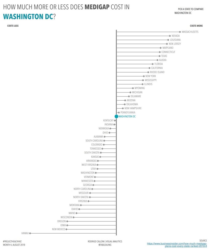
Rodrigo Calloni – I love the simplicity of this viz. I truly appreciate when people develop their own style. Rodrigo chooses fonts and colors, along with chart types, that are (in my opinion), truly his. This DNA chart is an excellent chart type for this healthcare data. Why? Because it clearly explains what the Medigap cost is for each state and ranks them accordingly. What is even better is that I can choose my state of comparison. This allows me to see a relativity to my state of choice. How much more or less do other state’s Medigap plan cost to my state? That is powerful information. Lastly, he didn’t use a map. While a map is fine for this data, I think sometimes it’s hard to not immediately think that location-based data (especially US state data) should have a map. I think this chart does a much better job than a map would have in telling this story! Excellent viz, Rodrigo!
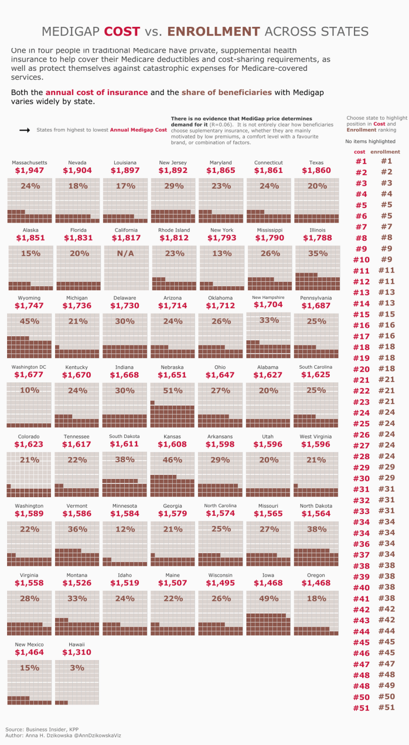
Paul Wachtler – Paul took a very different approach to this data set. Additionally, he broke some “rules,” which I appreciate. For one, there is a lot of ink here. I tend to avoid dark backgrounds, but this choice seems to work really well. Immediately when I saw this viz I thought it looked like something out of a newspaper or magazine. Paul also added some additional data on the number of Medicare beneficiaries and the percent with Medigap coverage by state. I find that this adds a bit more dimension to the viz and allows his graphical choice to really shine. The use of the state on top of this lollipop chart, of sorts, is quite creative. It still allows me to find the states I’m interested in just by the shape, but because there is an X and Y axis, I still am able to quickly make comparisons in which a map may have taken extra visual work. Excellent creativity!

Other awesome submissions by Luisa Bez, Nick Kraska, Young Song, and Anna Dzikowska. Click on the images below to view the interactive dashboards! As always, you can find each month’s data set on my Data.World site.