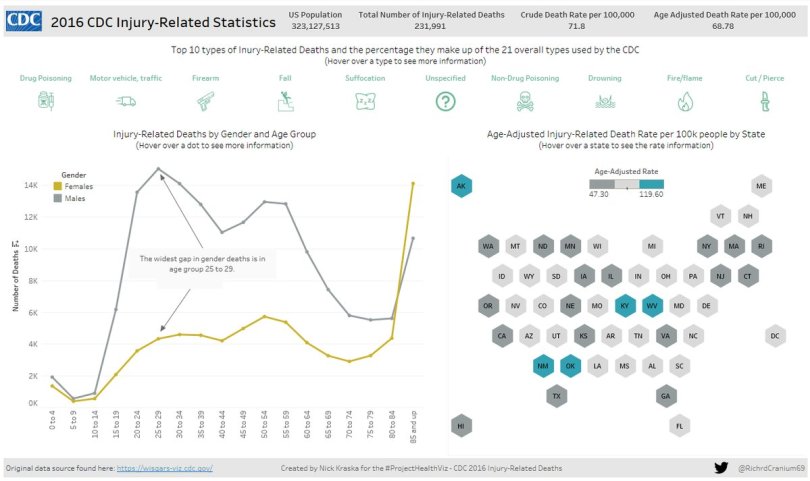
July’s data set was from the US Center for Disease Control (CDC) on causes of death for 2016. I didn’t intent to have two months of mortality data, so apologies on that!
Thank you this month to Anna Dzikowska, Nicole Lohr, Young Song, Sean Ramsdale, Ashleigh Trinh, Josh Smith, and Nick Kraska for sharing your #projecthealthviz!
Recently I shared on Twitter how I often use Google image search to find inspiration for a viz I’m working on. Usually, I search for ideas on colors or layout. In the case of this mortality visualization, I wanted color inspiration. I simply Googled “mortality infographic” and after scrolling for a bit, I came across this image below.

There are plenty of things that could be improved in this image (I’m not here to provide feedback on the viz), but what caught my eye were some of the colors (specifically the green and yellow), the title, the call out shapes, and the large BAN (big ass numbers) that gives immediate contextual data. This was enough to help me structure my dashboard.
The first thing I did was use PowerPoint to create my shapes. I saved those as image files, tiled them in my dashboard, and floated my text over them. To grab the correct colors, I used the “Pick Screen Color” option from the color palette and grabbed the exact color from the infographic image. (Can I tell you that I didn’t know that option was there for the longest time!! It’s a life saver!) The viz is quite simple, but I accomplished my goal which was to keep it concise and feel like an infographic. Below is my M3//Y1 #projecthealthviz followed by the other submissions. Thank you all for sharing your health viz love!