Two things I absolutely love about the Tableau Community:
- People’s willingness to help each other grow and learn by teaching and sharing with each other, and
- How Tableau users use data to increase awareness and access to important information to, hopefully, evoke change.
There are a number of wonderful social data projects (many on Twitter) that Tableau users can participate in. Below are a few of my favorites, but I’m sure there are more!
- Makeover Monday – A weekly data project (#makeovermonday) aimed at re-imagining and enhancing data visualizations run by Andy Kriebel and Eva Murray.
- Viz for Social Good – A project where nonprofit organizations provide datasets and details to the community and volunteers design visualizations using the hashtag #VizforSocialGood. The organization then can choose a viz to feature of their communication channels. This project was founded by Chloe Tseng.
- Storytelling with Data – Cole Nussbaumer Knaflic, author of the book of the same name, shares a monthly visualization type challenge. Participants choose their own data, but create a visualization using the identified chart-type or design bset-practice for the month. Recent charts included waterfall charts, waffle charts, bar charts, and using color and titles consciously. The challenge uses the hashtag #SWDchallenge
- Workout Wednesday – A weekly challenge (#WorkoutWednesday) where participants are given a completed visualization and are asked to recreate it. These vizzes test your knowledge of Tableau and help you strengthen your skills. Andy Kriebel and Emma Whyte have led this challenge in the past and Rody Zakovich runs it for 2018.
- Sunday Sports Viz – A weekly social project that focuses on, what other than, sports! This is lead by Simon Beaumont, James Smith, and Spencer Bauke.
- Throwback Thursday – This one I only recently discovered as it’s pretty new. It is run by David Velleca and Jonathan Leek. Each week they post a data set that goes back in history. The data is usually longitudinal spanning many years. Definitely worth checking out!
So, you may ask, if there are so many great projects to participate in, why do we need any more?
Well, the answer is simple… Or maybe not so simple. I’ve been working in healthcare for over 10 years, specifically in behavioral health (mental health and substance use disorders) at Beacon Health Options in Connecticut. Because healthcare data, and even more so for behavioral health, is often related to individuals, the data is usually protected. This makes it challenging at times to obtain access to even aggregate data. Healthcare providers are usually hesitant to publish data sets or they are unable to do so for various reasons.
We, in the Tableau Community, know that the best way impact change is provide people access to the data and to visualize it. If a picture speaks a thousand words then a picture designed from data must speak 100 times that.
We all value healthcare. We regularly Google what our symptoms mean and if we should seek professional help. We go to the doctor when we are sick. We (hopefully) have health insurance. We want our children, spouses, and friends to be healthy so we give advice and take care of each other. We exercise, eat right, and focus on our overall well-being. We meditate. We find happiness. Or some form of these concepts.
But I don’t see enough visualizations out there that help us understand health and healthcare. I see a lot of sports vizzes and political vizzes (nothing wrong with that), plus some occasional visualizations about high-profile health issues, but I think we can do more.
If nothing else, I am encouraging my Tableau Developers locally to use this as an opportunity to flex their Tableau muscles on healthcare data and play more with Tableau outside of work-related tasks.
So where do you start??
THE HASHTAG: #projecthealthviz – Post on Twitter your viz and any links to your Tableau Public page or blog.
FREQUENCY: Every month I will either publish or direct folks to the data set, likely on data.world, for you to explore and visualize. More to come on exact dates!
PURPOSE: To visualize health and healthcare data in order to increase awareness of health-related issues and to reduce stigma by improving access to interactive data.
PROJECT: Post your viz to your Tableau Public page and if you are on Twitter use the hashtag mentioned above and tag me (@ZenDollData). I plan to use the visualizations to write blog posts about the data and what people create. More to come on this!
FEEDBACK: Please email me at lindsay.betzendahl@gmail.com if you have questions, ideas or have data sets in mind. I’m always interested in any health-related data set that may be out there!
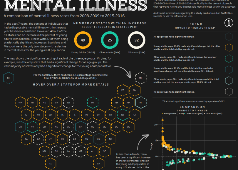
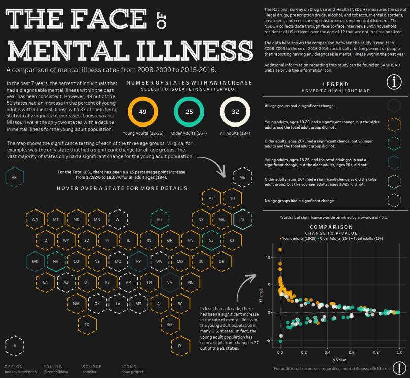
DATA: As I learn to navigate data.world I will post the data there. Here is the first data set for the project: US State Percent of Mental Illness in the Past Year and the original source is located here.
I hope you join me in my journey and adventure in visualizing more healthcare data!
#healthcaretableau
#projecthealthviz
#visualizeheath
#teamtableauhealthcare
Below is my viz for the first data set. I can’t wait to see what others come up with!!

7 comments