

What the Heck and Why?
For the past five years as a consultant at HealthDataViz, I have worked with a client, The Donaghue Foundation, to design and develop infographics for their annual reports. Historically, these reports were physically printed, such as shown below for the 2021 annual report.

However, in 2023 The Donaghue Foundation wanted web-based interactive infographics for the 2022 report. The engagement included the development of eight (8) infographics – one for each of the seven (7) grantees and one summarizing their Opportunity Awards and the drivers required to achieve high-value, equitable health care – seen in the image below of the final infographics.

However, what is important to know is that the idea sprang from a particular constraint: Make an interactive visualization without data.
The final of the eight (8) dashboards visualized, several main goals and the subsequent tasks by which to achieve each of the goals. For the client, this consisted of five (5) categories, or “primary drivers”, and the 3-5 “secondary drivers” within each category. The information I had was only categorical (basically like Category and Subcategory in Superstore) and didn’t have values that could be easily displayed in common charts or graphs. However, I needed the infographic to feel like it was data-driven and be interactive like the other infographics I created for this project.
I won’t reiterate the whole story here because you can read all about my design iterations and how I landed on creating this exploding pie chart on HealthDataViz’s blog page [link to actual post to be updated soon!]. I do suggest you go read that and then come back to understand how to build it as it will give more perspective on why I chose to build this chart and how it came to be.
The result was a sort of “exploding pie” chart that showed each “primary driver” and upon hover broke it down into its parts – the “secondary drivers” with the name in the tooltip. You can interact with the final dashboard here.
Okay – so how do we build this thing? Well, it’s not a pie chart at all actually – it’s a coxcomb chart. Coxcomb charts require the polygon mark type in Tableau and I had built one previously when I documented a week’s worth of my son’s poor sleeping after we had moved to a new home, so I knew where to start, but had to modify the concept a bit for my new need.
A few things to be aware of if you are considering building this:
- This example assumes the main slices are all the same size.
- The build shows each primary category with the same number of secondary categories, but you can adjust this in the data.
- This chart isn’t a best practice for decision-making and was created for creative purposes.
- This is a template so I don’t go into detail about all the math behind the scenes here.
Data Set Up
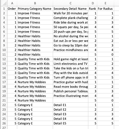
Setting up the data is pretty simple for this build. You will need five (5) fields:
- Order (Integer, discrete): This is the order you would like the slices of the pie from and clockwise.
- Primary Category Name (String): Name of each primary category (e.g. Get Healthy, Be More Active, Read More Books)
- Secondary Detail Name (String): Name of each secondary detail (e.g. Run for 20 minutes daily, Eat a piece of fruit each day, Read 5 books this quarter). Note that you will need the same number of rows for each category, but if one category has fewer secondary details, then this will be blank.
- Rank (Integer): Order of each secondary detail. Note that even if there is not a secondary detail, keep values for this field.
- For Radius (Integer): This will match the Rank field unless the row is blank for the secondary detail, then this value will be 0.

You can certainly add more or less slices, just make sure to keep the number of rows per primary category the same and use the blanks/nulls instead. Here is an example of how the data would look if some categories had less secondary details:
Download the template workbook from my Tableau Public page, load in your data and swap out the current data set for your updated dataset.

While the data source should easily replace with yours, it’s worth noting that in the data source pane the data table is unioned to itself to duplicate the data. This is what creates the “Table Name” field and that field is used to create the “Points” field.
Additionally, if you have more or less primary categories, update the values in the parameter to match the values from the Order field. This field doesn’t automatically update because we need the added value of 0 to also be present.
Additionally, the axes have been fixed to ensure that the center point of the circle remains at the center and that there is enough space for the “explosion” to happen without shifting the chart. You may need to adjust the axis ranges if you have more or less secondary detail values.
Now that you have your data loaded, you should have something that looks like an evenly segmented pie chart.
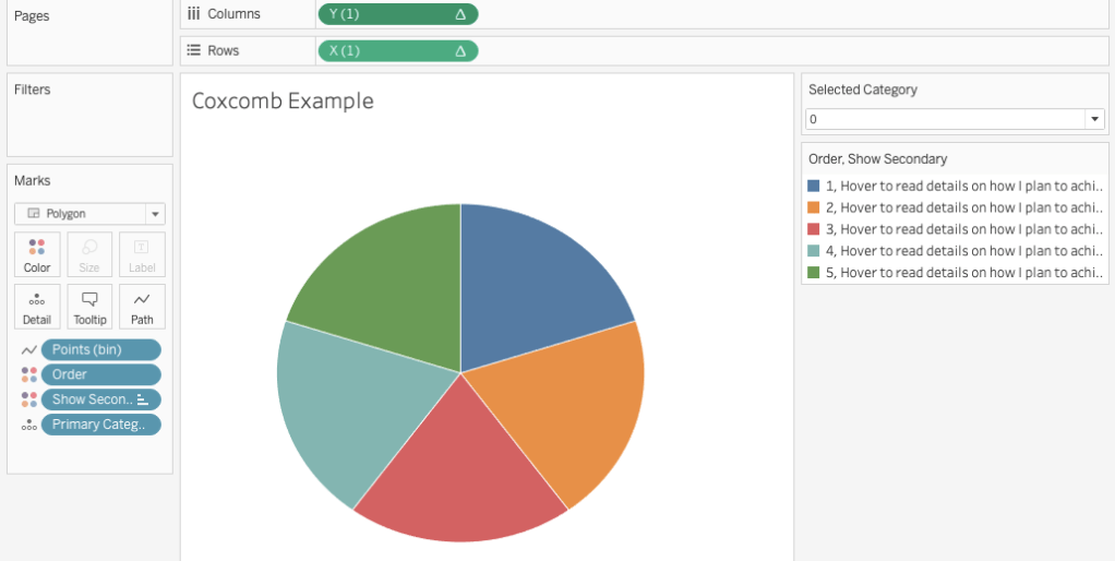
The fun part comes when we introduce a parameter action.
Exploding our Chart
On the template worksheet, you will see the parameter action drop down. If you change the value from 0 to 1, the slice of the pie will split into the secondary details. However, because color is assigned to both the primary category field and secondary details field each segment gets a unique color which is quite over whelming!

You will want to change the individual colors to something pleasing. I’ve used shades of the primary category color in my template example. Go ahead and change these individually (a bit tedious, I know) by selecting each parameter value and then adjusting the colors.

Parameter Action
The final step is setting up your parameter action. Now I’ve already done this on the template, but I’ll explain it anyhow. While can set up actions on a worksheet or dashboard, we will set the action on the dashboard as that is where this worksheet will live.
Once the worksheet is on the dashboard, go to Dashboard – Actions and select “Add Action – Change Parameter”. You can name it whatever you want, but the Source Sheet will be the one with the exploding pie/coxcomb, the Target Parameter is the “Selected Category” parameter, the Source Field is the Order field (aggregation doesn’t matter), and Clearing the Selection will “Set value to 0”. You can set to run the action however you wish, but I have it set to run on Hover currently.
You can download the template file here from my Tableau Public page. Reach out with questions!
Want More?
Check out my Movies + Data viz on Jim Carrey that also features this technique and my recent Happy New Year viz. Enjoy!


I love an exploding pie!
<
div>
Sent from my iPhone
<
div dir=”ltr”>
<
blockquote type=”cite”>
LikeLike
You’ve got a field called Table Name that seems to be integral to drawing the rings. It drives the Points field. Yet, I do not see mention of it in your post or any explanation on how to substitute the Points(bin).
LikeLike
Thanks for the feedback. Replacing the data source should still bring in the table name. However, to answer your question, the table name field is a result of a union of the data source table to itself within the data source pane, which is what drives the points, as you pointed out.
LikeLike