

In my 8+ years using Tableau, I’ve probably attempted to create most of the well-known and even obscure chart types. I’ve made radar charts, radial bar charts, Sankeys, coxcomb, bar charts, line charts, scatterplots, box and whisker, barbell charts, 3D bar charts, radial polygons, beeswarm, Marimekko, plum pudding chart, you name it. I also, once, made a sunburst chart in an effort at a previous job to create an organizational hierarchy, of sorts – showing layer of the organization (department) and then who fell into each department (C-suite, management, clinicians, etc) and even who people reported to. However, I never created one for public consumption as there really was never a use case I had…. Until recently.
I’ve been collecting my sleep data for the past year ever since I received an Amazon Halo tracker for Christmas 2020. I’ve always been interested in sleep. In fact, my Iron Viz for 2020 (prior to receiving my Halo) was on sleep. I collected data for 2 months on my sleep time using an old tracker I had, but the process of retrieving the data was manual as I couldn’t export it.
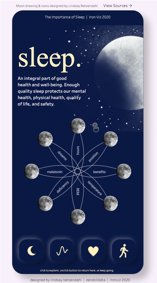
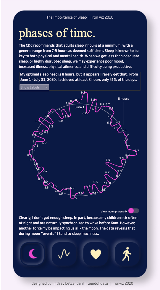
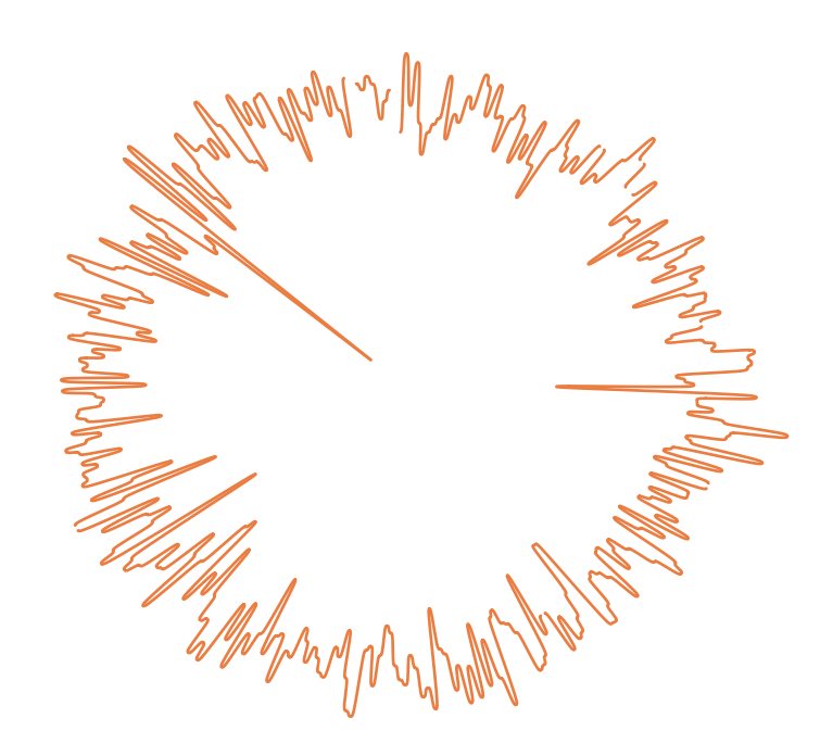
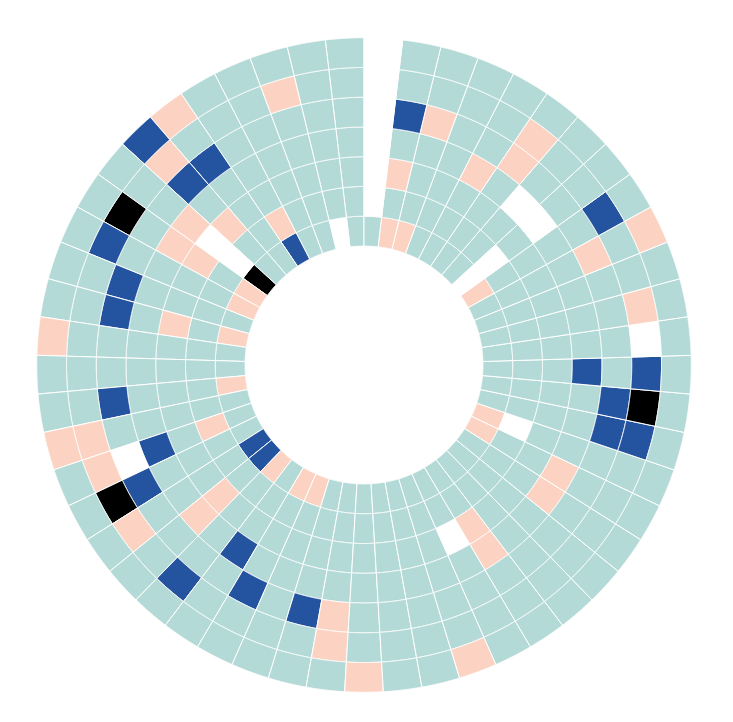
The New Year just started and I was excited to explore a full year’s worth of my sleep data. I quickly brought the data into my old Iron Viz submission to create the rounded radial chart as you can see in my entry above. It ended up looking like this below. While interesting (it does show the ups/downs of daily sleep and a few outliers), it didn’t give me the quick analysis I was looking for.
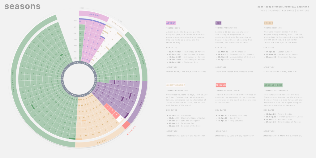
After mulling around a bit on how I would visualize this data, I saw an amazing calendar viz by friend, and talented data visualizer, Christian Felix. The focal point of his viz was a large sunburst chart displaying every day of the year. Suddenly, I realized that this would be an excellent way to visualize my sleep data as I could easily categorize the hours of sleep I got and show that with various colors. I expected that I might see some patterns across days of the week in this circular format.
Christian utilized Zen Master Ken Flerlage‘s sunburst template to get started. Ken’s template can be used for any type of sunburst and gives you some flexibility to even change the width of each ring or separate them apart with padding. This could have been useful for my organizational hierarchy I did back in 2017. However, I didn’t need that level of detail because I needed each ring to be the same size without padding to replicate a calendar. So I took Ken’s template and modified it just slightly to accommodate my needs. Then I just added in my data and viola! I had my sunburst.
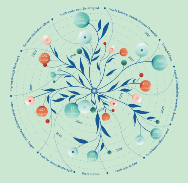
To finish up the viz, I was inspired by an image I came across on Behance. This gave me the idea to layer in some key dates over the sunburst. Using Figma, I created some flower-like illustrations and bubbles similar to the image below. I also utilized colors from this image in my viz as they really felt calming. Note that I had searched a lot for colors to use that represented “sleep” but none felt right. It wasn’t until I saw this image that I felt a sense of calmness and peace that seemed to represent the concept of sleep for me. Using the Arc plug-in in Figma, I was able to create the months around the sunburst and add in the details as mentioned.
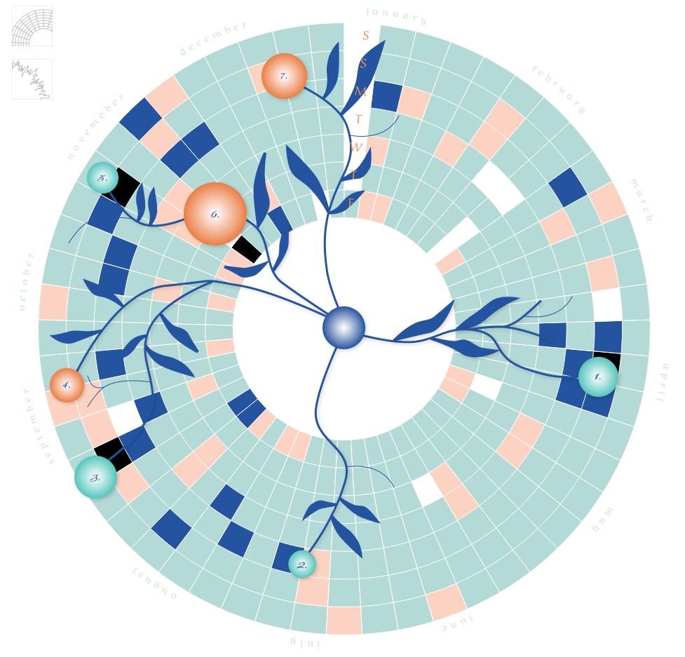
In order to make the Tableau tooltip functionality work, which I definitely wanted, I utilized an old, simple technique of layering worksheets. I placed the sunburst chart in the back with the Figma image on top and then added a copy of the sunburst worksheet with no color or borders on top. This allowed for the user to interact with the viz, while maintaining the image which otherwise would obscure the tooltip interactivity. A bit like an image sandwiched between two identical worksheets. The key is simply to make the two worksheets the exact same size and placed at the exact same x/y coordinates on the Tableau dashboard.
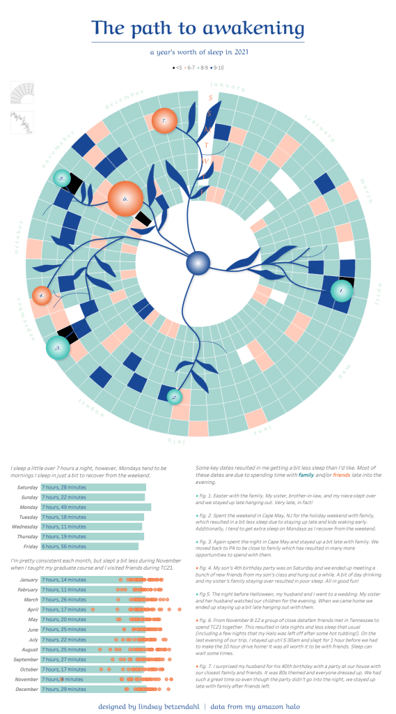
After that, I added in some details and explanations at the bottom of the viz. I also didn’t want to lose my previous curved radial chart, so I used a simple parameter action to swap the sheets so I could still access that view. Because there are so many data points, I didn’t want the labels visible, but I wanted to still have that option to view them. I used another trick that I’ve written about before, which is a method to hide a filter or parameter selection until it’s needed. Meaning, I didn’t want the “show labels” parameter to be available unless the radial chart was selected.
The final views look like this. I hope you check out the interactive viz and check out the Part 2 which has the tutorial to create an annual sunburst chart!
Cheers,
Lindsay

Love this! Nice job.
LikeLike