

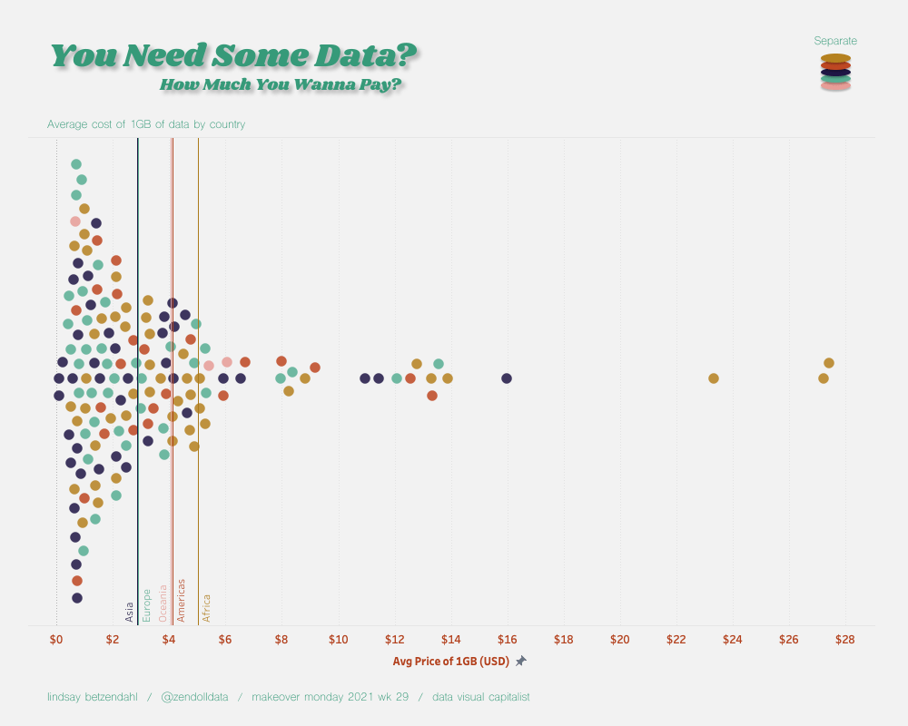
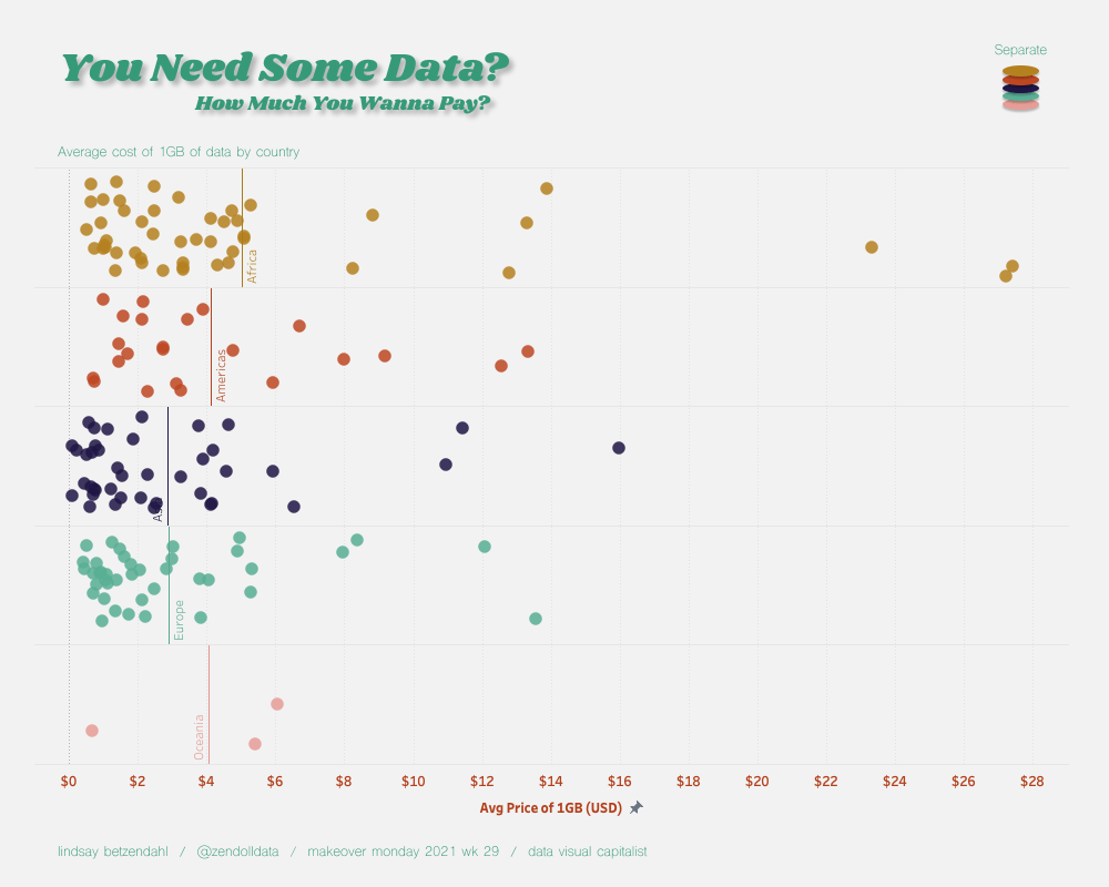
Using a 2021 MakeoverMonday data set from week 19, I created a simple viz that utilized three useful techniques: a background image made in Figma, a beeswarm plot created without calculations, thanks to James Trimble and a Twitter thread with Takafumi Shukuya and Agata Ketterick, and parameter-driven chart changes in one worksheet.
Background Image in Figma
After reviewing the data and deciding on a dashboard size (simple and standard 1000 x 800), I went to Figma to create a background and explored Dribbble for some color ideas. Since data usage is a more modern luxury, I thought it would be fun to use a retro color palette to simply juxtapose the topic.
Yes, I could have simply made my dashboard a light gray and added in two or three text images in order to obtain the font I wanted and a shape image for my parameter select in the upper right corner. But you know what? I like to be efficient, so one image was faster to export and import than 4.
If you haven’t seen my Top 10 Tricks to Intensify Your Business Dashboards presentation, then you should check it out. My first trick is how to create a perfectly sized background image and how it’s necessary to remove two layers of padding to get it to fit just right.
Beeswarm Generator
As I mentioned, I wanted to create a beeswarm chart for this data. There is a great, and simple method that Ken Flerlage has written about using a few calculations to obtain the chart. I’ve actually used this method before, but when I stumbled on this Twitter thread, I was extremely excited to try out this other method.
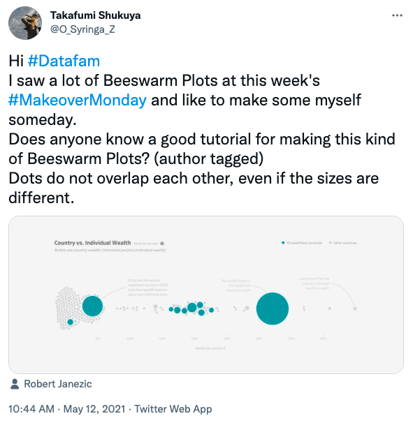
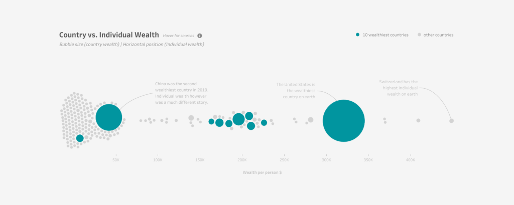
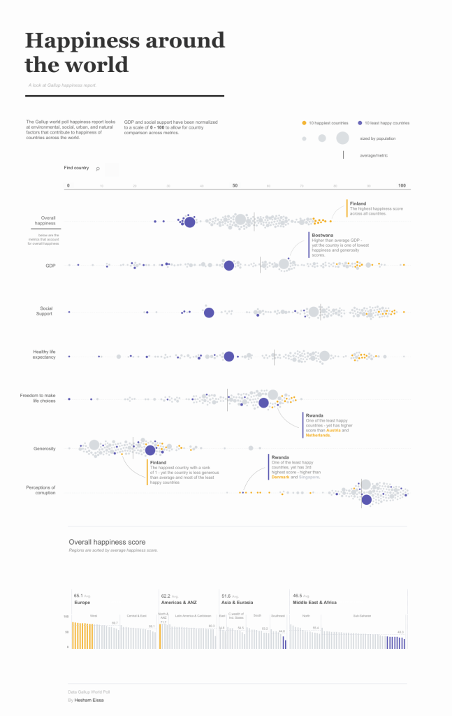
I’ve seen a few very beautiful vizzes that use other data prep or software to achieve this variable sized beeswarm. Robert Janezic and Heshem Eissa each have one that you certainly should check out.
James Trimble created two wonderful resources where you can copy in a csv data file and select what measures you want on your x-axis and which to be the size of the circles.
Single-sized circles: https://observablehq.com/@jtrim-ons/beeswarm-layout-generator/2
Variable-sized circles: https://observablehq.com/@jtrim-ons/beeswarm-layout-generator
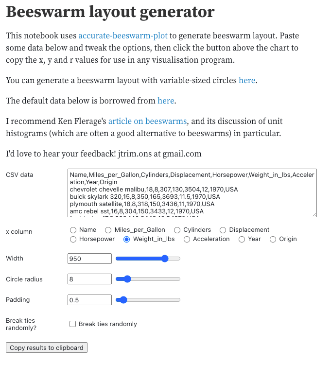
Using the single-sized circle generator, I copied in the “Cost of Data” data set and set the x column to the “Average Cost of 1GB” measure. You can change some of the look and feel of the circles as needed. I then copied this data into my Tableau workbook.

Now that I had the beeswarm, with color on region, I decided that I wanted a second view where the user could separate out the data by region so additional analyses could be made. I could have a done a sheet swap with two worksheets, but I decided that this was a situation where a simple calculation and a parameter would make this a reality.
One Sheet, Two Charts
So while I liked the look of the beeswarm, I wanted a regular jittered plot separated out by region as well. In order to accomplish this second view in one chart, I used a few calcs and a parameter.
I first created a “Swap” boolean parameter (true/false) that would act as the driver to the changing chart. Next, I created a calculation called “Axis Change” which would change what was plotted on the x-axis. If the Swap parameter was true, then show the Y value from the beeswarm generator, otherwise use a random placement.

Then I created a “Region Change” calculation that would add in the Region dimension when the Swap parameter was true but nothing if false.

Now, when the parameter is true the chart will display a beeswarm without Region, but when false the chart will be a jitter plot stratified by region.
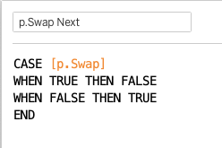
I then hooked up the parameter using a swap technique (also discussed in my Top 10 Tricks to Intensify Your Business Dashboards presentation). For this, I created a p.Swap calculation (just has the parameter field in it) and a p.Swap Next calculation. In a new worksheet, I put p.Swap and p.Swap Next on details and set the mark to a blank shape (if you want different shapes, you can put the p.Swap on shapes too).
Back on the dashboard, I set up a dashboard parameter action with a source sheet of my button worksheet, the target parameter is my Swap parameter, and the field is p.Swap Next. This will cycle through my two charts when the button is selected.
You can see the full viz in action here.

One comment