

If I’m honest, I do love a good simple business dashboard. One that delivers quick insights to executive clients. Yes, of course, I also really enjoy the highly designed and beautiful visualizations I see on Tableau Public most of the time. Full of custom images, interactivity, curvy lines, and creative complexities.
While there are some very important aspects to consider when developing a dashboard for someone in the C-Suite (your CEOs, CFOs, CIOs, etc.), there are also still opportunities to be creative in your dashboard design and ensure that the dashboard is both worth looking at from an analysis/insight perspective as well as a design/user experience perspective. As the saying goes, “business dashboards don’t have to be boring.”
But before I get into the gentle and deliberate integration of your “typical” business dashboard with some more modern and artistic design ideas, let’s get out some basic points that you should consider whenever developing a dashboard for an executive.
(Note: You can also check out Sean Miller’s recap blog post on January’s c-suite dashboard challenge here.)
#1. Consolidate onto one dashboard
Executives often don’t have much time to invest in diving deep into a dashboard, like perhaps a mid-level manager or analyst does. This means it’s important to reduce the number of clicks that someone needs to make to get to the information. It’s best to keep the data to one dashboard, if possible, for the summary. This means that if your executive has less than 5 minutes, they can get all the information on a single screen. This is also helpful for possible presentations the executive may have. They can pull up the dashboard or print a PDF of the view and be able to share that with others. Of course, additional drill down reports can be created to provide additional details when needed, but the key is that all the metrics that may summarize the data are on one dashboard page that is easy to consume.
This submission by Imad Hamouchi is a great example of a dashboard that has all of the information necessary on one single, condensed view. He even added in a download button to the top right so the executive can download an image quickly.

#2. Keep it high-level
Folks at the top often have the highest perspective of an organization. I had an old supervisor who used to tell me that sometimes you need the 10,000 foot view – meaning if you spend so much time in the details you may miss the larger picture. The role of the C-suite is to have that larger perspective on an organization and know what is going on in totality so they can respond and inform the correct people who are more “in the weeds” to do something. This means that it’s not going to be helpful to show an executive in a dashboard all of the data. They just need what is necessary to make decisions and understand what is going on in the company at this high-level.
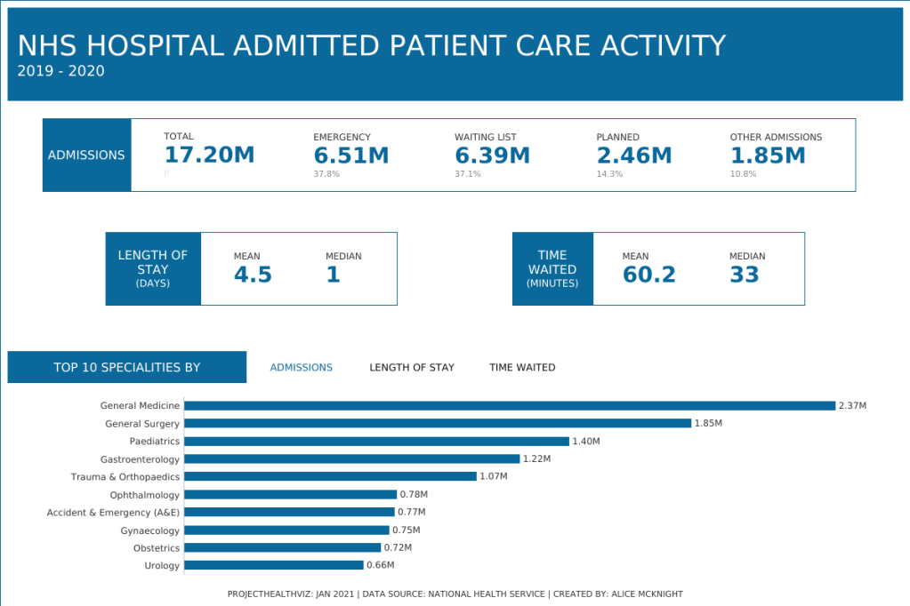
One way to accomplish this is to use high-level aggregation of metrics. For example, instead of showing the total sales for every sub-category, just show the total sales for the three categories. Additionally, display only the necessary information, such as just the top 10 items, instead of, say, all 50 will help an executive see the most important (or perhaps most valuable) items to focus on. The small slice of the data will depend on your stakeholder, so it’s important to understand what they need to see at a high-level and which slice of the information (is the bottom 5 more important to see than the top 5?).
Alice McKnight, in her submission, uses big numbers to summarize the data in the top portion of her viz. At the bottom, she shows only the top 10 specialties by each of the three metrics.
#3. Use grids and enclosure to organize
I certainly have OCD tendencies (Side bar: I get very distracted when things aren’t in their place and I may move something millimeters just to get it right. I organize my clothes by type and color. I clean my house incessantly.) and find joy in well organized dashboards. This means that each element better be aligned, straight, and in an organized fashion that makes sense when viewing from left to right and top to bottom.
I write in the book I recently co-wrote with my colleagues, Kathy Rowell and Cambria Brown, that “people typically view screens in an F-shaped pattern, working in a horizontal flow from left to right, then top to bottom, and covering less horizontal distance the further they get down the page.” I also mention that you can organize a dashboard in columns, like what Eric Balash does in the dashboard below, which will direct people to view the information in the left-most column first top to bottom then move to the next column and read top to bottom again.
The use of a menu panel on the left, followed by big numbers (or BANs), and then a well-organized grid of the charts is an excellent dashboard layout. Additionally, in the interactive version of this dashboard, the menu page is defaulted with the “Menu” and “Dashboard Information” closed. I think this is a fantastic choice for an executive dashboard. Why? Well, because when an executive comes to the dashboard, the first thing they will naturally see is the menu as it is on the left and is a dark color. However, we want them to look at the charts first then decide if they need to go to another dashboard. In order to direct attention to the charts first, having the menu collapsed helps to divert attention to the charts. Yes, there is an extra click to view the menu, but I think this is a good design choice for a c-suite dashboard. Most important data first, then the extra stuff.

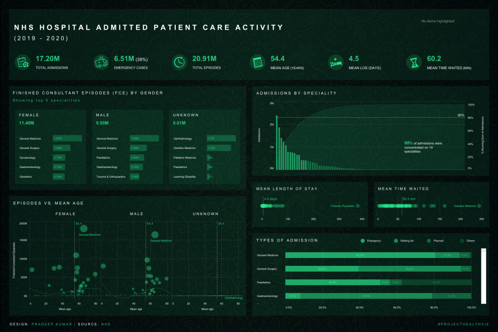
When using a grid layout, using color or borders to enclose charts or groups of charts can be effective in ensuring your user knows what charts “go together”. Eric uses “cards” to separate each chart with a white background over the light gray dashboard color. Pradeep Kumar G uses double layers of color in his view (below in section #6) to group the three bar charts on the left to indicate that they belong together and should be analyzed as a group.
#4. Interactivity should be minimal
As I’ve mentioned, the C-Suite is a busy group of individuals and while they may love their data, they need to be efficient with their time, which means we, as the developer/designer are required to balance what they want with what is quickly consumable. This means limiting the interactivity and filters on a main-level dashboard for an executive. Even if they want every filter under the sun, we probably should steer them away from that level of detail and interactivity.
It’s important to consider the “type” of interactivity too. For example, a drop-down filter requires a few clicks (one to open it, and another few to select options). When you do add interactivity, consider the method of the interactivity and if there is a way to make it very easy for an executive to execute.
In Sean Miller‘s submission he uses simple highlight actions to allow the user to hover over a speciality in the dot strip plot and it will highlight in the charts below. Additionally, there is a menu button in the top right which opens up a window containing a bar chart of all the specialities and an option to change the “top N” value. There is some customization options, but it’s not overwhelming and it’s simple for the executive to use.

In my visualization, I also kept the interactivity minimal by using viz-in-tooltips to show more detail (this doesn’t require any clicks!) as well as a simple parameter action to allow a user to select a type of admission to change the chart. Having the categories exposed in text is much faster than a drop-down parameter (in this case) because a user knows all the available values right away and can easily just click once to change the view. You can view my explanation of how to accomplish this in this “Monday Mini” visualization.
#5. Use color to say “look here”
Another way to ensure that information is consumed quickly and accurately is to draw attention using color. When an executive only has a few moments, color can help them identify the most important things to look at first. In Eric’s viz above, you can see that he uses a teal color to identify certain bars to look at. Sean also uses color to highlight the top 10 specialities helping a user quickly hone in on perhaps the most important items. Because our eyes are drawn to color that is different than the surroundings, we naturally will look to the color first. Again, this is very helpful to direct an executive to the data that requires action, is of concern, or is simply the most important.
#6. Consider simple charts for fast analysis
Some charts such as bar charts and big numbers are much faster to analyze and interpret than charts such as radar charts, small multiples, or even stacked bars. Use simple chart types that allow an executive to understand the data quickly and with accuracy.
Pradeep Kumar G uses simple BANs at the top followed by a series of three bar charts. Each of these charts can be understood extremely quickly and almost “at a glance”. He uses the Pareto chart, which while used infrequently is highly effective and people probably should consider using it more often. This is a great way to show an executive the values with the most impact – which specialities make up 80% of all specialities. Instead of just showing those in a filtered bar chart, the Pareto allows the user to also see how small the remaining dimensions are and even hover over them to see what they are. Dot strip plots are one of my favorite chart types and I also think these are great to show overall clustering of values and outliers. Again, these charts are meant for an at-a-glance view – we can quickly see the average values and how the values are distributed.
#7. Add short explanations and directions
You may think, my executives are smart, they don’t need hand-holding or directions so why do I need to add in explanations and such? Because you never want to assume that someone is as well-versed in the intricacies of your dashboard as you are. Where you added a lovely hover action filter or a fantastic “click to drill down” action or a beautiful viz-in-tooltip, someone else may completely gloss over and miss the opportunity to see what you created and fully interact with the dashboard.
I think it’s a best practice to add in small headers beneath the chart title explaining any important details about how to interact with the chart. For example, if there is important information in the tooltip, then simply write “hover for more details”. If clicking on a bar, like in Dennis Kao‘s viz, triggers an action filter, then write “click to filter other charts”. I love that Dennis added not only that the user should click a specialty to filter, but also how to select multiple bars and how to deselect. Again, while this seems intuitive to those who use Tableau often, it may not be to someone who uses a dashboard infrequently or just isn’t used to the action. Helper text certainly doesn’t do any harm and when small, or grayed out just a bit, it can provide details without being distracting in your chart titles.
Dennis also adds in some small definitions at the bottom of the viz. If there is room, adding footers can be helpful to eliminate those first 1 or 2 questions someone may have on a viz. Ideally, you want someone to be able to answer their top 10 questions and not have to come to you for more information. Adding either a small glossary, as Dennis did, or a pop-out window that has more information, definitions, or methodology, can help your user get all their questions answered within the dashboard.

Conclusion: Pulling it all together
In my submission for this month’s #ProjectHealthViz, I not only wanted to show all the aforementioned aspects of a good c-suite dashboard, but I also wanted to show that business dashboards can still be fun – specifically can have custom background images if it works with your client/executive.
I created a background image in Figma, which creates a nice calming frame for my dashboard. I have simple menu buttons on the side, but default the dashboard to the KPI page, which only has high-level summary metrics and little interactivity. As mentioned, I’ve added in some quick helper text such as “hover below” and a hand pointed icon to direct a user to select an admission type in the bar chart on the bottom left. The selections are single clicks and the user can see all the options, rather than any drop-down filter. The charts are simple (BANs and bar charts) but I added in some viz-in-tooltips to provide some high-level additional details with only the top 5 specialities listed in the tooltip. I’ve organized the dashboard into rows – the top two having the high-level BANs and the bottom row with the bar charts that provide a bit more detail. Lastly, I have red reference lines to draw attention to the above/below the total average for each metric.
You can use all these techniques to create a dashboard that is easy to use, engaging, and delivers value and insight to your executive all while still making it beautiful and fun!

I hope you found that summary helpful! Thank you to all the other people who submitted this month. You can see all the submissions via the #ProjectHealthViz tracker.
If you want to participate next month, be sure to check out the data page for details.
Cheers!
Lindsay

Very well said, Linsey. I often think about my audience when creating a dashboard, building a report, etc., “what I must know right now, what I should know, and what I should consider.” While all the colors are beautiful, but they can be distracting if there’s too much. Thank you for pulling everything together so fluidly!
LikeLike
Very well said, Linsay. I often think about my audience when creating a dashboard, building a report, etc., “what I must know right now, what I should know, and what I should consider.” While all the colors are beautiful, but they can be distracting if there’s too much. Thank you for pulling everything together so fluidly!
LikeLike