

If you’ve used Tableau before, you likely have noticed two fields in italics that are not from your data source. These fields, Measure Names and Measure Values, are auto-generated and can help visualize multiple measures from your dataset together a single chart.
When is it useful, or even necessary, to use these two fields? Let’s first get a good handle on what these two fields are and what they can and cannot do.
About Measure Names and Measure Values
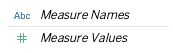
Measure Names is a field that contains the names of all the measures in your dataset represented as a discrete field. The Measure Values field similarly contains all measures in the data and displays as a continuous field.
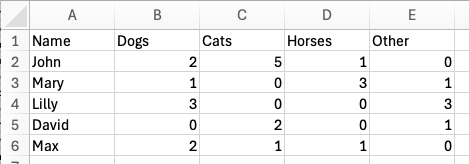
For example, I have a dataset with one dimension (Name) and four measures (Dogs, Cats, Horses, and Other). Each row is a person, and the values in the measure columns represent the number of each animal they own. John has two dogs, five cats, and one horse, for a total of eight animals.
If I double-click on Measure Names, Tableau will automatically create a table with both Measure Names and Measure Values (Figure 3).

We can see that Tableau has collected the names of all the measures into the autogenerated field “Measure Names” and placed “Measure Values” on the text mark. Below, we see a new card with each measure field, including any calculations I’ve created. You can easily remove any field from the Measure Values card to display only the ones you need.
Using Show Me, I can quickly create a bar chart that displays the four primary measures (the sum of each animal).

What happens if I want to add the Name to the view to see this data by person?
Now we can see each person, such as David, and the number for each animal type that he owns. David has three animals, two cats and one other animal.

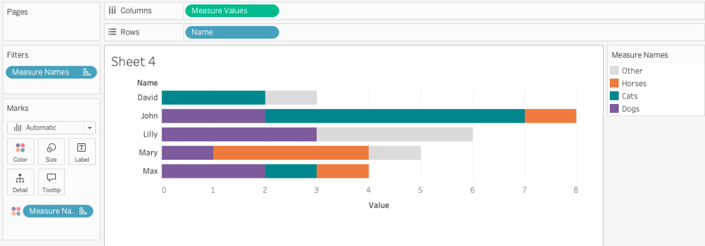
However, Measure Names and Measure Values have aggregation limitations. If I pull off Measure Names, you may expect Tableau to aggregate the values, but it doesn’t. Below you can see the highlighted mark representing the one “other” animal David owns, and behind it is the mark for the two cats. However, those values did not automatically sum to three, which is how many animals David actually has.

These auto-generated fields do not have a row-level structure that Tableau needs to perform aggregations, including table calculations.
Wide vs. Narrow Data Tables
The data structure of the table shown in Figure 2 is often called wide data because each measure is its own column. A wide structure is helpful for writing calculations to compare measures, for example, the difference between the sum of dogs and the sum of cats:
SUM([Dogs]) – SUM([Cats])
However, a wide data structure has some limitations. Above, I mentioned that John owns eight animals and David owns three, but to obtain that information, we would need to create a calculation to sum the four measures (columns):
SUM([Dogs] + SUM([Cats]) + SUM([Horses]) + SUM([Other])
Tableau cannot automatically aggregate across the measure values without a defined calculation. We saw this occur in Figure 6 when I pulled off Measure Names from the bar chart.
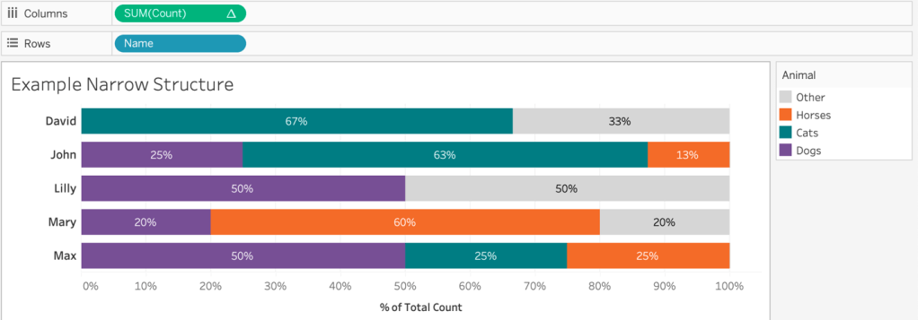
However, the same data in a different structure provides greater flexibility. Pivoting the data to a narrow structure, where there is a dimension for the type of animal and measure for the count of that animal each person owns, enables summing the number of animals by each person without any calculations.

We can use Tableau’s native field aggregation by simply dragging out the measure “Count” into the view to sum the values that represent the total count of animals. By adding “Name” to the view, we can even analyze the percentage of all animals each person owns using a table calculation.
With this data structure, I can easily create a bar chart counting the animals stratified by “Name” or “Animal”. We can look at the total number of animals per person, the count of each animal type, or a stacked bar chart that shows, by person, the percent of each animal they own, with “Animal” on color, as seen in the example below.
Limitations of Measure Names and Measure Values
As mentioned, a wide data structure, where the count of each animal is an individual measure, prevents us from efficiently aggregating all the animals without creating a calculation summing all four measures together.
We can create a stacked bar chart using Measure Names on color and Measure Values on columns to show the count of each animal type by person but are unable perform a table calculation to achieve the same visualization shown in Figure 8. Why is that?
These two auto-generated fields do not have the row-level structure that Tableau needs to perform a table calculation. A table calculation uses a “virtual” table that is determined by the dimensions in the view (what is on the rows, columns, marks, etc.) and performs the calculation on a defined “scope” of the data. Tableau calls the group of data on which the calculation is performed “Partitioning Fields”, and the remaining dimensions are “Addressing Fields”.
We could hack around this issue and create new calculations for each measure to get a percent of total value and use those on the Measure Values shelf, but this is a pain and there are additional limitations of this approach that I won’t go into here.

While this would allow us to display each animal’s overall percent of total, we cannot accurately display tooltips individually, so I cannot show the sum of each animal within its respective bar (see Figure 11) because I’m bound to only Measure Names and Measure Values as dynamic. Any other field placed on the tooltip will remain the same across all marks.
Another limitation with using these fields is that our ability to use reference lines is dramatically limited. You can use a reference line to span the entire table, or view, but you cannot use reference lines at the pane or cell level. In the example below, I cannot show the average number of cats per person for just the bar for cats, where I can with a narrow data structure.


What if pivoting your data is not a possible solution? How can we use multiple measures in a single chart, customize tooltips, use reference lines, and perhaps even create Gantt charts using the size mark card?
The trick? Bring in a second, very simple data source.
Joining in a Simple Measure Name Table
Again, I have a wide dataset with five measures. Each row represents a value for a dimension such as a person, a company, or whatever. I haven’t included a dimension in the mock data source because, for illustration, I’m focusing on using these measures in a wide data set.
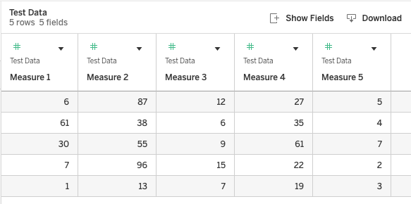
In addition to the table with the five measures, I also created a simple table that has one column called “Header”. The values in the column match to each of my measure names.

The tables need to be related. Edit the join calculation and type in the value 1 for both tables. This creates a cross join, joining each record from the first table to every record in the second.

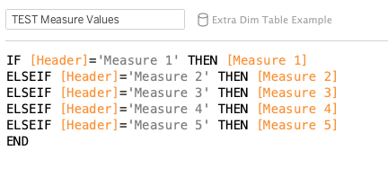
Now, in a worksheet, we can create a simple calculation that matches each Header value to a measure field in our dataset. In Figure 15, you can see the calculation that matches the Header field value to the measure. In our prior example, I would have matched the Header value of “Dog” to the measure field also called “Dog”.
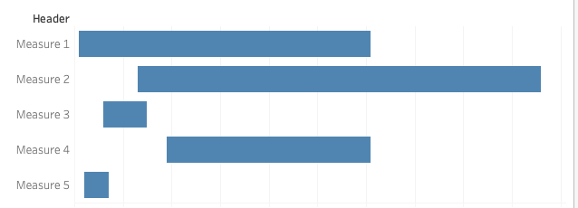
To create a bar chart, we can simply put our Header dimension on Rows and the new calculation on Columns. Tableau has accurately aggregated all the values listed in each measure column.

This calculation can now be used in a table calculation. Additionally, and this is what I really love, you can create other visuals, such as a Gantt chart, which you cannot do with Measure Names and Measure Values because you cannot size Measure Names independently of each other.
Place the new “TEST Measure Values” calculation on columns and change the aggregation to minimum. Change the mark type to a Gantt Bar. Then add a calculation for the difference between the minimum and maximum values onto size: MAX([TEST Measure Values])-MIN([TEST Measure Values])
Using this approach, you can create a much more complex view with multiple measures while maintaining other needed features, such as independent sizing, tooltips, and reference lines.
We can use our new field not only to calculate the minimum and maximum values within each measure field, but also to easily plot reference lines representing average and median values, which will display independently for each measure.

This approach certainly gives us much more flexibility without changing the original “wide” data structure we were given. However, it is worth noting that this approach is best used when you have a small number of measures that require a visualization that is not possible with Measure Names and Measure Values. Additionally, the measures should be of the same type. For example, if each measure represents a hospital and the values for patients’ length of stay.
In Summary
Measure Names and Measure Values are auto-generated fields within Tableau that allow us to visualize multiple measures and their names. Using these fields in dual axis line charts or bar charts can be powerful. However, these fields have limitations as they remain independent of one another and certain analyses, such as table calculations, cannot be performed or have limitations, such as reference lines and tooltips.
By bringing in a secondary, small dataset that provides faux measure names joined to our original dataset, we gain the flexibility to create a single calculation defined at the row level. We can perform more complex analyses on that calculation, including table calculations, using the size mark, and vary the analyses of reference lines. Sometimes, little hacks have significant gains, preventing data restructuring and expanding our visualization options – not to mention, also one happy developer.
