

Within Tableau, you may have used the option “Show Empty Rows” under the Analysis menu to force a table to show rows that do not have data based on the current selection, or just don’t have a possible value just yet.
For example, let’s say it’s the beginning of the year and I’m tracking the status of deliverables. In Q1, I have deliverables in the Green (on track) and Gray (not started) status, but none are yet in the Yellow (at risk) or Red (not achievable) status. However, by the end of the year, I’ll likely have a value for each of the possible status values, so my table eventually will look like the image below.
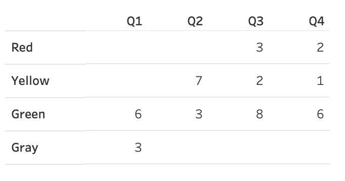
Certainly, the table above looks great. I can see that in Q1 there were no deliverables in the Red or Yellow status.
Using Show Empty Rows
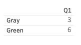
At the end of the year, with my fully complete data set, if I were to filter for just Q1, my table would naturally shrink down and only show the relevant rows, Green and Gray, as those are the only two values for that quarter.
However, if I select “Show Empty Rows” from the Analysis menu, the other status values that exist in the data set will show up, even though Q1 doesn’t have any data for the remaining status values.

What If the Data Doesn’t Exist Yet?
But what would it look like in Q1 before there are values for Red and Yellow? Since those two values do not yet exist in my data, even if I choose “Show Empty Rows,” there are no actual empty values to populate, and Tableau will return the table below. I can’t make values appear that don’t exist yet.
The problem is that this visual appears unusual, especially when people expect to see a full table showing the absent values. Showing all possible rows can help people visually confirm that no data is off-track just yet, with zeros or blanks to represent that no data matches the off-track values in this example.
So, what is the solution? A simple union.
Union Expected Values to Force Empty Rows
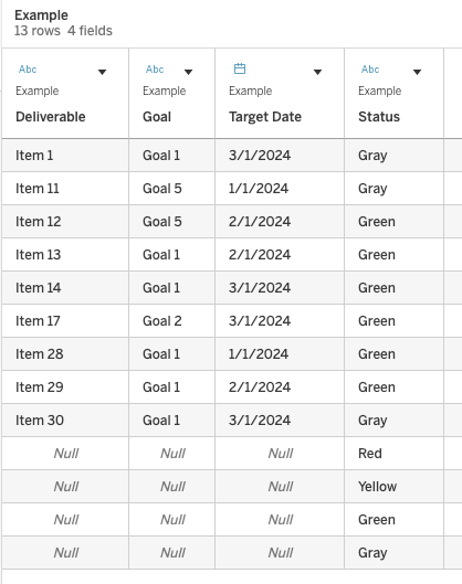
Create a separate tiny table with the dimension that matches the same-named field in the real data set and lists all expected possible values. See my example “Status” table below.

Next, in the Data Source Pane within Tableau, simply union this table to the actual data source. As long as the names of the Dimensions match (Status and Status, in this example), the missing values will be appended to your data.
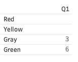
So, when I now select “Show Empty Rows,” my table appears complete and better represents the fact that there were no deliverables in a Red or Yellow status in Q1.
Pretty neat, right? I thought so!
Cheers,
Lindsay
