

The Need for Scrolling
As a data viz consultant, I encounter situations regularly where a client’s wishes, or their data, doesn’t fit neatly into the specified dashboard size. This means, inevitably, I need to introduce scrolling, which I venomently hate on a dashboard. This becomes even worse when you have multiple sheets that tie back to a single header field.
Here’s a terribly messy example (because that’s what they end up looking like):

Now, even after hiding the headers, you have three separate worksheets that do not scroll together. What. A. Pain. Also, not a positive user experience.
So, what’s the solution? Well, parameter actions may be able to help – at least some of the time. The disclaimer is, that with some complicated builds or filters, using the INDEX() calc (which this solution uses) may not be effective. However, this does work for scrolling through a single sheet as well as multiple sheets given the steps I’ve done below.
Setting Up Calcs
The basic premise of this concept is that we set up a parameter value and a subsequent calculation that will return only a specified number of rows based on the INDEX() calculation.
Step 1 | Index
Create a calculation called “Index”. The INDEX() calculation is Tableau’s way of numbering each row in the partition. This means that however you sort the view, the Index value for 1 will be the first row in the table.

Step 2 | Scroll Parameter
Create a parameter called “Scroll” with a data type as float and all allowable values. Unfortunately, you can’t use the Index field to “Add from Field”. But, this shouldn’t be too much of a problem since our parameter will be an action based on the total rows in our (later created) scroll worksheet. So, no worries, my friend.
Step 3 | Show Rows
Next, we need to create a calculation that will only show the rows within a certain range of the parameter value.
The “Show Rows” calculation will show (in this case I’ve selected) 25 rows based on the index value. So if the index value is 25, we will show rows 1-25. If it’s set to 40, only rows 15-40 will populate. Because the first 25 rows shouldn’t move until the parameter goes past 25 and I want 25 rows to show even if you are scrolling on row 5, I set the calculation to basically do nothing until you scroll past the 25th mark, hence the first part of the calculated statement below.

Step 4 | Build the Table or Graph
Build your table or view with the necessary headers and charts you need. If you are building more than one chart that need to scroll together then be sure to have the same headers, so that you have the exact same number of rows in both (or all) worksheets you will put on your dashboard.
Here’s how my first table looked:
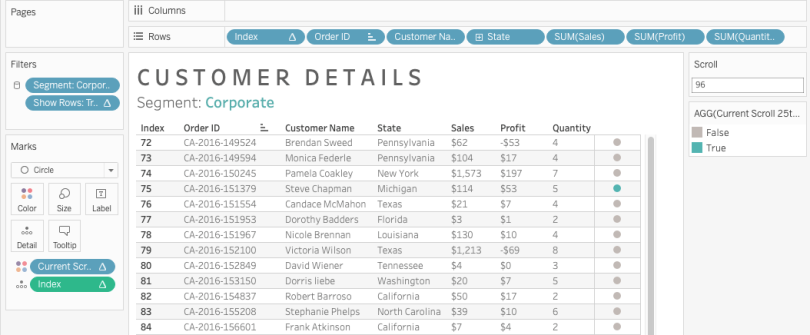
While you don’t have to, I added the Index calculation to my table so that the viewer could see the scrolling numbers. However, you don’t need it as a header at all. As long as it’s on the detail shelf you are golden. Make sure you have the Index field set to “compute using table down” since we want the numbers to just count down the rows of our table.
Step 5 | Scroll Indicator on Table
Because sometimes people can scroll faster than then intend to, or the delay is a little glitchy, I added a scroll indicator so that the viewer could see if they actually scrolled further than intended. Sometimes it’s hard to follow the numbers, so the color is easy to pick out in the movement (side note: pre-attentive attributes, folks). The calculation renders true when the value is divisible by 25. I chose this because I set my table to be 25 rows high. You can change this depending on how many rows you want to show in your dashboard. The result is the little circle you see move up and down as you scroll (see image above).

Step 6 | Create the Scroll Bar
The scroll bar (or Gantt chart, really) is what will (eventually) will drive our parameter action from. The main objective is just to set up a set of marks that has the same number of rows as the main table (or graph) we want to scroll. If our table has 200 rows, we need the scroll bar to have 200 rows so that the parameter will connect one with the other.
This means you need to create the same number of marks on the scroll bar sheet as the main table/graph sheet. (Note, that once you put the “Show Rows” calc on the filter, you will obviously only have the number of marks you specified.)
The tricky part here is to ensure all the fields on your main table/graph are on your level of detail shelf so that your marks match up. Then set your Index calc to compute using all of those partitioning fields.

Step 7 | Scroll Indicator on Scroll Bar
To add the color to show where your user is scrolling, simply create a calculation that is true when the value of the Index equals the value of the parameter and put that on the color shelf (see above).

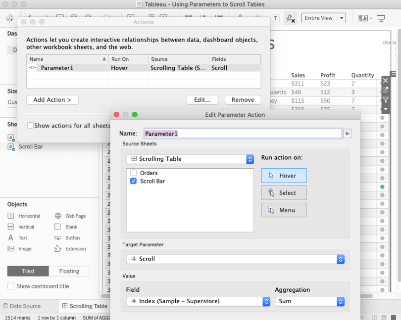
Step 8 | Hook Up the Dashboard
The last step is to create a dashboard, set the filter, and hook up the parameter. First, put the “Show Rows” calculation on your worksheet so that only the designated rows determined by the parameter value show up. Next, create your dashboard and set up your table/graph and your scroll bar worksheets side by side. Set both to view “Entire View”.
Next, create your parameter action. Go to Dashboard — Actions… and “Add Action”.
You will want to have this run when the user interacts with the Scroll Bar worksheet on hover. with the target parameter of the “Scroll” parameter. The field is INDEX().
This should be the result:
Or this with the multiple charts (pardon my shotty video capture, but you get the point).
Hopefully, that is helpful. However, I’m aware sometimes directions are only as clear as the one who is describing them and I won’t admit to always be the clearest individual on the planet.
SO….
As always, feel free to reach out on Twitter or email if you have questions or other ideas related to this idea!
Link to the dashboard, which you can download, can be found here.
Cheers,
Lindsay

Great idea and execution! Thank you! Have to ask for help though. Your example works well with my number tables. But for some reason when I add Index to my sheet with a stacked bar chart where categories add up to 100%, categories split into 2 or 3 rows in the same index line creating a mess. Can’t figure out why this is happening.
LikeLike
Hi! I’d have to see the work book but I assume it’s related to how you use the “compute using” function for INDEX.
LikeLike
Make sure you change the “compute using” for the index to include all variables. I’d have to see what you were doing – but likely that’s the culprit.
LikeLike
I downloaded your notebook in v2018.3 but for some reason the scroll-bar doesn’t work. Any idea why so?
LikeLike
Yes, because the scroll uses Parameter Actions which isn’t available until the 2019.2 release.
LikeLike
This was excellent. Thanks. I have a question about the calculated field “Scroll Size” in step 6. I see it in the screenshot but I don’t know what’s in the calculation. Please help.
LikeLike
You can download the workbook (it’s linked in the blog post), but the scroll size calculation is: IF [Scroll]=[Index] THEN 2 else 1 END
LikeLike
Hello Lindsay,
Great work, my requirement is little different, i have analyst data which needs individual sliders for each analyst, for ex. Analyst A count is 100 and if i want to see his 50% work i move my slider to 50, same with Analyst B but i need only 30% of his work where i move slider for Analyst B to 30 and so on.. Bottom line is if i have 15 analyst then i need 15 sliders individually, any idea?
LikeLike
It’s hard to really understand your use case without more details. Are you describing individual slider filters? The scrolling is really just to hook up multiple worksheets to scroll together when their length extends beyond the limits of the dashboard.
LikeLike
Hello Lindsay,
This functionality is great and I am trying to fit the same in my workbook too, would you mind sharing the twbx file again, it would be a great help. The reason being when I downloaded the file, the source is extracted and it says I do not have the permissions to open it.
Thanks,
ZG
LikeLike
Hi Zeenat, the data source is just Superstore. You can reconnect to your local copy which comes with Tableau.
LikeLike
Great work! Just one question though – If I set my scroll parameter as 1, the TRUE Current Scroll (which is showing in Green colour) is coming up at the bottom instead at the top. Not sure what I am missing here. Much appreciate the help.
Thanks,
Praveen
LikeLike
Can you share a workbook? I’m a visual person and would need to see it.
LikeLike
Hi Lindsay,
Thanks for sharing the tip for making synchronized scrollbar.
My problem is: Say I have only 50 rows in total, and I set my table to be 35 rows high. When I apply the scroll bar to scroll on my multisheet (two-sheet) dashboard, the scrollbar somehow does not function good as expected. Do you have any ideas to resolve such case?
Could you please leave your email so that I can send you some screen snapshot for easier review? Thanks!
LikeLike
Hi Marco, if you still need help with this issue you can email me at lindsaybetzendahl@gmail.com and I can try to take a look at the issue. Sorry for the late response. It is possible that the synchronized scrollbar is slow if you have a lot of data to process even if you have only a few rows since each movement of the scrollbar/parameter needs to compute values to display.
LikeLike
I’m a little late to the show here, but this was incredibly helpful to create my viz. When I created the scrollbar, my Gantt rows have gaps in between them. Is there an option to erase that empty space so it likes like a continuous bar? I am thinking it’s an setting you just didn’t mention perhaps?
LikeLike
This could be because of the number of rows that you have. If there are a few then perhaps they are spread out. You could adjust the size of them perhaps? Or just do fit width if you don’t need the full length of the area for the scroll. I’d have to see to really think about it, but I’m guessing that is the reason.
LikeLike